XF 2.2 Best practice to create new style?

oldford

Active member
I'm new to xenForo and have installed a test forum so I can prep for the big move of my live forum.

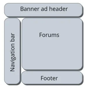
What is the best way to create a new style? Basically I want match my current page style which has an advertising header and left side navigation bar. Then the forum fills in the rest of the page body.

I've got a rough draft working by editing the PAGE_CONTAINER template file. I basically figured out the right spots to insert the HTML for my header and side navigation bar.

Is that the right approach? Or is there some way to do it without template edits? I prefer not editing templates if possible so future XF updates don't break things. But I don't know if that's possible.

Thanks!
 
Put your CSS template mods in extra.less whenever possible. Don't go around modifying templates that will become outdated with every update cuz that's a pain in the posterior.
 
Changes are merged into templates when you upgrade. So pain in the posterior is an exaggeration. But if you can achieve what you want w/o one even better. If you can explain in more detail I am sure someone can help.
 
Hacking templates directly isn't best practice. Can cause add-on conflicts later. You can do most everything you want to do using style properties and extra.less. If not there's the template modifications tool.
 
Editing templates is perfectly valid and doesn't carry any extra risk.

In fact, I prefer that to template modifications, which fail silently when upgrading if they no longer apply.
 
Will definitely need to edit PAGE_CONTAINER. I'd think ahead about mobile usage. Instead of removing the main default navigation bar from the template, use CSS to hide on larger screens, then show it on mobile devices while hiding the side navigation bar.
 
Thanks. Just to clarify, my side navigation bar is to navigate the rest of my site. It is not for forum navigation. Forum navigation will still occur using the default XF nav bar along the top.

I do need to wrap my head around mobile usage. For years I have only designed for large screens. Obviously I'm behind the times and am trying to catch up.

I was assuming I needed to create a separate mobile style and use an addon to detect mobile users. I didn't think about using CSS to show/hide elements. Is that based on display width?

This may be something that's worth me farming out to a template designer like lt3a suggested.
 
Use @media rules in extra.less to hide/show your elements. XF and pretty much all the styles available for purchase are responsive by default.
 
Top Bottom