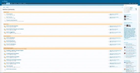
It really depends on the crowd, 80% of our customers want a familiar feel otherwise their users make a fuss. Each niche or market can be vastly different and taking to much of the "ten year old forum" feel away can be a bad choice. Being able to provide rich content and being unique in your niche or market is a key to success. Trying to make a forum something it isn't doesn't usually turn out well.
Why aren't those forums growing much faster? What I can't grasp is that we have Facebook login enabled, market on Facebook, and the people STILL don't sign up. It takes like 4 seconds with Facebook login enabled, so what's stopping those people? Is it the look? Is it the presentation of content? It's really a mystery that we should try figuring out. You'd think with Facebook login and a few links that people share/like, they'd be all over it. But there's something preventing them and we need to figure that out.
Most people are also content with repeating the same thing over and over as long as it "works" - but in regards to social media - this is not working to our advantage and we need to be competitive with their UI and ease-of-use.
Forums were massive back in the day. We could open forums and droves of people would show up outta nowhere.
We CAN pull those massive crowds back in, but we have to think forward and evolve.
As long as the functionality is there (or ability to code it in), then a good/creative designer can work wonders anyway.
Just something for people to think about when they're struggling to grow a forum they spent a few hundred on and can't figure out why no one's participating or they're not earning any cash back. Dumping money into projects and not seeing a return on investment kinda stinks.
@Davyc - spend a few moments on any social media site and look where the content is. It's in the center.
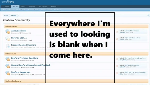
Look here. The center of the page is often blank. Is that a visual roadblock for new visitors? Are they getting lost? Not sure what to do? Think the site is broke? I'm not sure...
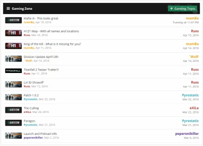
What we did on one forum was condense all nodes, label things under prefixes, then display this page as the "forum." We cut down on the need to browse nodes, made the blank center smaller, displayed full titles, etc - it helped, but I think it can be even better with a thumbnail preview or even exploring a grid layout (depending on your niche). A third column COULD be an answer. Or a smaller screen size...
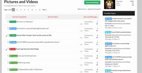
Was talking to @Russ ages ago about a 3 column setup (not sure if they released one yet), but I envisioned it looking something like this - which is much closer to that of Facebook and Twitter. It puts the content in the center where a majority of social media users are used to looking. This isn't a perfect look, but it helps present things in the center where many social media people are used to seeing them. And of course, any designer here could take this "idea" and come up with something that actually looks good. My MS Paint work is pretty crappy.
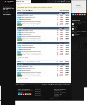
It's NOT that we want to be social media, but rather we should use social media's success and design in our favor. We can give people an experience that feels familiar and possibly mimics what they might be used to. It might raise their comfort level a bit and get them signing up more than they used to.
Social media is destroying forums and we would be exceptionally stupid and stubborn to not observe what they do and find pieces of it to integrate into forums and give them a more modern feel. They don't need to look super pretty, just be easier to use and display content better.
It's worth being open minded, exploring, and observing what made social media so successful and finding ways to integrate their success into our own projects.
Things that don't adapt over time usually become irrelevant.
