What have you done to make your Xenforo site mobile friendly?

That's a setting in the PixelExit style I use:
Great, I'm also using a PixelExit style.
The problem is that that bar is used a lot on PC and with that option the bar disappears from both PC and mobile styles. I removed it temporary and some users already complained :D

My solution for that one is a bit of a hack. The PixelExit style I use has an option to have a small New Posts link next to the off-canvas toggle
Thanks for the hack.
I think that's another quite used button, so in exchange of removing it completely I just added the logo and link on the left:
Code:
<xen:if is="@xb_offcanvas_menu_newposts">
<a href="{$logoLink}" rel="nofollow" class="xbOffCanvasNew Tooltip" title="{$xenOptions.boardTitle}">
<img src=/dualsim.png  alt="{$xenOptions.boardTitle}" display="inline-block" height="16px" style="margin:0px 6px -3px 0px">
<span>Foro</span></a><a href="{xen:link find-new/posts}" rel="nofollow" class="xbOffCanvasNew Tooltip" title="{xen:if $visitor.user_id, {xen:phrase new_posts}, {xen:phrase recent_posts}}">
<i class="fa fa-commenting fa-fw">
</i>
<span>{xen:if $visitor.user_id, {xen:phrase new_posts}, {xen:phrase recent_posts}}
</span>
</a></xen:if>
UPDATE: some users reported style problems with double icon:
upload_2017-2-9_18-56-42.webp
I solved it by removing this code at navigation_visitor_tab (removing user favicon):
Code:
<xen:if is="@xb_fa_visitor_tabs"><i class="fa fa-user fa-fw"></i></xen:if>

Thanks a lot!
 
Last edited:
HTTP/2 is super experimental though... hence only 10% of the web actually use it, even though all browsers now support it. It's a real pain to get right and working properly. NGINX is way easier, still painful though, than Apache, to get fully HTTP/2, especially with push.

My transition to http/2 has been very painless:

Step 1: Ask @MattW to change me from Apache to Nginx via Centminmod LEMP (tag @eva2000 )

Step 2: There is no Step 2 :D

As for server push, I haven't implemented that yet, but even without it, I am seeing big performance gains with http/2.
 
Great, I'm also using a PixelExit style.

If you remove the login bar using the CSS I provided for removing the header, make sure to offer someplace to login/register in mobile view. I did it by replacing the contents of the xb_mobile_bar template with the following, where the part shown in orange allows login / registration. But you have to enable the Mobile Bar in your Pixel Exit style for it to work.

Rich (BB code):
<div class="xbMobileBar">
<xen:if is="{$visitor.user_id}">
    <ul>
        <li><a href=/find-new/posts?recent=1 class="Tooltip" title="Recent Posts" rel="nofollow"><span><font size=2>Recent</font></span></a></li>
        <li><a href=/find-new/posts class="Tooltip" title="Unread Posts" rel="nofollow"><span><font size=2>Unread</font></span></a></li>
        <li><a href="{xen:link 'forums/-/mark-read', $forum, 'date={$serverTime}'}" class="Tooltip" title="Mark Read" rel="nofollow"><span><font size=2>MkRead</font></span></a></li>
        <li><a href=/watched/threads/all class="Tooltip" title="Watched Threads" rel="nofollow"><span><font size=2>Watched</font></span></a></li>
    </ul>
<xen:else />
    <ul>
        <li><a href=/find-new/posts?recent=1 class="Tooltip" title="Recent Posts" rel="nofollow"><span><font size=2>Recent Posts</font></span></a></li>
        <li><a href=/login/ class="Tooltip" title="Log in" rel="nofollow"><span><font size=2>Log in</font></span></a></li>
        <li><a href=/register/ class="Tooltip" title="Register" rel="nofollow"><span><font size=2>Register</font></span></a></li>
    </ul>
</xen:if>
</div>
Thanks a lot for pointing it out!
I still don't have that Mobile Bar feature, should upgrade asap for that.
Meanwhile just deleted
.Responsive #loginBarHandle { display: none !important; }
 
Step 2: There is no Step 2 :D
I think there needs to be... you're running nginx and I'm running apache.

Level playing field, forum home page -- you're using pixel exit which is lighter and faster than what I'm using, being Ui.X.

You're already using HTTP2, I'm not.

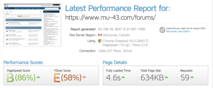
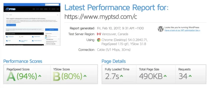
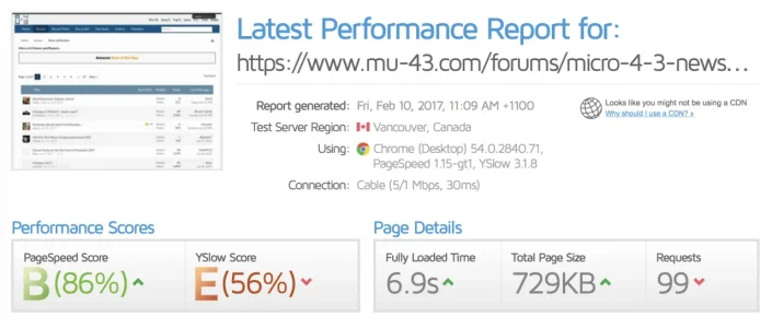
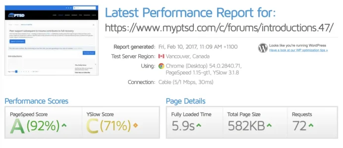
Being reasonable, I used the retest results for each forum home page, as the second and subsequent pulls are the more accurate.

Desktop Times -- Limited to a standard 5mbps down speed which is pretty average across the board.

Screen Shot 2017-02-10 at 9.34.45 am.webp

Screen Shot 2017-02-10 at 9.35.19 am.webp

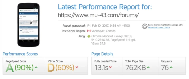
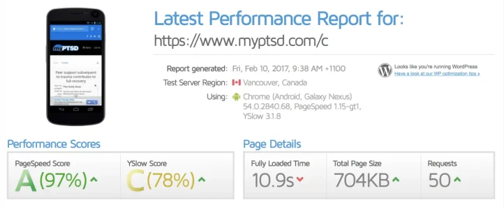
Now the awful test -- Mobile

Screen Shot 2017-02-10 at 9.39.18 am.webp

Screen Shot 2017-02-10 at 9.39.27 am.webp

I'm beating you on both desktop and mobile, using the most horrendous of all bloated systems, Cpanel vs your NGINX setup already using HTTP2.

I've been doing a lot of testing with NGINX recently, working towards an optimal setup to run my Wordpress and xenforo sites, and I have Wordpress mobile at 2.8 seconds and Xenforo mobile at 3.2 seconds, using NGINX, with the server here in Melbourne, Australia, testing from Vancouver to have maximum ping included.

I think you need a Step 2 process for your sites performance optimisation, to be honest.

I'm not taking into account the performance scores... they're here nor there, but the load times.

NGINX should be delivering sub 6 second for a mobile page load when correctly setup, just using php-fpm and HTTP2.

Xenforo forum home here loads mobile in 9 seconds from Vancouver... and they're likely hosted in the UK.
 
The mobile test does show ads... so the mobile is level. Yes, true, ads should always be disabled when doing speed tests... so lets use equal pages, thread views, both of which sites use Adsense.

Screen Shot 2017-02-10 at 11.11.36 am.webp

Screen Shot 2017-02-10 at 11.09.59 am.webp

Honestly, if you're using NGINX, HTTP2, should be using the latest PHP and MariaDB versions (7.1 and 10.1), you should be absolutely blitzing performance. I think you need to look at optimising what you have.

Are you using SSD? Is your NGINX optimised? Using mid level caching?

Do you have things like keep alive either off, or minimal? Or maximum if using upstream to your php-fpm?
 
I don't think those thread views are exactly level, either. We have very different ad setups. The page you show for mine has a CPM ad passback to Adsense passback to the affiliate ad pictured. All of which takes time.

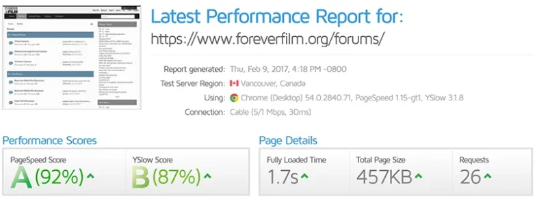
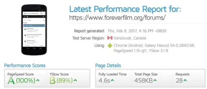
Here's how my forum index looks like on a site with the exact same setup as Mu-43.com and no ads. Doesn't help that the GTmetrix test site of Vancouver is 3,000 miles from my origin server.


desktop.webp

mobile.webp
 
Last edited:
That looks way better and what I would expect for what you're saying your setup is running... ads don't make that much impact though, especially as you can preload the dns for google ads.

I get that using Vancouver is a distance... but I also intentionally do that even when testing for Melbourne, especially if a site is global. I tend to then place global sites on my US server though, not Melbourne one. You can register and login to change the location for desktop use with gtmetrix, if your audience is only local.

What you have shown above is about what I'm getting with an optimised nginx setup, using 50 loaded online at once, on my test setups. I enabled google ads on it to test that too, using prefetch, and it only added just under 2 seconds for the full load.

Look into push... its worth it from what I've played with testing. I only implemented it for java and css, it took off the most time of all aspects, whilst using lazy load on all images, thus negating all of them but the first viewable images from loading and affecting page load. Could probably add that too for some given common images, such as logo or such.
 
I know that default Xenforo is fairly mobile friendly, but lots of members still prefer Tapatalk. I'm unwilling to use Tapatalk any longer, and none of the other app options appeal to me very much either, so I am trying to make do with customizations to my site styles.

I was hoping that we could all share some tips and tricks in this thread. Here are some of the things I've done (not necessarily) in order of impact):

1) Remove most of my ads. Ads slow things down a lot, and it's essential to keep mobile pages light. I left just my highest earning ads, which also happen to be among my fastest.

2) Use a mobile-friendly style. I use Flat Awesome + from PixelExit.

3) Make logo small and put large, tap-friendly links to "Recent Posts" and "Unread Posts" (New Posts) in my site header. This is how it looks on my phone:

View attachment 140940

4) Remove all user banners in the mobile phone view by adding this to the EXTRA.css template:

Code:
<xen:if is="@enableResponsive">
@media (max-width: @maxResponsiveNarrowWidth)
{
    .Responsive .messageUserBlock .userBanner
    {
         display: none !important;
    }
}
</xen:if>

5) Use an addon to allow users to post a new thread from any page including the site home page and forum index. I use AD Quick Thread.

6) Remove subnavigation links so there is a single navigation bar and also make the font smaller on page titles. Every bit of real estate counts in mobile.

7) Use an addon to enable push notifications in conjunction with the necessary mobile apps. I use [bd] Push Notification, which lets my members get notifications via Pushbullet.

Please share some of the things you've done to make your sites as mobile friendly as possible.
How did you get the word menu next to the hamburger menu please?
 
Cheers! That worked a treat. Any way of changing the font? So it's the same as "Admin" and "Moderator" fonts and thickness.
 
Last edited:
Cheers! That worked a treat. Any way of changing the font? So it's the same as "Admin" and "Moderator" fonts and thickness.
This should get you what you're looking for.

CSS:
.p-nav-menuTrigger::after {
    content: "Menu";
    vertical-align: super;
    font-family: 'Segoe UI','Helvetica Neue',Helvetica,Roboto,Oxygen,Ubuntu,Cantarell,'Fira Sans','Droid Sans',sans-serif;
}
 
Thanks! That is slightly better. Already have a "Forum" direct link which doesn't quite look right with the menu button now so I was going to try to have them the same font and position. Maybe I need to change the forum font rather than the menu one!
 
Last edited:
Top Bottom