Voting system could be more obvious

Mr Lucky

Well-known member
I guessed what the number and arrow probably meant because I have been reading the HYSs, but i think a lot of normal people wouldn't know that.
But they would understand if for example it had the word VOTE above the arrow and vote counter on the right. So this suggestion is purely to have the word, or an option to have the word there for those people who aren't used to these things.
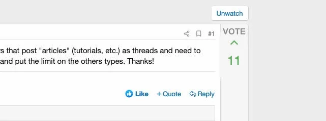

vote.jpg

EDIT: might also help if the box was on the left, people may be more inclined to notice it.
 
Last edited:
Upvote 42
It follows the same format as other popular sites that allow voting, like StackOverflow. If anything, I'd maybe make the arrows more prominent.
 
It follows the same format as other popular sites that allow voting, like StackOverflow.
That appears to be a developers' site. ("For developers by developers")

I'm really talking about what is intuitive for normal people who have never seen that site, or would leave very quickly if they did :)

Sometimes it's good to think like regular forum members as opposed to thinking like devs.
 
That appears to be a developers' site.

I'm really talking about what is intuitive for normal people who have never seen that site, or would leave very quickly if they did :)

Sometimes it's good to think like regular forum members as opposed to thinking like devs.
Sure, but that was only one example. I've seen many sites implement voting styling like this that are non-developer related, with Reddit being one of them. Do you have any examples of sites that implement it in a way that you're thinking? (I'm a visual person, so seeing it is helpful).
 
I don't see a problem with it at all. It's implemented just like reddit and stackoverflow. Most of everyone's community members will have used Reddit before so they will know what's going on.
 
Sure, but that was only one example. I've seen many sites implement voting styling like this that are non-developer related, with Reddit being one of them. Do you have any examples of sites that implement it in a way that you're thinking? (I'm a visual person, so seeing it is helpful).

No, I'm just trying to think from the point of view of somebody who has not seen this before.

All I'm suggesting is a very basic visual help/explanation for people who haven't seen a voting system on a site nothing really to do with actuial implementation of the system - just an indication so people know what it is. I'm trying to avoid to write in the post "use the arrow in the box on the right to vote for this answer/suggestion...)
 
Yes, seriously. Reddit alone is one of if not the most used community sites on the internet. And every other site that allows voting also follows the same metrics so people will have seen it somewhere or maybe even used it at least once before.
 
And every other site that allows voting also follows the same metrics so people will have seen it somewhere or maybe even used it at least once before.
When you say "people" it can only been people who have used Reddit, and it makes no sense to say
Most of everyone's community members will have used Reddit
Maybe on your forum, but not on every forum:

Screenshot 2020-06-24 at 16.48.07.png

Why would it be such a problem to just have the option of showing the word VOTES as a guide, to help those people who don't use Reddit?
 
Last edited:
I admin a small community run site where no one but me and one other IT pro (who is also an admin) would know Stackoverflow and only a couple are active on Reddit afaik. So I see merit in this even if it is not a "must have"
 
So I see merit in this even if it is not a "must have"
Absolutely not a must have, I'd prefer if it could be an option to just display the word VOTE or not. I can't actually see how it being there can harm anyone, but would not want to have it imposed on people who really find it a bad thing.

But I do think it's becoming more of a fad these days that functions are sometimes hidden behind cryptic icons. It's great for developers or people who use that kind of site. But I know for a fact the more elderly users with either not even see the number and arrow, or even if they do will ignore it.

I don't see anything to be ashamed of in explaining some things, or else just making them more intuitive.

And I don't get that just because some other site does something (unintuitive) that other sites should follow. The principle being two wrongs don't make a right.
 
When the time comes I'll likely be using \f176 for the icon instead of the the current \f106. f176 is a long arrow. For me at least the current icon makes me think more of a 'collapse' / 'open' type icon versus a vote symbol.
View attachment 228781
Honestly, I like the arrow without the line. I do think it needs to be a bit more noticeable. Like maybe put a new square around the arrow? Like so it becomes a different hue, like it does now...?
 
Although there's plenty of merit in making the arrow look different/better/more it still doesn't help people who do notice it , but still don't know what on earth it is for.
 
In my defense the reason I wouldn't want something there is because then it would look cluttered.

Even if elderly it should be common sense what that function is for. On the thread list itself it shows how many votes something has and already says votes right under the amount. When someone then goes into the thread itself you then see that the same numbers are right there which should make it very common sense what it would be used for.
It's more of a design issue is what I am referring to, rather than "I don't want it there because I don't understand it." It's more "I don't want it cluttered to remove some parts of the mobile viewing" (or desktop viewing, for that matter.)

This applies to everything else announced in 2.2.
 
Top Bottom