TinyMCE was definitely unpopular.
You are using an out of date browser. It may not display this or other websites correctly.
You should upgrade or use an alternative browser.
You should upgrade or use an alternative browser.
Very very very bad editor design!
- Thread starter mizter1nho
- Start date
- Status
- Not open for further replies.
Because the old one was trash. I spend several hours a day blogging via XF, and a significant amount of the time is wasted repeatedly try to get the old piece-of-trash editor to display things as I entered them.
I think you miss interrupted my post.
TinyMCE could be customised, it was just painful as the CSS was a mess.
I created a resource here explaining how to do it: http://xenforo.com/community/resources/styling-the-wysiwyg-tinymce-editor.349/
TinyMCE was a nightmare
TinyMCE was a nightmare.
Thankfully it never came up in my dreams.
Good point ... but ...@Garamond, the grey editor is consistent with previous releases, and is a rather neutral color. This allows it to 'fit' into most styles without much hassle and not have to restyle your editor to look out of place. Say a light blue editor or a bright green style (random example).
By logical extension, Xenforo should ditch everything blue and make everything grey.
Will I be shot if I say I preferred TinyMCE?
No, but I haven't heard of any uses of the Discouraged User feature recently...
Yes, it's neutral - but since the default theme isn't neutral then there should be some kind of adjustment to balance it out.@Garamond, the grey editor is consistent with previous releases, and is a rather neutral color. This allows it to 'fit' into most styles without much hassle and not have to restyle your editor to look out of place. Say a light blue editor or a bright green style (random example).
OK, now I cant stop laughing!
Then my work here is done.OK, now I cant stop laughing!
Good point ... but ...
By logical extension, Xenforo should ditch everything blue and make everything grey.
This doesn't make sense. XenForo chose blue as their default themes colors. It makes it easy to change, and most people do. I can't think of seeing a single instance where a style author actually styled the editor, so a grey editor + random color still works. But a non-neutral editor (blue) with a change forces style designers to update them. @Garamond, this is in response to you (my boss has me distracted).
This doesn't make sense. XenForo chose blue as their default themes colors. It makes it easy to change, and most people do. I can't think of seeing a single instance where a style author actually styled the editor, so a grey editor + random color still works. But a non-neutral editor (blue) with a change forces style designers to update them. @Garamond, this is in response to you (my boss has me distracted).
Sorry with lots of respect I don't get the end of what you said.
Are you saying there is an important reason in terms of styling why the background colour cannot be default @primaryLighter ?
Well, I see it the other way around.This doesn't make sense. XenForo chose blue as their default themes colors. It makes it easy to change, and most people do. I can't think of seeing a single instance where a style author actually styled the editor, so a grey editor + random color still works. But a non-neutral editor (blue) with a change forces style designers to update them. @Garamond, this is in response to you (my boss has me distracted).
And since it's easy to adjust colors, the default forum package should be consistent all the way down to the editor. It just doesnt make sense as it is now.
I like the new editor but I do have a few pedantic criticisms:
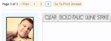
1. It's hard(er) to tell if you have pressed one of the bold, italics or underline buttons. How about inverting the colours i.e. make the background of the button darker and change the text to gray when pressed? I don't know, I just think it needs to be more obvious that it's been pressed.
2. I don't like the XenForo usercard style pop-ups for adding links/code. TinyMCE pop-ups looked and felt better to use although they took ages to load.
- Status
- Not open for further replies.
Similar threads
- Question
- Replies
- 2
- Views
- 698
- Question
- Replies
- 2
- Views
- 778
- Replies
- 13
- Views
- 7K

