100 of those posts were made recently. My site got linked on the GSLAS. http://gslas.com/favorite_links.htmlso you do have 4 my bad. Why not take the advice and use it? 165 posts in 2 years LOL
You are using an out of date browser. It may not display this or other websites correctly.
You should upgrade or use an alternative browser.
You should upgrade or use an alternative browser.
Utah Fishkeepers
- Thread starter CarpCharacin
- Start date
And what is that website?100 of those posts were made recently. My site got linked on the GSLAS. http://gslas.com/favorite_links.html
100 of those posts were made recently. My site got linked on the GSLAS. http://gslas.com/favorite_links.html
That really doesn't mean anything, you need to be on your site, posting several times a day, get more articles up and get people talking. You've been given advice from several people, some with large sites that know what it takes to get a site off the ground.
I'd advise you to take that advice or your site will forever sit stagnant.
Wasn't the question, how does his site look? I find the attack on his administration skills...odd. And somewhat inappropriate.
TPerry
Well-known member
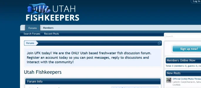
Your logo blends into the background - a negative (a green tone fish would probably look better but you would have to play with the coloration to get a blend)What do you think needs ot be changed? Is the banner good?
The style appears to be pretty much stock for the purchased style it is.
For my browser, there is a LOT of wasted space on either side

The great salt lake aquarium societyAnd what is that website?
It was a free style. I like the fixed width. I tried a green fish, but I didn't like it as much as the blue fish.Your logo blends into the background - a negative (a green tone fish would probably look better but you would have to play with the coloration to get a blend)
The style appears to be pretty much stock for the purchased style it is.
For my browser, there is a LOT of wasted space on either side
View attachment 140703
The great salt lake aquarium society
It was a free style. I like the fixed width. I tried a green fish, but I didn't like it as much as the blue fish.
Yeah but the blue fish blends in to much with the background. People here are offering suggestions on how to make your site look better and be successful but doesn't seem like you really care to much to listen. You really should seriously consider listening to the suggestions that have been given to you especially the countless times people mention about how the fish in your logo blends in. It should stand out somewhat but not be over powering.
Well, actually, they're recommendations. All of which are subjective and open to interpretation. For instance, I agree that he should go with a brighter colored logo. I think the red popped and complimented his style more than the subdued colors, as red is stylistically a solid accent color. On the other hand, I think fixed width is the way to go for most forums, as administrators, who tend to think your entire screen real estate needs to be crammed with...something, forget that wide screens mean that a completely fluid width requires back-and-forth head motion just to read one sentence. There's no reason you should have to do that.Yeah but the blue fish blends in to much with the background. People here are offering suggestions on how to make your site look better and be successful but doesn't seem like you really care to much to listen. You really should seriously consider listening to the suggestions that have been given to you especially the countless times people mention about how the fish in your logo blends in. It should stand out somewhat but not be over powering.
I'm a little confused as to why this particular user is being affronted for his opinions on our feedback. It's our opinion, and he's neither obliged to take them nor leave them. We when offer our opinion, he tells us why that is or isn't feasible. He knows his site better than anyone. We're supposed to work around that. Nobody should be telling any administrator how to run his own website. Our suggestions are just that. Suggestions.
I want to keep my site an all blue color scheme. That is why I have the admin usernames set to blue, not to red. I used to have them set to red, but I changed it. I made the blue logo darker so I can still see it, but so it isn't a bright color. I don't want to have bright colors on my site. When I created my logo, I tried an orange and a green fish and I liked the color of the blue the most.
The reason I recommend a contrasting logo (doesn't have to be red, but it should be a stark contrast from the main color) is the uniformity of color tends to make the page look washed out. And a solitary accent color can give the rest of the colors life that they ordinarily wouldn't have. Think of it from a design sense. For instance, if you've seen a interior designed living room or office, that's a only a couple of colors. But there will be an accent pillow or picture that's a stark contrast from the main colors. There's not a lot. But the addition of those two items brings the room to life in a way the colors can't on their own. Or if you've ever seen a woman wear a black and white dress, but red shoes. Or a staged back-and-white photo, with a solitary item in the photo still in color. Same principle in all of those. The blue works and the blue is great. But a solitary accent color for the logo give the blues a greater depth and presence. But, again, just my 2 cents.I want to keep my site an all blue color scheme. That is why I have the admin usernames set to blue, not to red. I used to have them set to red, but I changed it. I made the blue logo darker so I can still see it, but so it isn't a bright color. I don't want to have bright colors on my site. When I created my logo, I tried an orange and a green fish and I liked the color of the blue the most.
My xF site isn't ready yet, but I'll give you an example of what I mean with my old vB site. For years I had the dark grey and deep blue theme. And it looked fine. But something about the overall site just wasn't working visually. In my case, it was dark. Dark all the time. And the blues weren't enough to make it seem more alive. So I added nothing more than a yellow 1px border to the base of my category strips. It really made a difference in the visual appeal. I'm afraid I don't have a before pick, but hopefully you get the idea.
Attachments
Ok, but what should I do about my favicon? Should I change it to green too?
Personally, I think you can be flexible there. You can have your consistent branding, but each icon/banner should be suited to it's specific needs. I like to use different, but similar, iconography for my logo and favicon. Try making several in different colors and see what stands out best to you. Although, note that favicons tend to take forever to update in your browser once changed.Ok, but what should I do about my favicon? Should I change it to green too?
TPerry
Well-known member
I made the blue logo darker so I can still see it, but so it isn't a bright color.

Sorry, but if you aren't looking STRAIGHT on at the screen (at least on my LCD) the above blends in to much and is more an irritant to me.
If you insist on a blue, then you need to work on the coloration to be a tad more noticeable.
That's like I went through several different coloration ideas before settling on this (it more or less matches the flow of the rest of the site)

I changed the fish to green. How do you think it looks now?
Yeah, actually that's much better. You can also play around with that exact shade of green for highlights around the forum, if you want. I think that's got a good contrast.I changed the fish to green. How do you think it looks now?
TPerry
Well-known member
Looks a lot better than it did. If you are good with graphics you may want to shade the bottom part of the fish with a lighter tone of green fading into the darker green.I changed the fish to green. How do you think it looks now?
Utah fishkeepers is supposed to be a mainly freshwater forum. I like the cichlid logo I have since the cichlid hobby is big in utah.I think some type of fish background like a coral reef or some such would help things out and a simple basic text logo.

