You are using an out of date browser. It may not display this or other websites correctly.
You should upgrade or use an alternative browser.
You should upgrade or use an alternative browser.
Lack of interest Upvote - Downvote Indicators
- Thread starter Neutral Singh
- Start date
This suggestion has been closed automatically because it did not receive enough votes over an extended period of time. If you wish to see this, please search for an open suggestion and, if you don't find any, post a new one.
This suggestion has been closed. Votes are no longer accepted.
You have to ask yourself why they are removing votes. Is it because they really want to remove it or because they are not sure they voted? I think that is the real question. I have also visited and been puzzled because I am not used to the orange/green yet. I agree an indication would be good. A blatant one. I do not agree with changing the arrows. That would actually confuse me. I would see down and think I voted down when I did up? And remember downvotes can be enabled! So after you vote they swap? Down is up up is down? How is that intuitive? I agree we can make it more obvious we already voted. But I like the system. To me it is intuitive.We can agree to disagree
As said before, I might be wrong but I am pretty sure our users will find it easier to understand why an up counter goes down by one and the down counter goes up by one if they click on a thumbs down (while previously having voted up) instead of summation counter going down by two.
Literally everything you stated there has nothing to do with the core functionality of the feature.I can think of 3 differences:
1 Arrows rather than like/dislike icons (not a huge deal if it's easy enough to swap out the icons)
2 Vertically aligned (not a huge deal but I think there is a small psychological impact on the whole up/down debate)
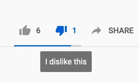
3 Only one number on xenforo , ie the difference rather than showing the actual number of like & dislike. This is the big one that people do/will find confusing as it doesn't immediately re;ate to what they just did, unlike with the Youtube example.
Together it adds up to not being as user friendly or intuitive as I would like. But I don't wish to be selfish, ultimately I'll accept the will of the people
(NB: bullets have disappeared!)
If downvotes were enabled on this very forum then you would see they act the same way.
I have a feeling if downvotes were enabled here none of this would exist. Except for the fact they could make it more obvious we voted.I'm starting to think that people are believing the way that it is setup on this forum (NO DOWNVOTES ALLOWED) is the default way which it is NOT.
Same here lmfaoI have a feeling if downvotes were enabled here none of this would exist. Except for the fact they could make it more obvious we voted.
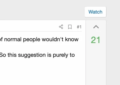
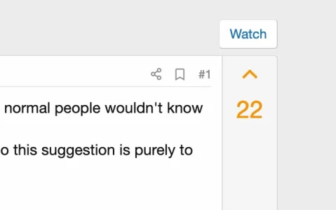
up arrow bold if you have already up-voted.
and what for an up arrow for already voted? )
Don't tempt fate, somebody will suggest thatWhere's the bin icon when I want to take a reaction away?
All of these points are entirely irrelevant.I can think of 3 differences:
1 Arrows rather than like/dislike icons (not a huge deal if it's easy enough to swap out the icons)
2 Vertically aligned (not a huge deal but I think there is a small psychological impact on the whole up/down debate)
3 Only one number on xenforo , ie the difference rather than showing the actual number of like & dislike. This is the big one that people do/will find confusing as it doesn't immediately re;ate to what they just did, unlike with the Youtube example.
Together it adds up to not being as user friendly or intuitive as I would like. But I don't wish to be selfish, ultimately I'll accept the will of the people
(NB: bullets have disappeared!)
Would everyone please bring their attention to the following test thread.
Go have fun realizing how the voting function actually works and see that it's exactly the way you think it should be when it already is.
Go have fun realizing how the voting function actually works and see that it's exactly the way you think it should be when it already is.
Aren't they enabled on question threads/forums? If not it looks very much like it and they don't work like I (and others) are thinking.If downvotes were enabled on this very forum then you would see they act the same way.
Just had a thought about this.
The up arrow is what is causing confusion. Why not change it to a big + to add your vote for the suggestion. Then when it is clicked, change it to a big - to indicate that you can remove your vote.
For us programmatical types, the current XF way makes sense for some of us. But I can see trying to describe this to members, and having to explain it over and over again (even if we put it in our forum FAQ).
But it does...Aren't they enabled on question threads/forums? If not it looks very much like it and they don't work like I (and others) are thinking.
I don't understand.and what for an up arrow for already voted? )
I think to better visualize that you have already voted solves most of the problem.
Make what you voted for bold, like it is done with reactions. The reaction icon changes when you have reacted. Make arrow change when you have voted.
Why do you keep bringing up the icon difference??? That has nothing to do with this...In which case I'm not seeing the icons I'm talking about or the two different numbers. Are you seeing those or just up/down arrows with only one number ?
View attachment 229039
Are you saying if YouTube changed their icons to a happy face and a sad face it would no longer be the same functionality??
The number itself also doesn't matter that it's only showing one. If you downvote a thread/post/suggestion/answer after upvoting it it will go back down to the number it would be at without a vote and then one more below that due to the down vote.
How is this so hard to grasp, it is not rocket science, a 2nd grader would already understand this.
Sorry for my rusty English )I don't understand.
I think to better visualize that you have already voted solves most of the problem.
Make what you voted for bold, like it is done with reactions. The reaction icon changes when you have reacted. Make arrow change when you have voted.
I mean the one who already upvoted doesn't need the up arrow anymore because he can't upvote anymore.
That icon sits there to give him an option to take his vote back (to deduct one vote).
Wouldn't an down arrow be more appropriate for that?
They are and they work as I would expect. I vote up or down. I can click either to remove. I can vote up, then down without removing it add see it jump 2.Aren't they enabled on question threads/forums? If not it looks very much like it and they don't work like I (and others) are thinking.
Ex:
If it is a 5 already and I vote up it is 6. If I decide I wanted to downvote not upvote I click down and it goes from 6 to 4. If I decide I just want to remove it I click the one I voted for. Back to 5.
This to me is 100% intuitive.
Downvoting and taking back your vote are not the same thing.Sorry for my rusty English )
I mean the one who already upvoted doesn't need the up arrow anymore because he can't upvote anymore.
That icon sits there to give him an option to take his vote back (to deduct one vote).
Wouldn't an down arrow be more appropriate for that?
But hopefully not be quite so insulting. Or maybe they would.How is this so hard to grasp, it is not rocket science, a 2nd grader would already understand this.
If other platforms do it the way it is done here now, I think the best way is to let it be that way, but show it more clearly that you have already voted.Sorry for my rusty English )
I mean the one who already upvoted doesn't need the up arrow anymore because he can't upvote anymore.
That icon sits there to give him an option to take his vote back (to deduct one vote).
Wouldn't an down arrow be more appropriate for that?
Now it is done with color, it could be done with a bolder arrow or a filled arrow.
And I compare it to how it has been solved earlier on xenforo, the reactions, they change when chosen and change back when unchosen.
That wasn't insulting and I apologize if it came across that way.But hopefully not be quite so insulting. Or maybe they would.
I was showing that this is so simple that anyone by now should have been able to understand how the feature actually works, even after using it themselves which we all have so far.
Similar threads
- Replies
- 9
- Views
- 982
- Question
- Replies
- 5
- Views
- 2K
- Replies
- 0
- Views
- 257


