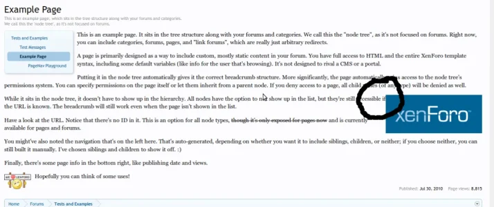
Ugly margin in the example page

It is the padding problem, not the margin one.
Well technically it can be fixed with padding or margin...

In this specific case, I would fix it with margin, not padding. Padding is used for inside of a div. Margin is used for outside of a div. In this case, you want to have a margin outside of the division that holds the image. Yes, this can be done just as easy with padding, but for semantics, you're looking for margin.

I personally try to use margin as much as possible and only resort to padding when the area I need shifted is within the content div. The major difference is that margins collapse, while padding does not. If you have two DIVs, side by side, both with padding of 10, where the two DIVs meet in the middle will have a combined space between of 20. If you do it with margin instead, it would collapse the margin and end up with a combined space between of only 10.
 
Top Bottom