As designed Thread view on mobile: No top pagination in portrait view

Valter

Active member
Affected version
2.0.0
While viewing thread on mobile there is no top pagination when in portrait orientation. Just watch/mod options centered. I must scroll page down to use bottom pagination.

When in landscape orientation then it shows fine (pagination left, watch/mod options right).

Please change to have pagination always shown on the top.

portrait.webplandscape.webp
 
Last edited:
This change was made intentionally. If you wish to change it, it will need to be changed in CSS.
 
Any way of implementing this on desktop view?

My users are complaining about the navigation is only on the bot.

The pagination is at the top on desktop view by default. If not then something is wrong or you have some style that removed it.

This thread is about how to make the default mobile pagination behaviour consistent with desktop.
 
Thanks @Mr Lucky!! So many members were complaining about missing page navigation on mobile.

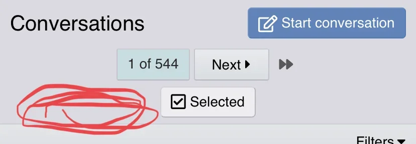
Any way to move the page nav to the red swirlies? Chance of line wrapping?

195307
 
Thanks @Mr Lucky!! So many members were complaining about missing page navigation on mobile.

Any way to move the page nav to the red swirlies? Chance of line wrapping?

View attachment 195307

That row will get populated with more buttons depending on the context, ie. thread controls, watching and unwatching threads, extra buttons from add ons, it's probably best to leave them on their own lines.

195312

It does jump down at larger widths

195314
 
This change was made intentionally. If you wish to change it, it will need to be changed in CSS.

I would urge the developers to reconsider this in future releases. Only critical elements should be displayed in the header (IMHO that would be Pagination, "Mark read", "Watch/Unwatch" and "Jump to New"). Non critical elements should be collapsed or moved to the bottom (rather than hiding critical elements to make room for non-critical elements).

This should do it.

Thanks for the CSS code.

Any way to move the page nav to the red swirlies? Chance of line wrapping?

Yes, I tweaked it so the pagination floats left and the other block floats right. To minimize the chance of wrapping it hides the "Prev" button and condenses the "Next" button.

CSS:
// unhide and condense top page navigation for mobile viewports
@media (max-width: @xf-responsiveNarrow) {
    .block-outer:not(.block-outer--after) .pageNavWrapper:not(.pageNavWrapper--forceShow) {
        display: initial;
        float: left;
        .pageNavSimple-el--prev {
            display: none;
        }
        .pageNavSimple-el--next {
            text-indent: -99999px;
            min-width: 0;
            width: 25px;
            i {
                text-indent: 3px;
                float: right;
            }
        }
    }
    .block-outer-main + .block-outer-opposite {
        float: right;
        margin-top: 0;
    }
}

That row will get populated with more buttons depending on the context, ie. thread controls, watching and unwatching threads, extra buttons from add ons, it's probably best to leave them on their own lines.

Or just say no to worthless pollution in the header. It would be better to collapse or move non-critical elements to the bottom if it causes the header to wrap.
 
Last edited:
Top Bottom