The Crafted Brew

mlw4428

Member
Hello everyone! Myself and a small team of guys started up a website called The Crafted Brew. I heavily modified an existing theme (left the original credits in place, despite it being a fairly involved edit).

There's still some work left to do and I'm sure there are better ways to accomplish whatever could be improved, but for now I love it. I will note that the background doesn't work so well if you run IE8 or less -- generally speaking, I'm not overly concerned as officially we don't support browsers who don't handle CSS3.

The community is for both commerical crafters and homecrafters who like to brew (or if you can, distill) their own alcoholic beverages. I haven't released this next tidbit of info anywhere, but The Boston Beer Company (makers of Samuel Adams beer) have graciously donated some items for some giveaways/contests. We'd love to welcome you into the community and maybe we can share some laughs, some brews, and have fun!

The Crafted Brew
 
Doesn't look good. The theme and the colors in the theme clash so badly that it bothers the OCD part of me. I can't even read some of the text.
 
I quite like it, themed well with the subject matter.

Some feedback though. The background image took a little while to load, it's huge, I'm sure you must be able to compress this down aggressively:

Screen shot 2013-03-25 at 14.55.36.webp

It's not about older browsers not liking it, it's about people on mobile connections etc. not liking such a huge file which really is just a background image (and making some browsers slow).

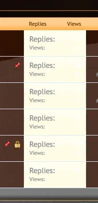
On my browser (Mac, Firefox) I cannot see the text in the replies column, and also the light background looks a bit out of place (as in, why highlight replies stats in that way?):

Screen shot 2013-03-25 at 14.55.56.webp

Finally, "Log in or Sign Up" tab on the top right is default Xenforo blue, it does not match the rest of the page.

Other that that, nicely done :)
 
I quite like it, themed well with the subject matter.

Some feedback though. The background image took a little while to load, it's huge, I'm sure you must be able to compress this down aggressively:

View attachment 42661

It's not about older browsers not liking it, it's about people on mobile connections etc. not liking such a huge file which really is just a background image (and making some browsers slow).

On my browser (Mac, Firefox) I cannot see the text in the replies column, and also the light background looks a bit out of place (as in, why highlight replies stats in that way?):

View attachment 42662

Finally, "Log in or Sign Up" tab on the top right is default Xenforo blue, it does not match the rest of the page.

Other that that, nicely done :)

I'm sorry about the delay in replying -- starting a company takes a lot of work and then I have my full-time job ontop of that! I've corrected some of the issues. I will investigate some sort of compression option for the background image. The site isn't really designed for mobile/wap use (although that may be something I look at in the future). I'm not sure I can compress the image due to it being already compressed.

I set it up this way as it provides some level of "backwards compatibility" with non-CSS3 compliant browsers (IE 8, 7, etc). What should happen is that they see the website as intended for the most part, but the background is set to "repeat" itself once they scroll past the default image bounds. I do not believe Xenforo has a hook that would allow "stretching" a background image that would be compatible for non-CSS3 browsers and while I might be able to code this in, I had to look at it from a cost-benefit/time view. I will, however, add this into my "to-do" list, but it may be a while coming around with this.

I also disabled, for now, the security software that prevents logins from "spammer" IPs. The next version of Xenforo addresses this and for now, I will just manually process.

Doesn't look good. The theme and the colors in the theme clash so badly that it bothers the OCD part of me. I can't even read some of the text.
I appreciate the constructive criticism. My primary palette for this theme was Orange, Brown, White, Black (various shades of each). These colors are darker and to me and the people I've shown work together. At this time I do not foresee changing the theme colors, but again -- I appreciate the critique.
Looks good.
If you click on [Help] Tab is it possible to display your Staff list pagehttp://thecraftedbrew.com/help/staff-list
as the default landing page when someone clicks [Help] ?
Perhaps, I'm not fully sure on this -- I'm not a web developer by trade and my guess is that it would take more work than what would be beneficial for myself.
 
Your background image is a massive 6.6MB.

Just re-saving it as a .jpg with 20% compression reduced it to 1.5MB.

You should consider reducing the file size (bytes) as that is way too big for a background image and will use up a lot of bandwidth and make the site slow to load.
 
Your background image is a massive 6.6MB.

Just re-saving it as a .jpg with 20% compression reduced it to 1.5MB.

You should consider reducing the file size (bytes) as that is way too big for a background image and will use up a lot of bandwidth and make the site slow to load.

I have compressed the file to about a sixth of the previous size. As the site grows I will look at doing an CDN for the majority of the images.

*Edit*

After doing some additional work, I've spend up the loading of the webpage considerably. I disabled Twitter API as it was taking forever for Twitter libraries to load from Twitter's servers (when tested from UK and China servers). I also enabled caching and am seeing HUGE performance increases. Thank you for the suggestions!
 
Back
Top Bottom