http://team-legend.fr
Hello guys !
It's been 3 years and a half that I use XenForo now (just started my 4th year of support #proud) and I've never shown anything related to my website. I've tried a lot's of addons during these years and a lot's of differents themes/skins/designs etc... but I was never happy about my board. I have to say that I was doing nothing, no studies, no job, nothing except videos games and html/css... so... I was trying new stuff all the time.
Now that I live in the US, I have way less time to spare so for the first time, I was really trying to make it so that I don't want to change my board again and after a year and a half I can now say that ... I'm done !!!
My board is based around Xenith by the great @Mike Creuzer and his awesome team @ThemeHouse ! Heavily customised but still, based around it And I have to say that since I've purchased UI.X, when it got released, I've never switch to anything else
About the Addons I use, there is actually not a lot. Everything portal related is based on XenPorta 2.0 by @Jaxel. I also use, Extended Covers by @XFA and some other admin addons and things that are not enabled yet.
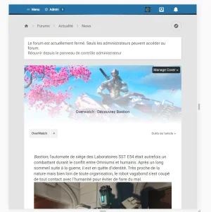
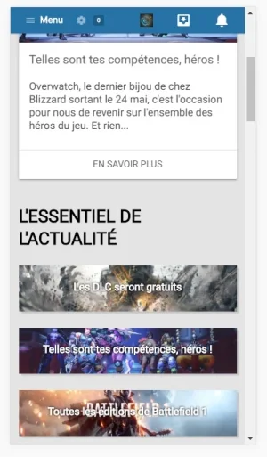
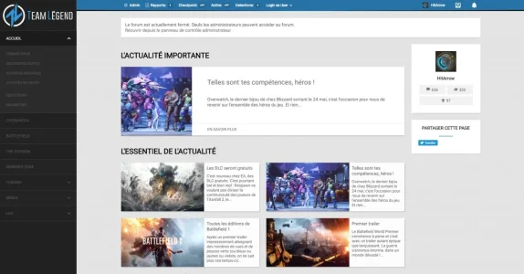

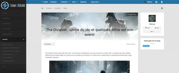
Now that everything is done I'll take some time to clean my EXTRA.CSS because right now it's a huge mess, and then, try to override some of the original files (from Xenith). If any of you have ideas about how I can improve it, go for it
Hello guys !
It's been 3 years and a half that I use XenForo now (just started my 4th year of support
Now that I live in the US, I have way less time to spare so for the first time, I was really trying to make it so that I don't want to change my board again and after a year and a half I can now say that ... I'm done !!!
My board is based around Xenith by the great @Mike Creuzer and his awesome team @ThemeHouse ! Heavily customised but still, based around it
About the Addons I use, there is actually not a lot. Everything portal related is based on XenPorta 2.0 by @Jaxel. I also use, Extended Covers by @XFA and some other admin addons and things that are not enabled yet.


Now that everything is done