Hey,
I just wanted to show this off a little bit. This is the staging site:
Still needs more testing to launch, then tweak and enhance. The designer promised to go through it this weekend and clean it up... the UI is pretty bad.
Cool Features:
I would like some harsh design critics. What you like, don't like, are we missing schema anywhere.. did you find a bug? Feel free to use this as a playground.
I just wanted to show this off a little bit. This is the staging site:
Still needs more testing to launch, then tweak and enhance. The designer promised to go through it this weekend and clean it up... the UI is pretty bad.
Cool Features:
- Activity Stream on the home page for the people you follow.
- Marketplace for visitors to sell their items with a API and .csv import tool.
- Blogging Platform
- Cool game like hot or not but for watches. Get this when someone uploads a image there is a alert to ask if they would like this included in the game. The game gets fretted monthly and the winner gets some points.
- Custom Point system.
- Custom Gallery System
- Extended the Like System to include the objects thats outside of XF.
- Cool Article and Wiki System.
- Custom Search with Elastic Search
I would like some harsh design critics. What you like, don't like, are we missing schema anywhere.. did you find a bug? Feel free to use this as a playground.
") I would love some ideas though.
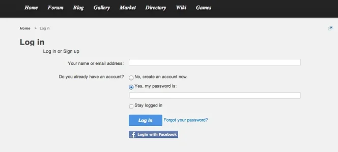
I would love some ideas though. . But if I had to really nitpick, then it would be those 3 different login links all concentrated in the same area, the icons - especially the RSS icon - does not really flow with the rest of the elements. And lastly I feel the tiny red and green circles for the discussion & messages do not really serve a purpose, maybe replace them with something more meaningful?
")