You are using an out of date browser. It may not display this or other websites correctly.
You should upgrade or use an alternative browser.
You should upgrade or use an alternative browser.
Quark 1.5.22.0
No permission to download
- Thread starter Dad.
- Start date
Hmm I tested this myself. Can you post your uix_logo.css file and or revert it if it's been edited for me please? Sorry for the trouble.The new online indicator is funky, I like it! I'll see how my community react to it.
Viewport width 100% doesn't work still. Only 2000px works.
Ugh by fault sorry. I hadn't done the template merges after upload 1.4.0.1Hmm I tested this myself. Can you post your uix_logo.css file and or revert it if it's been edited for me please? Sorry for the trouble.
 It works fine.
It's no problem! Glad it's working.Ugh by fault sorry. I hadn't done the template merges after upload 1.4.0.1
Going mad here....
Getting there with the design however i cannot for the life of me work out how to centre the Logo at the top of the page?? I have moved the Nav bar back to where it usually is (dont want to confuse my members too much all in one go!!), however PLEASE could someone tell me how to do it...
Thanks")
EDIT - dont panic - sorted it. For some reason it didn't work first time around, however tried again and works perfectly Now all i have to so is work out how i can lighten the background to the logo bar, and all should be good with the world
Getting there with the design however i cannot for the life of me work out how to centre the Logo at the top of the page?? I have moved the Nav bar back to where it usually is (dont want to confuse my members too much all in one go!!), however PLEASE could someone tell me how to do it...
Thanks
EDIT - dont panic - sorted it. For some reason it didn't work first time around, however tried again and works perfectly
Now all i have to so is work out how i can lighten the background to the logo bar, and all should be good with the world
Last edited:
For the Posbit Avatar Size style property, was it meant to be used for this theme? As changing the value doesn't do anything. I believe because of this css:
Although anything other than the 50x50 wouldn't look good without also editing the avatarHolder as well.
Code:
        .messageList .message.sectionMain .avatar img {
            width: 50px;
            height: 50px;
        }
Although anything other than the 50x50 wouldn't look good without also editing the avatarHolder as well.
Yes it is. If you turn off quarks post bit it'll work fine. We will see about making it work with quarks post bit turned on.For the Posbit Avatar Size style property, was it meant to be used for this theme? As changing the value doesn't do anything. I believe because of this css:
Code:.messageList .message.sectionMain .avatar img { width: 50px; height: 50px; }
Although anything other than the 50x50 wouldn't look good without also editing the avatarHolder as well.
The avatar options, by their nature, can often require advanced knowledge so if you have questions please feel free!
oops... Think i broke it.... 

And all the text is vertical instead of "normal"....

Happened after upgrading to 1.40, and then Merging the templates...
Whats the easiest way back? Is there a "factory default" button, or do i need to reinstall (Does it not only on the Child but on the un-altered "quark" master too...
And all the text is vertical instead of "normal"....
Happened after upgrading to 1.40, and then Merging the templates...
Whats the easiest way back? Is there a "factory default" button, or do i need to reinstall (Does it not only on the Child but on the un-altered "quark" master too...

Ah yep, had to enable Classic Postbit to change the avatar size. Making it work with the quarks default would be nice though like you said.Yes it is. If you turn off quarks post bit it'll work fine. We will see about making it work with quarks post bit turned on.
I think that's supposed to be part of the style.However for some reason the pics in Postbit are offset too far to the right...
 Pretty nice and unique I'd have to say, a bit different than most other themes. If you meant the staff member sign overlapping the avatar, I believe that only happens if staff have a blank user title.
You could adjust the avatar position changing this part of the CSS though (might not be a good idea as it may overlap usernames that are long):
Code:
        .messageList .messageUserBlock div.avatarHolder {
            background-color: transparent;
            position: absolute;
            right: -36px;

}.messageList .messageUserBlock div.avatarHolder { background-color: transparent; position: absolute; right: -36px; }
Cool - Could you advise which css file please??
CheersI always suggest not editing any existing css files other than extra.css or a new one.Cool - Could you advise which css file please??
I always suggest not editing any existing css files other than extra.css or a new one.
No problems Mike - Any chance you could advise how i may fix this then please??
Or maybe just make the column slightly wider to fit the Avatar into the box... ??
Cheers
Glad you got it, but you can also go to Message Layout style property group and adjust the width of User Info Container (@messageUserInfo).No problems Mike - Any chance you could advise how i may fix this then please??
Or maybe just make the column slightly wider to fit the Avatar into the box... ??
Cheers
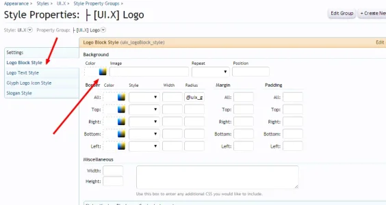
Sure, go to UI.X Logo style properties, the first setting on the left.Anyone know how to change the background colour behind a centered logo at the top please???? Effectively the bit between the profile bar at the top, and the first navigation line ...
Cheers
Attachments
Cool - sorted - Finally, any way of changing the Font used in posts? Have had more than a few moans that it's difficult to read posts (however headings are fine!), and that it would be easier to read using a "sans serif" font....
Also, How can I change the post font color??? (Needs to be slightly lighter)..
Many thanks
EDIT - better than that - have you some kind of guide mike as to what colours in the colout picker change what in the theme? I'm starting to throw together something, however still at a loss on some of them
(however headings are fine!), and that it would be easier to read using a "sans serif" font....Also, How can I change the post font color??? (Needs to be slightly lighter)..
Many thanks
EDIT - better than that - have you some kind of guide mike as to what colours in the colout picker change what in the theme? I'm starting to throw together something, however still at a loss on some of them
Last edited:
Cool - sorted - Finally, any way of changing the Font used in posts? Have had more than a few moans that it's difficult to read posts
Also, How can I change the post font color??? (Needs to be slightly lighter)..
Many thanks
Glad you got it sorted!
To change font in the post/message:

EDIT - better than that - have you some kind of guide mike as to what colours in the colout picker change what in the theme? I'm starting to throw together something, however still at a loss on some of them
Honestly, there are a lot of colors doing different things. What I would do is change the color to something obnoxious like hot pink. See what it changes, then change that to what you want it to be. Its the quickest most efficient way I can think of.
I believe XenForo shouldn't use much of a general color palette and should instead just have a few select colors that you know for sure what they do. I suggested this years ago
")