"Post New Thread"-Button / change position

erich37

Well-known member
Suggestion:

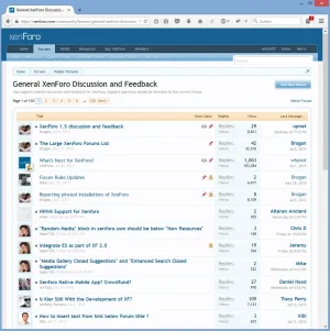
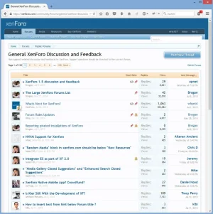
change the "Post New Thread"-button towards similar position as it is already on "mobile view".


Advantage:
This will make the button better exposed and therefore also better visible.


Example:
this new suggested button-location also makes more logical sense, as the user is actually posting a "New Thread" into the Forum named "General XenForo Discussion and Feedback" which makes better sense when the button is horizontally in the same position as the wording "General XenForo Discussion and Feedback".


Current Position:
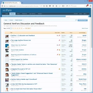

post_button_currentposition.webp


New Position:

post_thread_button_newposition.webp


:)
 
Upvote 13
I honestly can't see the benefit this would bring, as it's mostly personal preference in my opinion. This could be easily done with a tiny template modification if you really need it.
 
I agree with @erich37

Or at least move it down when using notices (sometimes people use larger than this I found here on XF) to avoid scrolling to the top to post a thread
upload_2015-7-22_1-9-45.webp

Just like when XF has subforums, then the button moves down to just over the threads
upload_2015-7-22_1-10-52.webp
 
Just like when XF has subforums, then the button moves down to just over the threads

That's because you're wanting to create threads in XenForo Suggestions, not Closed Suggestions, so it makes sense to have the button there in that case.
 
I guess you noticed this has been posted in the "Suggestion"-Forum, not in the "Question & Answers"-Forum.
No need to be so hostile towards us just because we give you non-positive feedback. The thing with this suggestion really is, that is completely personal preference and I therefor don't see any reason it has to be changed. If you want it to be different, you can change it. But if it would be changed by the team, I'd change it back in my forum, that's it.
 
No need to be so hostile towards us just because we give you non-positive feedback. The thing with this suggestion really is, that is completely personal preference and I therefor don't see any reason it has to be changed. If you want it to be different, you can change it. But if it would be changed by the team, I'd change it back in my forum, that's it.


Rules for Brainstorming

:barefoot:
 
Last edited:
Another Advantage:
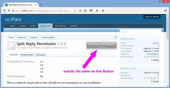
- the button could be styled "bigger" and therefore will be better visible (exactly the same size as the "grey-colored Download-Button" which we already have at the RM.)


Example:
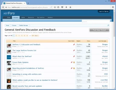
when member is "logged-in".


post_button_when_logged_in.webp


Example:
When not being logged-in (visitor / guest), then the button could look very similar to the "grey-colored Download-Button" which we already have at the RM.
When the "guest" clicks onto this "grey-colored Button", it will forward you to the "Log in or Sign up"-form (exactly the same as it is working at the "RM Download-Button).


rm_grey_button.webp


not_logged_in_grey_button.webp


:)
 
Last edited:
Sorry for the old bump, definitely love this idea.

@erich37
Can anyone supply the template edit to move the "Post New Thread" down below the breadcrumb tree? Also to increase the size of "Post New Thread"

Thanks
 
Sorry for the old bump, definitely love this idea.

@erich37
Can anyone supply the template edit to move the "Post New Thread" down below the breadcrumb tree? Also to increase the size of "Post New Thread"

Thanks
I would also like to know! I've been moving the code around in forum_view for the past 10 minutes and it doesn't matter where I stick it, it loads in the usual place. Can't seem to find where or what controls it. I assume some CSS somewhere but it's beyond me.
 
Top Bottom