You are using an out of date browser. It may not display this or other websites correctly.
You should upgrade or use an alternative browser.
You should upgrade or use an alternative browser.
Implemented Online Status Indicator / move outside of Avatar-image
- Thread starter erich37
- Start date
- Status
- Not open for further replies.
This suggestion has been implemented. Votes are no longer accepted.
Until the dot is moved to next to the username, the feature is useless.
Not only that, but it was moved to a good location on mobile to the avatar. I don't believe that was a good choice - it's barely visible now.
Edit: Some redacted... I don't think straight when I'm tired. Sorry. I'll sleep now (later).
Not only that, but it was moved to a good location on mobile to the avatar. I don't believe that was a good choice - it's barely visible now.
Edit: Some redacted... I don't think straight when I'm tired. Sorry. I'll sleep now (later).
Last edited:
It's a good job there's a thing called CSS so other silly idiots can move it elsewhere, eh?
The fact it was moved from a good place to the bad place is the issue, and are you calling me a silly idiot? I don't believe I called anyone that.
You have called Mike and Kier exactly that as they are the ones who decided on that location.The fact it was moved from a good place to the bad place is the issue, and are you calling me a silly idiot? I don't believe I called anyone that.
What are you talking about it being moved from a good place to a bad place?
This feature has never existed until now.
You have called Mike and Kier exactly that as they are the ones who decided on that location.
What are you talking about it being moved from a good place to a bad place?
This feature has never existed until now.
On the mobile responsive layout, the dot was on the actual postbit, on the far right. I checked recently, and it had been moved to the corner of the avatar, where it was only just visible.
I think it was moved to a more consistent place on mobile.
Sorry. I meant to say "idiotsilly person" because that's so much better. I didn't call anyone that, either, by the way.
By definition, saying an idiot would be a lot worse than saying a silly person. As this word idiot had a strikethrough, it was redacted meaning it wasn't there.
I'm done here for now, I need to finish watching this and then I need sleep.
On the mobile responsive layout, the dot was on the actual postbit, on the far right. I checked recently, and it had been moved to the corner of the avatar, where it was only just visible.
By definition, saying an idiot would be a lot worse than saying a silly person. As this word idiot had a strikethrough, it was redacted meaning it wasn't there.
I'm done here for now, I need to finish watching this and then I need sleep.
Stop with trivial nonsense.
By definition, stop, for the love of humanity.
Until the dot is moved to next to the username, the feature is useless.
Not only that, but it was moved to a good location on mobile to the avatar. I don't believe that was a good choice - it's barely visible now.
Edit: Some redacted... I don't think straight when I'm tired. Sorry. I'll sleep now (later).
That good place your referring to Liam, doesn't exist when placement for this specific feature is based more on user preference. If it was moved to your happy place By the devs, there would be a 100 people posting they preferred it in it''s original location or their happy place. Think of the placement, heck, even the circular design as a placeholder till you get your hands on 1.4 and then (if you don't like the placement) change it, that goes for the design of the circular indicator. It's both easy to change and to move to "your" preferred location.
Edit: Comparison test.
Edit: Top-right wins.
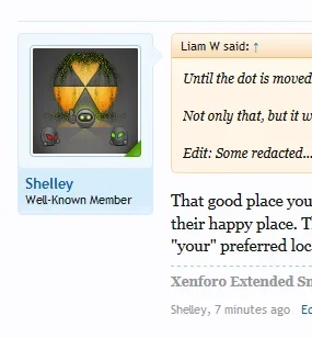
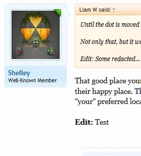
Edit: more testing. Darn!! Messgeuserinfo span arrow needs adjusted, shame.


Last edited:
I wouldn't hate it:
View attachment 79389
But in some ways it concerns me from the point of view that usernames are no longer in a consistent position.
Exactly, I tried this through firebug yesterday and came to the same conclusion. Probably why I never even bothered to submit a screeny since it wasn't even worth starting a debate on it and plus it just looked downright sh-t, IMO.
And as brogan stated, when long usernames break onto another line. Infact, and if memory recalls, there was an extensive discussion on this. It's really fine where it is imo.
One issue I think will happen is that members will add their own status indicators onto their avatar.
LOL, you are correct:
a member could just put a "green dot" into his Avatar-photo.
Just implement a "green dot"-graphics over your Avatar-photo, then you are always online.
Last edited:
LOL, you are correct:
a member could just put a green dot into their Avatar-image.
So the user will always shown as being online.

Will look strange on their profile page and member card with that green dot.
- Status
- Not open for further replies.
Similar threads
- Replies
- 1
- Views
- 80
- Question
- Replies
- 1
- Views
- 376
- Replies
- 11
- Views
- 1K
- Replies
- 1
- Views
- 279
