I think this page could be made a bit clearer in order to avoid any confusion:
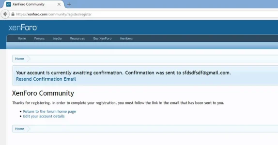
1)
Issue:
Currently, the eye of the user is only focusing on the blue-colored "Notice" which says "Resend Confirmation Email".
Suggestion:
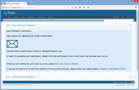
Put all text into the blue-colored "Notice-Box".
2)
The user needs "action-able" information:
change the text from:
"Your account is currently awaiting confirmation."
towards:
"Please confirm your E-mail address."
3)
change the text from:
Thanks for registering. In order to complete your registration, you must follow the link in the email that has been sent to you.
towards:
Thanks for registering. In order to complete your registration, please click the confirmation link in the E-mail that has been sent to you.
4)
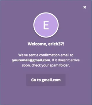
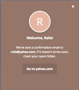
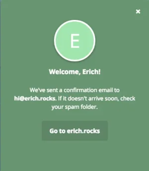
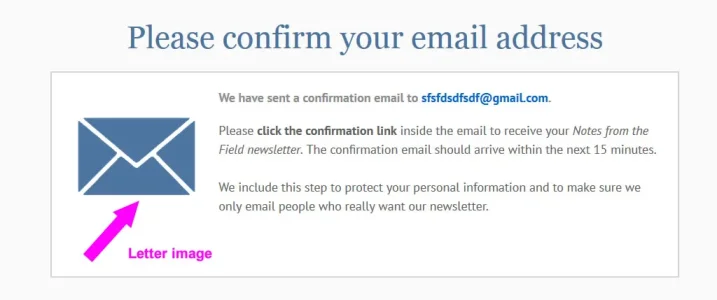
Maybe add a "Letter image" similar to this example here:

Upvote
16
