Flexile

Flexile 1.1.5.1

No permission to download
Status
Not open for further replies.
Figured it out... added these to their respective sections...

Code:
#content.EWRcarta_PageArchive .pageContent,
#content.EWRcarta_PageView .pageContent,
#content.EWRporta_Portal .pageContent,
Code:
.EWRcarta_PageArchive .breadBoxBottom,
.EWRcarta_PageView .breadBoxBottom,
.EWRporta_Portal .breadBoxBottom,
Code:
.EWRcarta_PageArchive .breadBoxBottom .breadcrumb,
.EWRcarta_PageView .breadBoxBottom .breadcrumb,
.EWRporta_Portal .breadBoxBottom .breadcrumb,
Code:
.EWRcarta_PageArchive .section,
.EWRcarta_PageView .section,
.EWRporta_Portal .section,

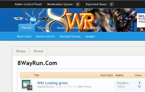
I LOVE the look of this skin... however, I feel that it doesn't really suit my header image:
http://xen1.8wayrun.com/wiki/

Got any ideas how I could fix it?
 
Can I make a recommendation?
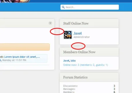
Untitled-1.webp

I circled two points... The space between the blocks should be identical...
 
Okay... can I make another recommendation?

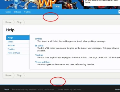
Untitled-1.webp

I circled two points... once again, these spaces should be identical. The top space is 30px, while the bottom is 40px.

You can see how these changes look here: http://xen1.8wayrun.com/wiki/
I made #content { padding: 25px 0px; }

Why 25px instead of 30px or 40px? Because the margin-bottom of content areas with a sidebar is also 25px... and what I'm going for here is symmetry.
 
Okay... can I make another recommendation?

View attachment 5579

I circled two points... once again, these spaces should be identical. The top space is 30px, while the bottom is 40px.

You can see how these changes look here: http://xen1.8wayrun.com/wiki/
I made #content { padding: 25px 0px; }

Why 25px instead of 30px or 40px? Because the margin-bottom of content areas with a sidebar is also 25px... and what I'm going for here is symmetry.
What template is used to adjust these?
 
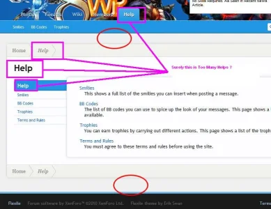
overhelped.flexile.breadcrumbs.are.only.for.forums.webp

How about making the breadcrumb optional on non-Forum pages ?
See this thread for more information

Only a lame CMS like vB's would have Breadcrumbs on non-forum pages.
Surely xenforo should aim much higher.
 
So anyone have any ideas on what I can do to make my unselected navbar tabs easier to read?

Untitled-1.webp
 
So anyone have any ideas on what I can do to make my unselected navbar tabs easier to read?

View attachment 5586


I am not a designer, but how about moving the logo to the right away from the tabs... then it would hide the login/register tab at the top, so you would need to move that to the left.

Or you could make the text another color, but I can't think of one that would stand out AND look good with your site...

You could also change the header height.. but I don't know how that would work with your logo..

Jamie
 
I am not a designer, but how about moving the logo to the right away from the tabs... then it would hide the login/register tab at the top, so you would need to move that to the left.

Or you could make the text another color, but I can't think of one that would stand out AND look good with your site...

Jamie
There is an advertisement banner on the right... either way, the header should be on the top left...

If I could do a black stroke around the text, that would probably be enough... but I dont know how to do that, and I think it doesn't work in any browser except internet explorer.
 
Sorry, didn't see the Ad spot. I run an Ad Blocker.

btw, I love your logo! Did you design it?

Jamie
 
Sorry, didn't see the Ad spot. I run an Ad Blocker.

btw, I love your logo! Did you design it?

Jamie
Our logo was made by one of our members... The character in the background of the logo is a random header script that I wrote. It also forces certain characters to appear on certain forums... http://www.vbulletin.org/forum/showthread.php?t=240629

exm-logo.webp

The blue "star" in the logo is actually the "Soulcalibur", which is a sword. It points in all 8 directions.
 
Woah. Thread exploded while since I last visited. I'll try to answer some questions now but the rest will have to wait as I have other stuff to do...

Figured it out... added these to their respective sections...

<snip>
Yeah, this is something that bothered me while I was coding the style. I had to add specific CSS declarations depending on the page so the visual look would be consistent. It really depends on the structure you use for the page whether you'll have to make these changes or not for your mod. I'll try to make it work better with mods by default in the next version...

I LOVE the look of this skin... however, I feel that it doesn't really suit my header image:
http://xen1.8wayrun.com/wiki/

Got any ideas how I could fix it?
So anyone have any ideas on what I can do to make my unselected navbar tabs easier to read?

View attachment 5586

Have you tried making the blur for the text shadow larger (and darker)? Otherwise you could try to give the background of the links container a color of something like rgba(0,0,0,.5), a border-radius of 6px, and a box-shadow of something like "0 0 10px #000". This creates a darkened "shadow" area that works well and makes the links stand out. The problem is that the "shadow" background also bleeds onto the secondary bar below:

shadow.webp

If there was a way you could mask the shadow, you would be in business. Hope this helps or inspires you. If you could increase the header height, at least so the links drop below the "WR", I think it would help a lot. :)I also agree with your recommendations on padding. This will be changed in the next version.
View attachment 5585

How about making the breadcrumb optional on non-Forum pages ?
See this thread for more information

Only a lame CMS like vB's would have Breadcrumbs on non-forum pages.
Surely xenforo should aim much higher.
This is really a general XenForo issue. The default theme of XenForo has the same 'problem.' I recommend you post this suggestion in the general XenForo suggestions forum.
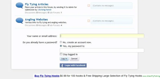
How come the log in that is usually above the header, drops to the footer like this?
View attachment 5584
Do you have JavaScript enabled? The login will drop to the bottom of the page if JavaScript is disabled (this occurs on any theme). :)
 
Have you tried making the blur for the text shadow larger (and darker)? Otherwise you could try to give the background of the links container a color of something like rgba(0,0,0,.5), a border-radius of 6px, and a box-shadow of something like "0 0 10px #000".
Would you mind explaining to me exactly how to do this? Both the blur and the shadow container?
 
Erik, I downloaded that font and have been trying to replicate the Flexit style for my site Aircraft Pilots and for the life of me I can't do it...I only have Windows Paint and Gimp and I don't think Gimp can do it...could you advise how you created that style with that font...thanks greatly if you can

You could always try Paint.NET.

http://en.wikipedia.org/wiki/Paint.NET said:
Paint.NET is a proprietary freeware raster graphics editing program for Microsoft Windows, developed on the .NET Framework. Originally created as a Washington State University student project, Paint.NET has evolved from a simple replacement for the Microsoft Paint program, which is included with Windows, into a powerful editor with support for layers, blending, transparency, and plugins.
 
Okay... I figured it out... I don't think it works in IE though...

Hows this? http://xen1.8wayrun.com/portal/
Looks pretty good in my opinion. :)
Erik, I downloaded that font and have been trying to replicate the Flexit style for my site Aircraft Pilots and for the life of me I can't do it...I only have Windows Paint and Gimp and I don't think Gimp can do it...could you advise how you created that style with that font...thanks greatly if you can
It's just the font in white with a 2-3px, around 75% opacity black drop shadow going straight down. The GIMP should be able to do it. Paint.NET should be able too as well. :)
 
Status
Not open for further replies.
Top Bottom