You are using an out of date browser. It may not display this or other websites correctly.
You should upgrade or use an alternative browser.
You should upgrade or use an alternative browser.
Facebook's new new new design
- Thread starter Onimua
- Start date
Peggy
in memoriam 2016
Yes I will continue using it because I have a lot going on, on FB...and all of you will continue to use it, and will get used to it within a week.
That doesn't mean I'll like it nor get used to it.
Onimua
Well-known member
Hard not to, with my friends there... but doesn't mean it's a huge inconvenience that I have to find ways around it to get functionality that makes most sense rather than let Facebook pre-determine what it thinks I want to see...and all of you will continue to use it, and will get used to it within a week.
Wildcat Media
Well-known member
Yes I will continue using it because I have a lot going on, on FB.
That doesn't mean I'll like it nor get used to it.
I've gotten so disgusted that I'm dumping it. Folks can find me on Twitter or Google+, which at least has an interface that is clean and uncluttered. I figure if nobody wants to follow me other ways (even via email), then too bad, I won't fret over it. I don't use it much anyway that I'd lose out on anything--it's mainly a time sink for me. I have some "pages" for numerous websites that I maintain to use as cross-promotion, so I can't dump it entirely. But on a personal scale...yeah, I'm done. I've been debating doing this for a year, and this last round of clusterf**edness is that final straw breaking my camels' back.
I have my own photojournal site that I put my photos on, and then "share" links to Twitter and G+. Having a third party like FB hold onto them is just asking for trouble, and it also means that anyone can view them (they don't have to be FB members).
Onimua
Well-known member
There's a difference between optimizing a design and redesigning something in such a way that it's just not user-friendly.People hate it when webpages are new designed. Take your community, and redesign it. Then wait for feedback. If you are not a design god, you'll get most likely overly negative feedback. Even if the design is more useable")
Marcus
Well-known member
I understand you. But to be fair, this is also what I get as a feedback: That the older design was more user friendly. That the current design does not achieve its goals. That I took something that worked and now it does not work as good as before. People feel comfortable on a webpage, and then they feel like home using it. When they come back on some day, everything is moved. This is not a good experience.There's a difference between optimizing a design and redesigning something in such a way that it's just not user-friendly.
Onimua
Well-known member
I know people get comfortable with a site that's had the same layout for a long time. I don't know why Facebook didn't do what it did before and announce the changes beforehand, indicating what the new features were, and allowing users to change to it to try it out. I also don't understand why they didn't keep the option to list all updates in chronological order ("Most recent" link).I understand you. But to be fair, this is also what I get as a feedback: That the older design was more user friendly. That the current design does not achieve its goals. That I took something that worked and now it does not work as good as before. People feel comfortable on a webpage, and then they feel like home using it. When they come back on some day, everything is moved. This is not a good experience.
What irks me here in the latest change is that Facebook is deciding for me what it think is top news or recent news to me, which has so far proven to be incorrect. Status updates and other posts from my friends, some that I deem important, are never seen because of this new layout.
So far the way around all of that is to just create a list, put all my friends in it and just view it from there. Seems to work, though slightly inconvenient since I can't just open Facebook and have it right there immediately.

Forsaken
Well-known member
Generally when you redesign your pages, you take into account how people use your page. You also take into account design practices, and many other elements that will make it a success.I understand you. But to be fair, this is also what I get as a feedback: That the older design was more user friendly. That the current design does not achieve its goals. That I took something that worked and now it does not work as good as before. People feel comfortable on a webpage, and then they feel like home using it. When they come back on some day, everything is moved. This is not a good experience.
Facebook totally didn't do any of this, and I've heard nothing but people lambasting them for the new redesign. Good news is, Google+ won't be so dead now
.Crazyfruitbat
Well-known member
yeah some of the updates on facebook are just annoying me - I turned off a persons feed because I was fed up of seeing 'I'm going to bed now' but after doing so seems to have disabled my updates on their side so I started getting 'why are you blocking me' messages.
I like google plus a lot more, but the lack of people is making it hard work to keep using - twitter is still my favourite
I like google plus a lot more, but the lack of people is making it hard work to keep using - twitter is still my favourite
Carlos
Well-known member
The only thing that I hate about the new redesign is that in addition to your wall feed, you have, yet another feed on the right column. Making it a bit over the top. Then the wall feed is now filtered to many different types, and giving you freedom to filter them into sections, but this is sleazy because it makes way for ....advertising. When they already have.... advertising on the right column.
Ridiculous, really.
And whomever designed the e-mail system needs to be fired - because you can't really make a new conversation. It's almost like you're bringing up an old topic from the dead. And the only way you treat that conversation as new is to archive your old conversation (facebook's version of "delete"), it really ruins the e-mail experience. IMHO.
The only thing I like is the navigation - it seems to go back to it's roots. And it follows you - eliminating the need for going back to the top to reach options and search, and whatnot.
Kevin
Well-known member
Have an Android or iOS device? The 'Photos' section of Google+ works nicely for that.I don't use it much anyway, I prefer twitter. The main reason for my facebook account is contact with family and a place to house my photos lol
Onimua
Well-known member
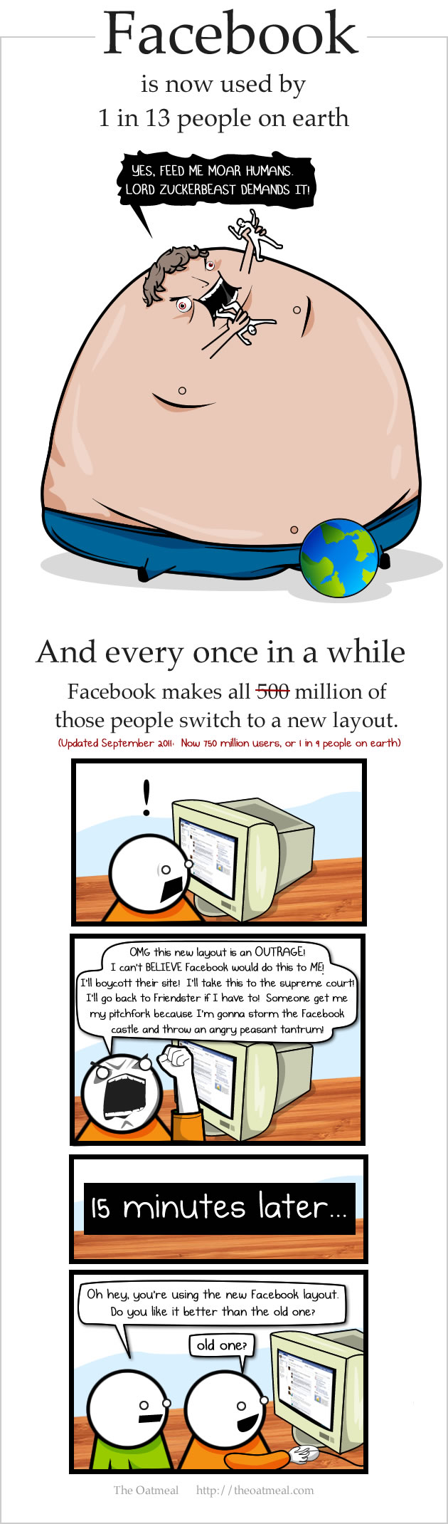
Heh, I remember seeing that one before. Still, this one to me definitely isn't something I'm getting used to any time soon, and have since reverted to a much more sensical news feed via Lists.I think Mathew Inman from The Oatmeal says it best....
Peggy
in memoriam 2016
I know people get comfortable with a site that's had the same layout for a long time. I don't know why Facebook didn't do what it did before and announce the changes beforehand, indicating what the new features were, and allowing users to change to it to try it out. I also don't understand why they didn't keep the option to list all updates in chronological order ("Most recent" link).
What irks me here in the latest change is that Facebook is deciding for me what it think is top news or recent news to me, which has so far proven to be incorrect. Status updates and other posts from my friends, some that I deem important, are never seen because of this new layout.
So far the way around all of that is to just create a list, put all my friends in it and just view it from there. Seems to work, though slightly inconvenient since I can't just open Facebook and have it right there immediately.
I agree, I agree, and I agree.
Stooooooopid changes.
Similar threads
- Replies
- 2
- Views
- 997
- Replies
- 21
- Views
- 2K
- Replies
- 4
- Views
- 1K
- Replies
- 4
- Views
- 1K
- Replies
- 21
- Views
- 4K