You are using an out of date browser. It may not display this or other websites correctly.
You should upgrade or use an alternative browser.
You should upgrade or use an alternative browser.
Email Customizer [Deleted]
- Thread starter Arty
- Start date
- Status
- Not open for further replies.
Can it be??? Wow! Going to try this out ASAP! 

No changeDoh. Didn't think of that. Try replacing content table opening withCode:<table width="640" cellpadding="0" cellspacing="0" border="0" dir="{$emailLanguage.text_direction}" style="width: auto; max-width: 640px; {$wrapperStyle}">
That seem to work well.Maybe replace with="640" with width="100%", but that might break purpose of having fixed width style.
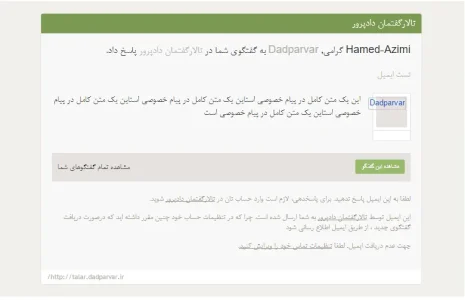
On gmail web client and apple mail it displays full width layout with dark background, email is centered.
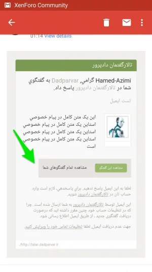
On gmail client for android and standard mail client for android it displays small layout, without shrinking text.
Wrapper table opening:
Code:
<table width="100%" cellpadding="0" cellspacing="0" border="0" valign="middle" style="{$bodyStyle}"><tr><td valign="top" align="center">
Code:
<table width="100%" cellpadding="0" cellspacing="0" border="0" dir="{$emailLanguage.text_direction}" style="width: auto; max-width: 640px; {$wrapperStyle}">Click "edit" button, then in editor navigation click "building blocks" then "content table opening". On right side you'll see HTML code for that block. Add at start of block something like this:Where would I add my logo?
Code:
<table width="100%" cellpadding="0" cellspacing="0" border="0" valign="middle"><tr><td valign="top" align="center">
<a href="http://link-to-your-forum/"><img src="http://link-to-your-forum/link-to-your-logo.png" /></a>
</td></tr></table>Thanks that worked perfectly! I am definetely going to purchase this when it comes out! Great product, Arty!Click "edit" button, then in editor navigation click "building blocks" then "content table opening". On right side you'll see HTML code for that block. Add at start of block something like this:Change links to correct urls. Make sure they are full urls with domain name.Code:<table width="100%" cellpadding="0" cellspacing="0" border="0" valign="middle"><tr><td valign="top" align="center"> <a href="http://link-to-your-forum/"><img src="http://link-to-your-forum/link-to-your-logo.png" /></a> </td></tr></table>
Still ~0.1pt font on iPhone 6 with these settings. Desktop client is fineThat seem to work well.
On gmail web client and apple mail it displays full width layout with dark background, email is centered.
On gmail client for android and standard mail client for android it displays small layout, without shrinking text.
Wrapper table opening:Content table opening:Code:<table width="100%" cellpadding="0" cellspacing="0" border="0" valign="middle" style="{$bodyStyle}"><tr><td valign="top" align="center">Code:<table width="100%" cellpadding="0" cellspacing="0" border="0" dir="{$emailLanguage.text_direction}" style="width: auto; max-width: 640px; {$wrapperStyle}">
all content there:In email styles list click edit button, in editor navigate to topic reply notification -> message footer -> wrapper style. Check if it has width somewhere.
Code:
font-size: 16px;
font-family: Montserrat, Arial, sans-serif;
line-height: 1.28;
margin: 20px 0;
color: @contentText;
background-color: @primaryLighter;
border-bottom: 1px solid @primaryLighter;I've checked your XML files. They are correct. So something must be triggering error. My guess is its second table.@Arty the customizations that I created yesterday are also showing in really tiny print on iPhone so it's something else that has been changed since the first beta.
Try this: editor -> building blocks -> wrapper table opening and wrapper table closing. Remove values from those two properties and test email on phone. It will mess up your background color, but it might fix font scaling. If it works, I'll know how to fix problem.
This looks correct. Probably alignment isn't changed correctly for RTL language. I'll test thatall content there
This corrected the font on iPhone 6 view (portrait and landscape) but placed the content off center on desktop client.I've checked your XML files. They are correct. So something must be triggering error. My guess is its second table.
Try this: editor -> building blocks -> wrapper table opening and wrapper table closing. Remove values from those two properties and test email on phone. It will mess up your background color, but it might fix font scaling. If it works, I'll know how to fix problem.
- Status
- Not open for further replies.

