CTA Featured Threads & Portal

CTA Featured Threads & Portal [Paid] 2.17.0

No permission to buy (£40.00)
Chrome/Android has a few quirks.

My main site has a fixed width and for some reason it applies huge left and right margins even when there is ample width to display the site correctly.

It doesn't really make sense in your case though as the number of menu items doesn't change, just the focussed tab.
Edit: I have just checked both screenshots and the alignment of the first five menu items is identical.
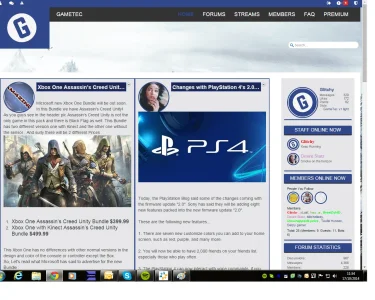
There must be a miniscule difference in positioning that's causing the issue.

Anyway, I've resolved it for now. I renamed "Chat" to "Chat Room" and Inbox and Alerts are now displaying.
 
You would have to set up all the SPs accordingly to float the blocks left, give them a percentage width, etc.
 
if you could point me to the start i could try work out.

dont mean to be annoying but i really not sure what CTA SP i need to edit first
 
cool okay so at the moment it looks like this and this is what i have put in the SP.

How would i go about making it like it was on your?
 

Attachments

  • homepage.webp
    homepage.webp
    171.8 KB · Views: 22
  • SP.webp
    SP.webp
    55.3 KB · Views: 18
I can't provide exact instructions as I no longer have the edits.
You will just have to play around with the SPs/CSS until you get it looking how you want.
 
right there is no need to be funny about it.

a simple reply or acknowledgement would of been fine from when you asked me to pm you.

If you have been busy to not being able to reply to me then fair play im sorry for keep pestering you.
 
If you have been busy to not being able to reply to me then fair play im sorry for keep pestering you.

Or you could be patient. Not even five hours has passed and you're already asking.

Paul can't respond at your convenience. He's a busy man and will respond to people when he's able to.
 
You would need to add some custom CSS to restrict the size.
For example, this would work in posts:
Code:
.message .messageContent .messageText img {
max-width: 50%;
}

Would this be a modification to a CTA style or were you thinking somewhere else?
 
That is an example of the CSS required to restrict image sizes.

You will need to use the correct selectors as required.
 
Media queries relate to browser width, not the device type.

You can though use a media query to hide it below a certain width.
Use .ctaFtSliderWrapper { display: none } in the media query.
 
Top Bottom