Can the registration process be simpler?

TheBigK

Well-known member
I've been wondering whether the registration process can be simplified. Community boards aren't like the social networks where people have lot of information to fill in their profile fields. In most cases, we're just fine with the username, password and email.

One thought:

1. Ask the visitor to enter email ID and a confirmation link is sent to his account. User clicks on the email link and verifies the account.
2. The user is automatically taken to the profile editing page to set 'username', 'password' and other custom details etc.

Do you think this is better? Is there another better approach?
 
I think it would be an innovative option and worthy of some testing on a per forum basis but I already think Xenforo is pretty streamlined and I don't think it should be default but it would be better as a core option rather than an addon.
 
I've been wondering whether the registration process can be simplified. Community boards aren't like the social networks where people have lot of information to fill in their profile fields. In most cases, we're just fine with the username, password and email.

One thought:

1. Ask the visitor to enter email ID and a confirmation link is sent to his account. User clicks on the email link and verifies the account.
2. The user is automatically taken to the profile editing page to set 'username', 'password' and other custom details etc.

Do you think this is better? Is there another better approach?
Not sure this seems any quicker.

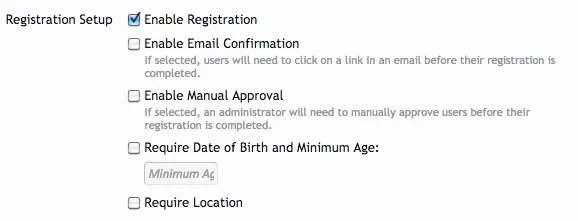
Current process is:

1) User enters desired username.
2) User enters desired e-mail address.
3) User enters desired password.
4) User enters other fields displayed during registration.
5) User confirms account by e-mail.

Your process is:

1) User enters desired e-mail address.
2) User confirms account by e-mail.
3) User enters desired username.
4) User enters desired password.
5) User enters other fields displayed during registration.

It's identical, just in a different order.
 
@Chris D Sorry to bump an old thread, but years on I feel it best to do that instead of making a new thread.

Simple things like hiding the birthday and linking the 'Sign up now' button directly to the /register page has quickly increased my registrations where they had fallen stagnant.

@TheBigK is on to something. You must get the impulse buy-in of the user. Once they have done so, they are now more committed to your site than ever before. Think of the registration process in bounce-rate terms. No one here would say any of the arguments against quickly enticing a user at their landing page from Google. Yet here we are ignoring the major step in converting guests into members of the community. How many click that link, see the myriad of boxes and decide they'll "do it later" never to return?

I hope that devs or some 3rd party will reconsider and look to make signups down to the smallest labor possible for user to start engaging with the site.
 
Last edited:
I think the combination login/register function has always felt odd and confusing. Solutions need to be made to make registration brain dead simple and fast. People's tolerance for signing up is extremely low these days.


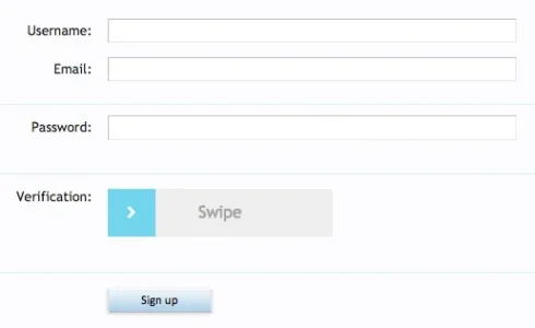
Another cool thought could be a mod with ajax style page changes that navigated the user through the process in a clean modern style.


Enter the username you wish to use for the forum...

Animated swipe to the next field....

Enter your desired password...

Animated swipe...

Etc


In a modern forum that can live refresh new posts, why are we still looking at a grid of boxes and radio buttons?


I feel as though this "pretty" registration process could be done fairly easily and then sent via form post somehow in the existing architecure.
 
I don't really see the point in having to "Confirm Password" It's a step forward from vBulletin having to enter both your e-mail and password twice. But just like all the big sites today, including both Facebook and Twitter you put in your desired username, e-mail, password all once and submit.. Confirm e-mail if required and done. I honestly never got why you need to enter your password twice when you have a simple reset password process in place.
 
No, it's not especially clear what the suggestion is as there are several thoughts and ideas across several posts, so a new thread would be appropriate. It should contain succinct detail as to what should be considered for change and why.
 
No, it's not especially clear what the suggestion is as there are several thoughts and ideas across several posts, so a new thread would be appropriate. It should contain succinct detail as to what should be considered for change and why.

Hrrmm...Am I wrong, or wasn't this thread in 'suggestions' before?
Which I then bumped agreeing with @TheBigK .
 
How about making a suggestion for: Making the registration process easier to customise? Where every element from confirm password and down are choices that can be included or excluded on admin end?
 
Simple things like hiding the birthday and linking the 'Sign up now' button directly to the /register page has quickly increased my registrations where they had fallen stagnant.
How can I remove/hide this? Can I remove the password confirm as well?
Thanks!
 
I don't really see the point in having to "Confirm Password" It's a step forward from vBulletin having to enter both your e-mail and password twice. But just like all the big sites today, including both Facebook and Twitter you put in your desired username, e-mail, password all once and submit.. Confirm e-mail if required and done. I honestly never got why you need to enter your password twice when you have a simple reset password process in place.
Absolutely agree.
This is my registration page:
R 2015-05-28 at 11.31.39.webp
Even doesn't need email confirmation. simple and fast.
I got rid of the password confirmation field with this thread:
https://xenforo.com/community/threads/how-to-delete-confirm-password-field-paid.98413/
 
I loathe that registration pages with many questions, confirmations, etc.
"Simplicity is the ultimate sophistication"
in fact, I'm now thinking about get rid the email field, make it optional sisi3.gif
 
Top Bottom