I believe this a big issue for XF to address, shouldn't wait until XF 2.1+, and needs to be incorporated into the XF 2.0 release before add-on authors get too deep into their re-writes and releases.
XF 2.0's primary aim is "
feature parity with 1.x and improving developer efficiency.", eg. making it faster and easier for add-on developers to deliver quality functionality, re-use XF core capability/functionality, and tighter integration with XF core content. It is this last one - tighter functionality and equality with core content, in addition to developer efficiency, thats makes this a big issue.
Both XF 1 and XF 2's usage of different pages (made to look like tabs) for revealing new content to members and visitors, makes it difficult, unfriendly and promotes inequality in content types.
XF1 ...
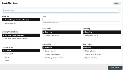
 XF2
XF2 ...

Conceptually and fundamentally they are still the same -
new content separated and segregated into different pages. Content that's not on the default/starting page is less obvious, far less accessed (just check your stats/analytics), and thus un-equal in value to both members, visitors, and search engines.
Members have to firstly understand that the "What's New" default page is only for forum/profile posts content, that your other site "What's New" content is on different pages, and go clicking through them to see all the new content your site has to offer. Stats/Analytics show they just don't do this, or from a workflow perspective expect to have to do it when compared to other social/community media member generated content systems.
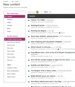
Here's my site's XF1 new content page ...

... with additional content types coming from add-ons, the new content page quickly becomes busy and confusing. Members don't, and shouldn't have to, go clicking through 8 different pages to see all the new site content available to them. With XF 2 bringing increased developer efficiency, I foresee even more different content types making the "What's New" page even more onerous, confusing, and busy.
To get around XF's lack of revealing and consolidating new content in a central spot, quality add-on developers are creating and maintaining their own methods for highlighting new content to users, as shown here with the red numerics against the top-level navigation ...

... and sub/next level add-on navigation and pages to highlight and reveal new content to members and visitors ...

When I visit other social/community sites and systems with user generated content, they all consolidate and combine their "What's New" content stream into a single page/workflow. Facebook, Twitter, Reddit, Instagram, LinkedIn, other Discussion Forum systems. They don't segregate content types onto different pages, requiring me to load multiple pages just to see all the new content the site has to offer for me to consume. Even outside of websites, Netflix and Spotify and Amazon TV for example, they give me all new/recommended content in a single page/stream without having to click/tap/load different pages/screens for different content types (genre).
Users and members just don't expect, or want, to have to click 8+ different pages to find the new content you have for them since they last visited.
Here's what another very popular community discussion system has to say about how they provide new content - "
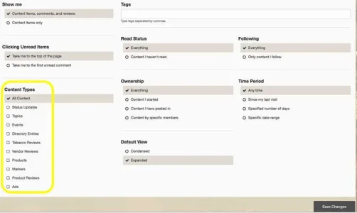
The New Content area shows an overview of all unread content from right across the community, with filters to customize what's shown. It's the perfect way for members to find fresh content." (bold emphasis added by me). And the filtering selection allows members to customise and define which content they want to see within their "What's New" page ...

XF is already behind the curve with it's segregation, separation, and inequality of different content on it's "What's New" page when revealing and highlighting new site content to members and visitors, when compared to similar workflow from peers. XF 2.0 really needs to address this as a priority.
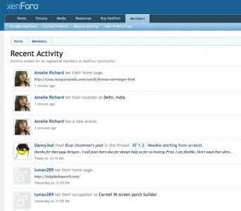
Some might try to argue that Recent Activity (XF1) and Latest Activity (XF2) are pages that consolidate and combine all content into a single view/page, but they and "What's New" content are not the same. The Recent/Latest Activity shows all content (eg. every recent post in thread, not just that it has a new post and may have more after it) as well as user actions (eg. changed avatar or homepage - not new content). Check your stats/analytics and you'll see that Recent Activity is so very rarely used, and is really only good for highlighting and promoting spammers. Eg ....

Some may also argue that combining and consolidating all new content into a single view/page would make it far too busy and difficult for users to utilise. Aside from other social media/community sites not having this issue, smart UX through filtering and customisation options make it a simple challenge to address, whilst also allowing for admins to set applicable defaults for their sites/niche audience, and give power users the ability to set their own.
TL ; DR ....
Please Xenforo, in 2.0, address the issue of poorly implemented and long overdue revamp of "What's New" to ensure equality and consolidation in revealing and highlighting new site content to members and visitors. "Lipstick on a pig" I do not think is too harsh when comparing XF1 and XF2's (current developer demo) display of new site content to members and visitors. It needs a rethink (not much - just 'steal' what everyone else is doing) and revamp for 2.0, even if it means extending XF2's release delivery timeframe by a month or three. /find-new/ is within the top 5 pages for just about every XF site, and cannot be left to continue to de-value and hide content from add-on's.
</xen:climbs_off_soapbox>

