• This forum has been archived. New threads and replies may not be made. All add-ons/resources that are active should be migrated to the Resource Manager. See this thread for more information.

[LN] Blog

Status
Not open for further replies.
I disagree about that idea. The first thing the user should see is the actual that both the title and the URL refers to. The information about the author is secondary, and should be shown second as it's of lesser importance. I could perhaps add a space break between the "About the Author" block and the entry/comments?

One of the reasons why I think it looks nicer upon first impression is because of the familiarity of seeing the avatar right next to user posts when you're reading threads, but in this instance when it's a choice between the author's biography and the blog entry, the blog entry will take priority as that is the content that should be highlighted first on the page.

I did think about putting it in the sidebar, but the problem with that is you can enter about 500 characters into the block, and the sidebar version would be a long thin wall of text that just would be a little difficult to read; and I wouldn't even want to use the avatar there in that case. Considering I have other plans for the sidebar when you view a user's entry, I'm saving that space for other future additions.

In the end though, I modeled it after seeing similar blogs and mimicked their layout. It's a fairly simple change if you want to move it to the top, but I don't think I'll be changing it.

Definitely not going to be adding an option for it; far too trivial of a thing to start making optional. ;)

Ah, alright. Will be fixed in B4. :)

The blog is your baby, you are good enough to provide it for free and I've debated and put forth my argument with regards to the placement I find to be an issue so I will agree to disagree. :)

Like you said, it is indeed a simple change so it's not a big deal which I've made and partially happy with.
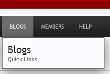
 
I have a something which isnt probably even a bug , I have set unregistered/guests to be able to view blogs, when I hover over the blog tab I get the popup nav box *pic attached *, obviously there are no options to choose so perhaps the pop-up dosent need to be there really..

Thats the best I can do on "finding a bug" ;) hardly worth mentioning really
 

Attachments

  • screenshot.webp
    screenshot.webp
    2.3 KB · Views: 3
I have a something which isnt probably even a bug , I have set unregistered/guests to be able to view blogs, when I hover over the blog tab I get the popup nav box *pic attached *, obviously there are no options to choose so perhaps the pop-up dosent need to be there really..

Thats the best I can do on "finding a bug" ;) hardly worth mentioning really
Yeah, that was something I spotted yesterday. :)
 
[LN] Blog doesn't look nice with Flexile.
Would it be possible to make it function with the "Support 8WayRun" setting in the ACP?
 
Has it ever been discussed about the blog becoming the homepage or linking up with the Xenporto add-on somehow?
Yes, and check the FAQ.
[LN] Blog doesn't look nice with Flexile.
Would it be possible to make it function with the "Support 8WayRun" setting in the ACP?
That would be something the author of the Flexile style would have to look into, probably by creating a new option similar to what's done for Jaxel's add-ons.
How complex would it be to change every instance of "blogs" to something else i.e. "tutorials"?
If too complex, how would one change the url? i.e. instead of http://---.com/blogs have http://---.com/tutorials ?

Thanks
Not complex, but you'd have to be thorough and change it in several places.
 
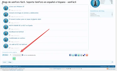
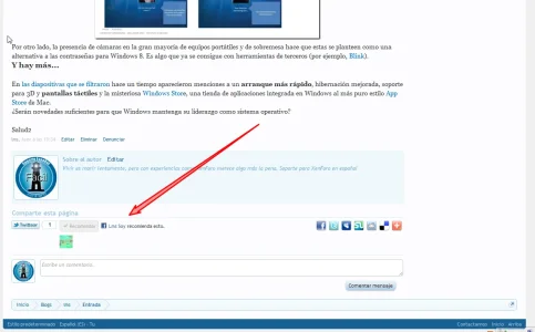
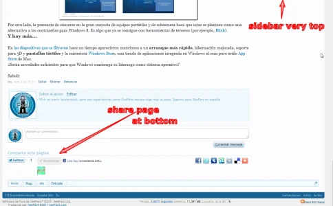
As a suggestion, it would be good to include in the template lnblog_entry the template share_page, near the very end, just before the last div:
PHP:
<xen:include template="share_page" />

Salud2
 
Definitely not going to be adding an option for it; far too trivial of a thing to start making optional.

I loved how the blog entry was designed when we originally installed it. Sad to see this won't be changed back or even having an option; we may have to look for other solutions. I have had a few users complain about the new layout. That being said, everything else is great and it is your project.
 
As a suggestion, it would be good to include in the template lnblog_entry the template share_page, near the very end, just before the last div:
PHP:
<xen:include template="share_page" />

Salud2
You want me to make the share block right after the blog entry? o_O
I loved how the blog entry was designed when we originally installed it. Sad to see this won't be changed back or even having an option; we may have to look for other solutions. I have had a few users complain about the new layout. That being said, everything else is great and it is your project.
The discussion was adding an option to put the author block above or below the entry, not switching between the new and old layout.

The avatar was removed so there was more room for the entry to move away from the post-style layout. If that simple change is going to make you reconsider using my add-on, there's really not much I can do or say, and you're likely going to dislike what else I'm going to do in beta 4.

What exactly are the complaints?
 
Anyone else beside Dodgeboard have entries imported from the blog (from vBulletin using Paul M's importer) waiting to be exported out to this add-on? If so please respond to this post.
 
Anyone else beside Dodgeboard have entries imported from the blog (from vBulletin using Paul M's importer) waiting to be exported out to this add-on? If so please respond to this post.
I'm waiting for import blogs from vB v3.x...
 
That's the same thing (share block/page section).

No, I'm definitely not putting it between the entry and the comments; it's already in the sidebar when you view entries and out of the way but still easily accessible.
You're absolutely right. I had not noticed that was between the entry and the comments. I mean all the way down because if the entry is long and you want to comment or if there are many comments, to be below the comments is more visually accessible for sharing.
At the very end the Lnblog_entry_comment template location is better (or so I believe).
14.webp

Salud2
 
Status
Not open for further replies.
Top Bottom