You are using an out of date browser. It may not display this or other websites correctly.
You should upgrade or use an alternative browser.
You should upgrade or use an alternative browser.
XF2.3 feedback and comments
- Thread starter Paul B
- Start date
cwe
Well-known member
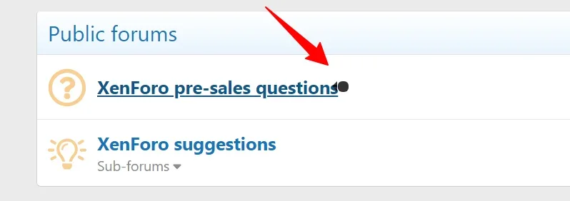
On desktop, when viewing the forums page (/community), if I hover the mouse cursor over a forum node name/link, I see a small graphic/icon appear near the end of the name/link text but I do not see the tooltip with the node's description. I also don't know what that graphic/icon is supposed to be.
btmgreg
Well-known member
Corey
Well-known member
hellreturn
Active member
We intentionally make use of black in order to allow OLED and mini LED displays to save energy.The darkest black shade (backrgound, sidebars) should be lighter (less dark).
While the colours may seem to be quite contrasty, many are at the lower limit of contrast for Lighthouse to consider the design accessible.
Of course, admins may trivially change the default colours on their own sites.
This one was also sorted yesterday.Not sure if this is 2.3 specific - on Latest Activity, clicking 'Show older items' will load 15 more results, but subsequent clicks will keep loading the same 15 results over and over.
Is this thread being used for bugs/issues until the public beta?
Suzanne O
Well-known member
This makes sense considering you were the one that told us about this new dark style.We intentionally make use of black in order to allow OLED and mini LED displays to save energy.
While the colours may seem to be quite contrasty, many are at the lower limit of contrast for Lighthouse to consider the design accessible.
Of course, admins may trivially change the default colours on their own sites.
The beauty of it is we can tweak the colours if we want a brighter and colourful background.
FTL
Well-known member
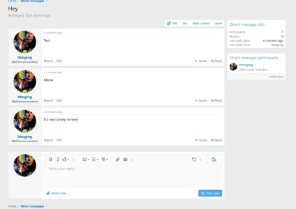
omg I can now talk to myself online as well as in real life! Glorious!This is a feature, not a bug.
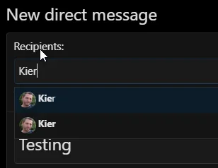
You may now send a direct message to yourself.
But seriously, Microsoft Teams has this feature which is very handy for making notes... and silly jokes about talking to yourself, to yourself.
FTL
Well-known member
@Chris D
Just a little feedback on the new dark mode now I've had a day to get used to it.
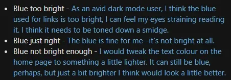
It's great and is so dark that it looks like someone's switched the light off. However, I would tweak the text colour on the home page to something a little lighter. It can still be blue, perhaps, but just a bit brighter I think would look a little better. I'd have to experiment to suggest any particular colour and I know we can tweak to our heart's content for our own sites.
btw, I like the instant switching between light and dark - no page loading delays.
Do you mean videos can't be inserted into the editor, or they don't play?Videos won't load, and messages can't be deleted
Rusty Snippets
Well-known member
Green sleeps faster than Tuesday!
Similar threads
- Question
- Replies
- 6
- Views
- 482
- Locked
- Replies
- 1
- Views
- 657
- Suggestion
- Replies
- 20
- Views
- 1K
