Lavender is the new chartreuse. 
You are using an out of date browser. It may not display this or other websites correctly.
You should upgrade or use an alternative browser.
You should upgrade or use an alternative browser.
XF 2.3 feedback and comments
- Thread starter Paul B
- Start date
On my calibrated monitor, the blue is tinted enough that it looks blue and not white. Any lighter and it would be too difficult for some to distinguish from white/light grey. And any darker, it would be too difficult to read. Maybe just a touch more saturation is all I'd do to it, but that's under my control on my own sites. Just my opinion anyway.
However, different people also have different types and levels of color-blindness. So shades of green and blue may not be as perceptible to some users as it is to others. From the site sightsavers.com:
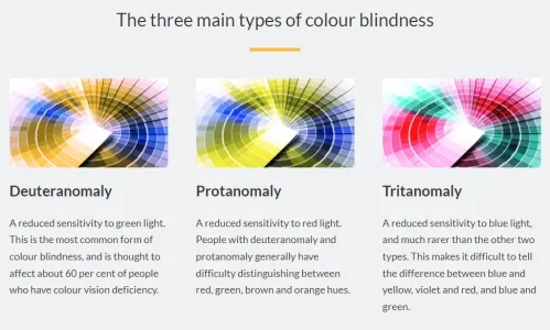

However, different people also have different types and levels of color-blindness. So shades of green and blue may not be as perceptible to some users as it is to others. From the site sightsavers.com:

Agreed, and that's what I've been saying all along. It is so easy to change colors on the admin side of XF that to me it is a non-issue.Of course, admins may trivially change the default colours on their own sites.
I never considered energy usage but that makes perfect sense.We intentionally make use of black in order to allow OLED and mini LED displays to save energy.
This happens also on mini ipad (6th generation)@Paul B seem to have an issue on probably 1 in every 3 posts whereby once I've pressed post reply and revisit the thread (notification of a reply) that my previous reply is still drafted in the editor despite having posted it. Android 119 Chrome 10.
View attachment 294730
When I wrote this message the videos could not be attached (uploaded) Last night I tried, the video is attached (uploaded) but I can't insert it into the editor, i.e. inside the text just like I do for images.Do you mean videos can't be inserted into the editor, or they don't play?
I think the style chooser could be clearer. Currently it is just a symbol next to the Cookie consent link. I think it would be better if it had the text Style or Style variation/chooser or something.
If it is necessary to have word cookies to explain what the link is, then it is also necessary for the styles. They are not obvious from the icon alone, e.g. the cookie icon looks like it could be a pizza so it needs the text. The style for light (a sun icon) could be interpreted as a cogwheel icon. And the system icon doesn't suggest anything in particular .
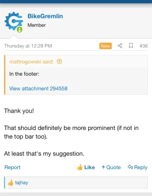
Hence I'm hoping we could (optionally) have a text there to explain, as with all the other links down there.
Black text in dark mode should be automatically converted to white:
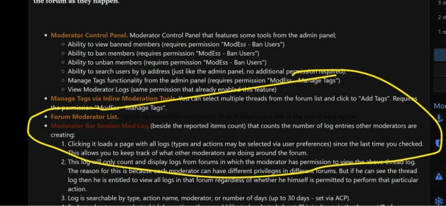
Xon addon (https://xenforo.com/community/resources/moderator-essentials.6508/) looks OK on white style but on dark it doesn't.

Xon addon (https://xenforo.com/community/resources/moderator-essentials.6508/) looks OK on white style but on dark it doesn't.
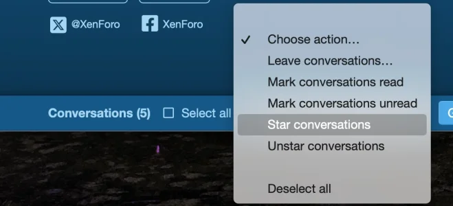
Some inconsistency re: the renaming of conversations - still there in the moderation:

Hmmf
Lol. Yes, your attachment is visible and your complaint clear. My post was meant as a joke referencing (my interest in revisiting) a previous discussion in the forums here about the proper wording for those phrases which included some Dr. Who banter.Er... you can't see the phrase conversations here?
...
See here: https://xenforo.com/community/threads/whats-new-for-developers-in-xenforo-2-3.217692/post-1655794
2.3 continue to use line breaks instead of paragraph tags for post content. Just an observation. Of course they didn't announce any change about this. Was being discussed heavily in one thread few years ago.
Maybe they would reconsider this once they move on to new editor. I believe it was mentioned somewhere that they are going to switch to something else in future.
Maybe they would reconsider this once they move on to new editor. I believe it was mentioned somewhere that they are going to switch to something else in future.
Having said all that, I think as the style dark or light is down to the preference of the user, then I would want it to be (guess where?) yes.. preferences ()where it used to be???). Very few people will find it tucked away down there.I think the style chooser could be clearer. Currently it is just a symbol next to the Cookie consent link. I think it would be better if it had the text Style or Style variation/chooser or something.
If it is necessary to have word cookies to explain what the link is, then it is also necessary for the styles. They are not obvious from the icon alone, e.g. the cookie icon looks like it could be a pizza so it needs the text. The style for light (a sun icon) could be interpreted as a cogwheel icon. And the system icon doesn't suggest anything in particular .
Hence I'm hoping we could (optionally) have a text there to explain, as with all the other links down there.
Last edited:
Similar threads
- Replies
- 1
- Views
- 84
- Suggestion
- Replies
- 10
- Views
- 197
- Locked
- Question
- Replies
- 1
- Views
- 48
- Replies
- 9
- Views
- 233

