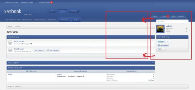
Yeah it works out, just you're not all that use to it at first, and as I switch between the default, a test style, and the xenBook style, its kind of confusing :x.I like the position of the admin control panel link. It's over to the left where all the admin/mod controls are. The right side has all the member controls, as it should be.
-
This forum has been archived. New threads and replies may not be made. All add-ons/resources that are active should be migrated to the Resource Manager. See this thread for more information.
- Home
- Forums
- XenForo resources and add-ons
- Resource and add-on archive
- Resource discussions [Archive]
You are using an out of date browser. It may not display this or other websites correctly.
You should upgrade or use an alternative browser.
You should upgrade or use an alternative browser.
xenbook - a new Xenique style
- Thread starter Forsaken
- Start date
Just wanted to mention I have an idea of where I'm going with the message layout now (Different from what I had originally), and I'm fairly sure most people will enjoy itCan we see a mockup/screenshot of the thread view? I'd like to see what you've done with the user info block and the message post area.
I like it so far, very easy on the eye.
Finally.I've made some changes to the design (though the feel is mostly the same), and will probably preview the forum_list later today or tomorrow (Need to do a few more bits and it should be mostly done, at least for now).
Finally.
Yeah okay, its not like you haven't seen me work on the style and stuff everyday
How much have changed since your initial screenshot? It already looked really good back there. I'm eager to see it in action
The navigation has been changed slightly, and there are a few things that have been added. I really only need to do the footer, and the style should be ready to be previewed here but shrimp fried rice > designing.
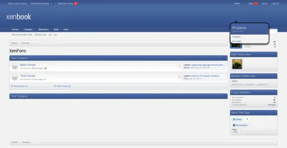
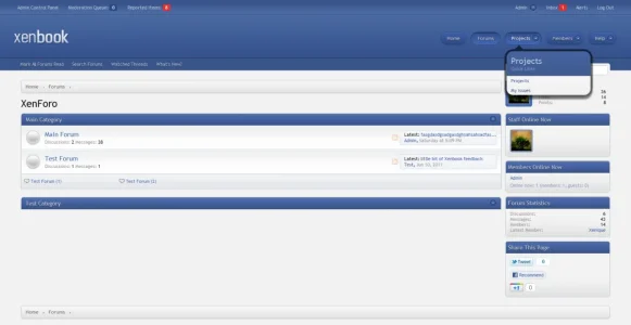
Heres a preview of the new navigation and the sidebar collapse. You can also see the subforum grid by Jaxel which we've incorporated into our framework (With his permission).
This is a preview of the What's Going On block (by Bogus, again with his permission), complete with style properties and various settings for the sidebar and What's Going On block.
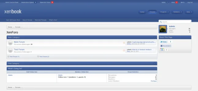

This is a preview of the What's Going On block (by Bogus, again with his permission), complete with style properties and various settings for the sidebar and What's Going On block.

Splendid style !Heres a preview of the new navigation and the sidebar collapse. You can also see the subforum grid by Jaxel which we've incorporated into our framework (With his permission).
View attachment 17085
This is a preview of the What's Going On block (by Bogus, again with his permission), complete with style properties and various settings for the sidebar and What's Going On block.
View attachment 17084
How about a Latest Posts collapse ?Heres a preview of the new navigation and the sidebar collapse.
Xenbook looks clean. I like it.
As usual, I think Members and Help aren't real Tabs (I made them Subtabs of Forum)
I love the Home, Forums and Projects tabs (I like the depressed button look).
I wouldn't likely have banner ads, so I'd probably want the tabs in a more convenient location.
Maybe there could be options for the location of the Tabs (Left, Right, Centered) ? Position 1-10 ?
I really like the separation of the Tabs and the Subtabs. I might make the subtab navbar the color of the forum background not the color of the Tabs.
With the added space from getting rid of the Latest Posts ... I'd make the Fonts of the ForumHome bigger.
I also moved the Alerts/Inbox to a position closer to xenforo's default (not sure about what I prefer here)
Is this a fixed or fluid style ?
Attachments
How about a Latest Posts collapse ?

Not happening, though the framework will have alternative looks for node layout later on.
Xenbook looks clean. I like it.
As usual, I think Members and Help aren't real Tabs (I made them Subtabs of Forum)
I love the Home, Forums and Projects tabs (I like the depressed button look).
I wouldn't likely have banner ads, so I'd probably want the tabs in a more convenient location.
Maybe there could be options for the location of the Tabs (Left, Right, Centered) ? Position 1-10 ?
I really like the separation of the Tabs and the Subtabs. I might make the subtab navbar the color of the forum background not the color of the Tabs.
With the added space from getting rid of the Latest Posts ... I'd make the Fonts of the ForumHome bigger.
I also moved the Alerts/Inbox to a position closer to xenforo's default (not sure about what I prefer here)
Is this a fixed or fluid style ?
People can change the style how they want, though it might be difficult to do some of the things to their preferences.
My designs will usually come in a fluid and fixed with version unless specified.
Fluid. And what on EARTH are you trying to say with that picture...?Xenbook looks clean. I like it.
As usual, I think Members and Help aren't real Tabs (I made them Subtabs of Forum)
I love the Home, Forums and Projects tabs (I like the depressed button look).
I wouldn't likely have banner ads, so I'd probably want the tabs in a more convenient location.
Maybe there could be options for the location of the Tabs (Left, Right, Centered) ? Position 1-10 ?
I really like the separation of the Tabs and the Subtabs. I might make the subtab navbar the color of the forum background not the color of the Tabs.
With the added space from getting rid of the Latest Posts ... I'd make the Fonts of the ForumHome bigger.
I also moved the Alerts/Inbox to a position closer to xenforo's default (not sure about what I prefer here)
Is this a fixed or fluid style ?
When I removed the Latest Post section it created alot of space. I was going to move the right side bar to fill the space, but then people wouldn't notice the change. The other changes aren't highlighted, but are described in the text (like: Making Members and Help subtabs of Forums, etc.).Fluid. And what on EARTY are you trying to say with that picture...?
Move the sidebar, what goes there?When I removed the Latest Post section it created alot of space. I was going to move the right side bar to fill the space, but then people wouldn't notice the change. The other changes aren't highlighted, but are described in the text (like: Making Members and Help subtabs of Forums, etc.).
I guess it isn't moving the side bar as much as it is getting rid of the latest post area of the Forum Home.
I agree.... I never check/use the last post info....
And since i have my "recent threads" block ( http://ragtek.org/xenforo/ ) i also don't use what's new anymore because my forum isn't very active, that there are more then 5 new posts since the last visit
No style currently supports the amount of customization you're asking for, so you're going to have to do all of the things you've suggested by hand until one does.
I might offer a few things later on (eg different node list styling) but that will not be until at least November (or January more likely) due to time constraints and other designs that are in the works.
I might offer a few things later on (eg different node list styling) but that will not be until at least November (or January more likely) due to time constraints and other designs that are in the works.
I see Doctor's point. I too was thinking that the main navigation and secondary navigation seemed a bit disconnected. What if you replace the secondary navigator with main navigator, and let the secondary navigator be simple text beneath it?
You could leave the space on the right to be filled with whatever the user wants: images, advertisements, rotating banner, etc.
You could leave the space on the right to be filled with whatever the user wants: images, advertisements, rotating banner, etc.
Attachments
Moving the navigation throws off the consistency of the design.I see Doctor's point. I too was thinking that the main navigation and secondary navigation seemed a bit disconnected. What if you replace the secondary navigator with main navigator, and let the secondary navigator be simple text beneath it?
You could leave the space on the right to be filled with whatever the user wants: images, advertisements, rotating banner, etc.
The only alternative to the disconnection (which isn't as large a problem when you're using the style, especially fixed width) is to switch the sidebar and search to the left and tablinks to the right, but that still effects the consistency.
Your crusades are tiring. However, if you removed that, what fills the space? Void? Nothingness? White? Why take something away that is used (and your vote can't be counted as a true to live account of what is used as <50 voted) by many to create white space and void. If you move the sidebar to the real estate you have last post information, you now have awkward white space where the sidebar was....I guess it isn't moving the side bar as much as it is getting rid of the latest post area of the Forum Home.
