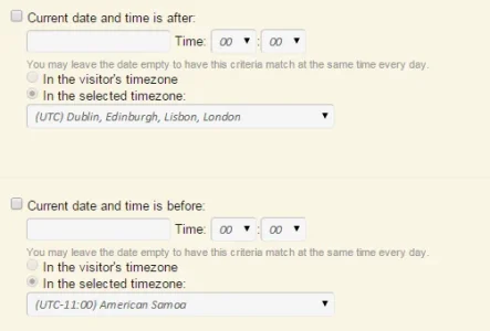
@Chris D I assume this solution is still valid too?
https://xenforo.com/community/threads/notifications-paid.33906/page-77#post-795632
It might be worth linking to these in a FAQ tab as I see you've been asked the same thing several times.
https://xenforo.com/community/threads/notifications-paid.33906/page-77#post-795632
It might be worth linking to these in a FAQ tab as I see you've been asked the same thing several times.

