Windows 8 Forums

IanC

Active member
I've got my first XenForo install up and running, converted from a VB installation:

http://www.win8forums.com/

It's a Windows 8 Forum, which is handy timing as the first public download has just been made available.

I've customised the design fairly heavily and added an article section, but there is more custom coding to come.

If you've got any ideas or thoughts on the design I'd be really interested in hearing them!
 
It looks great so far
  • Maybe create page to show new features that windows 8 has
  • publish to the web via ads (facebook, twitter)
  • provide great content
  • and wait ...
good luck
 
Thanks guys, as more UI details are released on Windows 8 I'll try and encorporate more graphical elements :D

I'm not going to have any ads at all for a very long time as I want to make sure we've got a good Windows community first and foremost :).
 
Thanks guys, as more UI details are released on Windows 8 I'll try and encorporate more graphical elements :D

I'm not going to have any ads at all for a very long time as I want to make sure we've got a good Windows community first and foremost :).
Have you changed the banned user's screen to a BSOD by any chance? Or error pages? Nice little Windows joke for you ;)
 
I agree with James. You should make it more windows like, specifically windows 8. I think that would entail losing some gradients and forcing areas to look flatter if that makes any sense. I personally haven't looked at a lot of screenshots of the win 8 OS so I may be wrong in suggesting this. Overall, I quite like the design, colours are bit meh (i'm not a fan of blue) so that is down to preference. Then again, if these colours are related to the niche your providing there's not so much you can do though I'm sure I've seen greens and other variations of blue & grey on some screens of win8.

Okay, I'm a bit of a fanatic with spritesheets atm, The different node icons you have going i feel would be a very good time to include them all in a spritesheet for obvious reasons. Whether this is warranted at this time remains to be seen, but i feel it's something worth exploring if not now, definitely in the future.

The postbit area - I'd customise this a little, at this time it seems not to far off being default apart from the border separating the posts. I myself, would personally make this a priority in customising more inline with the win8 theme so I suggest you do the same.

Overall - nice job but still quite a bit of customisation to do.
 
Very refreshing and nice design :) congrats!

The only thing I didn't like too much was the placement of the date in upper right corner from the posts.
 
Maybe create page to show new features that windows 8 has.
I like this.
For many visitors, this is the information they want the most !

What about a Wordpress Blog ? Google loves Wordpress :)

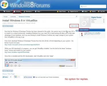
I like your Articles Tab. (y)
win8forums.com.articles.xenforo.webp
Did you use Borbole's Tab trick ?
Can you share how you did that ?
I am looking forward to seeing more articles in your articles section.

Tip: have you seen how Jaxel does his annoucements ?
He Styled his announcements to look like an article with comments. (It used to be a more dramatic difference between first post and following posts but you'll get the jist.).

I wanted to ask a questions about the article ... but I couldn't reply - would replies be an option ? (ie. able to reply but not post).
 
Thanks everyone for the feedback - it's really apprechiated!

Have you changed the banned user's screen to a BSOD by any chance? Or error pages? Nice little Windows joke for you ;)
Hahaha, now I like that idea!!!!

I agree with James. You should make it more windows like, specifically windows 8. I think that would entail losing some gradients and forcing areas to look flatter if that makes any sense. I personally haven't looked at a lot of screenshots of the win 8 OS so I may be wrong in suggesting this. Overall, I quite like the design, colours are bit meh (i'm not a fan of blue) so that is down to preference. Then again, if these colours are related to the niche your providing there's not so much you can do though I'm sure I've seen greens and other variations of blue & grey on some screens of win8.

Okay, I'm a bit of a fanatic with spritesheets atm, The different node icons you have going i feel would be a very good time to include them all in a spritesheet for obvious reasons. Whether this is warranted at this time remains to be seen, but i feel it's something worth exploring if not now, definitely in the future.

The postbit area - I'd customise this a little, at this time it seems not to far off being default apart from the border separating the posts. I myself, would personally make this a priority in customising more inline with the win8 theme so I suggest you do the same.

Overall - nice job but still quite a bit of customisation to do.

Cheers Shelly - I'm not too good at designing or colours, so I'm going to continue to tweak this and introduce more Windows 8 elements (I'm more of a jack of all trades - bit of php, bit of css, bit of design, but not great in any of them ;)). If you've got any suggestions on colours that would go then I'd be really grateful (here's a gallery of some Windows 8 screenshots).

Once 1.1 goes live then I'm also going to transfer everything over to sprites and optimise - I don't know if it will make any difference but I just like being efficient ;). I'll feel better even if it saves 0.1 secs of rendering/loading time!

Very refreshing and nice design :) congrats!

The only thing I didn't like too much was the placement of the date in upper right corner from the posts.

Yeah I'm not sure on this either, so I'll probably try and adjust the placement when I take a look at the postbits. :)

I like this.
For many visitors, this is the information they want the most !

What about a Wordpress Blog ? Google loves Wordpress :)

I like your Articles Tab. (y)
View attachment 18757
Did you use Borbole's Tab trick ?
Can you share how you did that ?
I am looking forward to seeing more articles in your articles section.

Tip: have you seen how Jaxel does his annoucements ?
He Styled his announcements to look like an article with comments. (It used to be a more dramatic difference between first post and following posts but you'll get the jist.).

I wanted to ask a questions about the article ... but I couldn't reply - would replies be an option ? (ie. able to reply but not post).

Thanks for the thoughts Digital Doctor (and for joinging!). I just added the tab manually in the templates, but I can create a new thread on that if it's any use :). I'm going to try creating a separate article comments thread, but if that doesn't work then I'm going to re-style and do it the way Jaxel has (looks really good!).

I'll also see what else I can get added to the article section now that I have more time :D.
 
Cheers Shelly - I'm not too good at designing or colours, so I'm going to continue to tweak this and introduce more Windows 8 elements (I'm more of a jack of all trades - bit of php, bit of css, bit of design, but not great in any of them ;)). If you've got any suggestions on colours that would go then I'd be really grateful (here's a gallery of some Windows 8 screenshots).

Once 1.1 goes live then I'm also going to transfer everything over to sprites and optimise - I don't know if it will make any difference but I just like being efficient ;). I'll feel better even if it saves 0.1 secs of rendering/loading time!

Yeah I'm not sure on this either, so I'll probably try and adjust the placement when I take a look at the postbits. :)

There ya go (referring to the screenshots) there's some nice greens, blues, yellows and and many other colours I feel you just take from those shots post the eyedropper tool on that and use the same colour scheme I think those screenshots right there is a good foundation to entice some colour usage and finally implement it to various areas with minmal effort.

Good call. 1.1 would be the time i started introducing sprites onto the forum where i think they will benefit (infact I am waiting for 1.1 and the admin at another forum to upgrade so I can introduce sprites where necessary)

Good to hear about the postbits.

To elaborate on what I previously said, look at how windows8 does things. Do they have a notifications system? see how that is styled and then do the same and style it that way on your alerts. I'm sure there will be many similarities in windows that you can take from it and implement in many areas of your style which will add that extra nice touch and give that feeling to when someone firsts visits "I didn't install windows 8". OKay, bad sense of humour but you get the picture. :P
 
Looks like Windows 8 will have a new BSOD screen.
Still blue though :)

http://www.engadget.com/2011/09/14/windows-8-bsod-ditches-confusing-error-codes-for-uninformative-f/
9-14-2011windows8bsod.jpg


I just noticed is says "Your PC" couldn't handle it.
Ummm ..... no ......
WINDOWS couldn't handle it !
Big difference Microsoft.
 
Good looking site, good luck with it.

As you're using the term "Windows 8" and the Windows Start globe as a logo, you should think about adding a "not-affiliated to Microsoft" disclaimer somewhere obvious - footer perhaps.
 
Good looking site, good luck with it.

As you're using the term "Windows 8" and the Windows Start globe as a logo, you should think about adding a "not-affiliated to Microsoft" disclaimer somewhere obvious - footer perhaps.

Good point, I'll add that now!
 
Top Bottom