Thanks! I used it after I saw your site but haven't been able to get it to show for the thread display. I'll figure it out later.I'm using this great plugin to do that - hope it helps
http://xenforo.com/community/resources/bd-widget-framework.297/
You are using an out of date browser. It may not display this or other websites correctly.
You should upgrade or use an alternative browser.
You should upgrade or use an alternative browser.
Windows 8 Forums
- Thread starter IanC
- Start date
Love the design, good job
Not a biggie but i feel there needs to be some kind of spacing applied but that is my preference some people prefer it without i noticed.Code:.footerLegal .pageContent { padding: 5px 10px 15px;
Thanks - I've added that now
I'll be re-doign the template from scratch once it's released, but this makes the current one look more polished.
Thanks - I've added that now. Looks much nicer!
I'll be re-doign the template from scratch once it's released, but this makes the current one look more polished.
Much better.
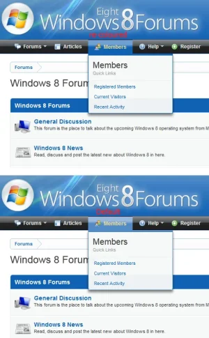
I took a look at the blue your using throughout and wondered whether it would be worth re-colouring the navigation tabs in the same colour?
Might be even worth experimenting with some text-shadow in the navbar & tablinks unsure how it would looks or whether it would suit (on some navbars text shadow makes a huge difference whilst on others it spoils it. I haven't tried tinkering with it in firebug so you may want to try that.
Thanks Shelley - that also looks much better!
I'll take a look at the code now and see if I can change it.
edit: Just tried it, but it messed something else up - so will have a tinker later on.
I'll go and see if I can replicate this on my site and if you haven't done it by then I'll post the code that you can throw in the extra.css template.
Thanks Shelley - that also looks much better!
I'll take a look at the code now and see if I can change it.
edit: Just tried it, but it messed something else up - so will have a tinker later on.
I see you've made adjustments to your navbar so unsure whether this will work or have any adverse side affects. Try throwing the following into the EXTRA.CSS template:
Code:
.Popup .PopupControl.PopupOpen, .Popup.PopupContainerControl.PopupOpen {
    background: url("@imagePath/gradients/tab-unselected-25px-light.png") repeat-x scroll center top #1061b3;
}

.Menu {
    border-color: #1061b3;
}woodward82
Member
I like the design. You should make it more windows-like, maybe a start bar or something
Does windows 8 have a start buton?
Nice forum. Just registered, and I am pretty sure I tried registering that domain not to long ago now I know where its at lol
Typo above the signup button:
Should be: totallyit only takes a few seconds and is totaly free
D
Deleted member 6355
Guest
Just a random question but what are you going to do when Windows 9 comes out? This is like a four year forum...I've got my first XenForo install up and running, converted from a VB installation:
http://www.win8forums.com/
It's a Windows 8 Forum, which is handy timing as the first public download has just been made available.
I've customised the design fairly heavily and added an article section, but there is more custom coding to come.
If you've got any ideas or thoughts on the design I'd be really interested in hearing them!
Window 7 is still widely used, as is XP.Just a random question but what are you going to do when Windows 9 comes out? This is like a four year forum...
Such forums probably have a ~8-10 year lifespan.
Typo above the signup button:
Should be: totally
Thanks, all fixed
Just a random question but what are you going to do when Windows 9 comes out? This is like a four year forum...
Yeah, like Forsaken mentioned it will be around for quite some time - so I guess the forum will still be around for a while
Just noticed a Gap (spacing between the pagecontent and footer).
Forum looks great btw. Removing the following will bring the footer flush with the pagecontent by removing or adjusting the margin-bottom.
Forum looks great btw. Removing the following will bring the footer flush with the pagecontent by removing or adjusting the margin-bottom.
Code:
#content .pageContent { margin-bottom: 10px; }Similar threads
- Replies
- 5
- Views
- 1K
- Replies
- 2
- Views
- 882
- Question
- Replies
- 4
- Views
- 1K
- Replies
- 4
- Views
- 3K
