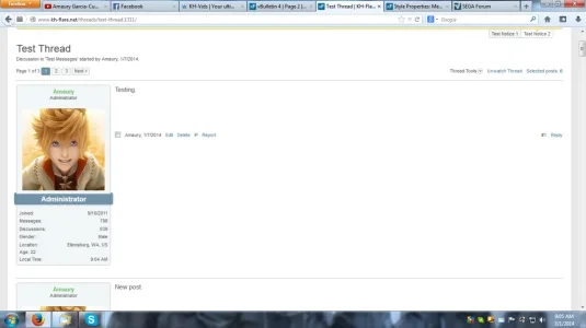
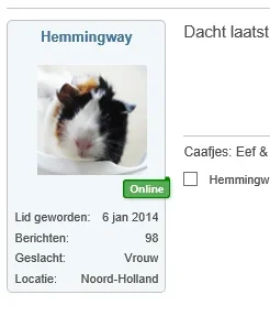
However, I can't confirm the issue, and I already fixed this specific issue a while ago:
Not sure why you guys are having issues, but you can increase the width of User Info Container and left margin of Content Container accordingly until it's just right. I'll have @Nights, my co-worker, take a look when he's available again and see if he can figure out why you two are seeing this.
I like the avatar width for profile info but not for the posts. Its way too large and dominating. Very distracting for readers. It becomes a post of avatars which isn't good for content imho.
I like the avatar width for profile info but not for the posts. Its way too large and dominating. Very distracting for readers. It becomes a post of avatars which isn't good for content imho.
Just wanted to mention that I respectfully disagree because we all have a right to our opinions. This is how it worked on vBulletin and how lot of people running XenForo have them set up (like here).
Hi, it still isn't working for me. The left sidebar is too wide and not quite lined up with the bottom. If you made the avatar wide the same as here, it would be choice for me. Hope that helps
Hi, it still isn't working for me. The left sidebar is too wide and not quite lined up with the bottom. If you made the avatar wide the same as here, it would be choice for me. Hope that helps
Jake, if you download this style to your site, do you experience the same issue? If yes, is it also an issue on KH-Flare? @Nights is busy with college and hasn't had a lot of time to come on lately, so figured I'd ask you.