Okay, that sounds good.
You are using an out of date browser. It may not display this or other websites correctly.
You should upgrade or use an alternative browser.
You should upgrade or use an alternative browser.
Turnkey Mobile Apps for XenForo with Addon/Theme Support, Android & iPhone [Deleted]
- Thread starter vbresults
- Start date
If the domain name has PS3 or sony in the name, it will be rejected by Apple. In terms of it being a modding site, if there isn't any piracy/warez involved, it shouldn't be a problem. The turn-key license is $29/mo (sorry for missing the last part, thanks for the reminder @whynot).@vbresults I have a quick question, i'm not sure if my site going to be approved by apple or not because it's mainly a PS3 modding site, I would like also to ask about the full paid app, what's the plan for $29 is it monthly or annual price?
Last edited:
thats weird, thats like asking themes to cut their prices because other themes are availableWill this be reduced in price now there is an actual native xenforo app available?
not my app so its up for vbresults to respond, just thought its a very weird question lol
Will this be reduced in price now there is an actual native xenforo app available?
I'm not seeing why this should cost less than the other one. They are very different and bring different capabilities. Have you tried both of them? I tried both before making my decision yesterday to pay for this one.
I've registered at https://www.turnkeymobileapps.com/ created a free app and tested it on my iphone. Works very well. Now I would like to buy the full version . What should I do no? Should I login to turnkeymobileapps.com and just create another app? Or can I upgrade the free version? @vbresults
You can do either; if you want email support and do not want sponsored listings, you can buy the premium version. If you want help center support and don't mind sponsored listings (see screenshot below), you can use the free version. There are buttons to take each of these paths on your app's page.I've registered at https://www.turnkeymobileapps.com/ created a free app and tested it on my iphone. Works very well. Now I would like to buy the full version . What should I do no? Should I login to turnkeymobileapps.com and just create another app? Or can I upgrade the free version? @vbresults
Both FMA (Free) and TMA (Premium) are full versions, they have the exact same features. Note, at the moment, version 1.x is deployed, which has advertising deactivated since it was reworked in 2.x, which is being released soon. So temporarily, if using the free version, there are no sponsored listings.
Screenshot of upcoming 2.0, sponsored listings are marked "Sp":

Last edited:
Hello,
I want to take the app put with extra feature, so do you do custom work?
If yes how can I contact you?
I want to take the app put with extra feature, so do you do custom work?
If yes how can I contact you?
At the moment no custom work is being done, but if that changes some time next year you'll be notified.Hello,
I want to take the app put with extra feature, so do you do custom work?
If yes how can I contact you?
Sad news :"(At the moment no custom work is being done, but if that changes some time next year you'll be notified.
do we get the app source when we buy? so we get ourself to make features we want?
No, you do not get the source codeSad news :"(
do we get the app source when we buy? so we get ourself to make features we want?
now I'm more sad xDNo, you do not get the source code
Thank you anyway for your good work with this app = )
I am a happy customer. I have three sites on the paid tier and 4 more sites on the free tier. Members like the app a lot.
I do have one feature request which would make it a lot better for my uses.
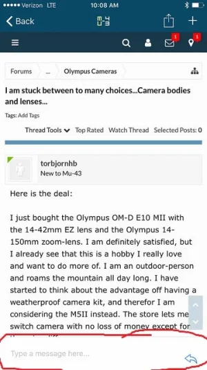
Currently the app defaults to showing a text entry area at the bottom of the page view like this:

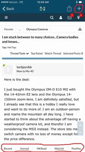
If someone taps on the plus sign in the upper right corner, it hides that text entry area completely like this:

My mobile style is already optimized to the point where I don't need the text entry space at the bottom. Members complain to me that it is redundant to have that.
In addition, members frequently ask me why the mobile bar buttons (Recent, Unread, etc) don't show in the app like they do on the mobile website. I tell them to tap on the "+" to make them show, and then they are happy. But for every member who asks me that question, there are no doubt others who simply stop using the app because they assume it lacks that feature.
So I am requesting that the option be added for site owners to disable the plus sign altogether so that the text entry part at the bottom never shows up.
I sent this request to @vbresults by email and was told it was possible if others request it as well, so I am posting it here in hopes that @The Sandman @RoldanLT and others will back me up on this request!
I do have one feature request which would make it a lot better for my uses.
Currently the app defaults to showing a text entry area at the bottom of the page view like this:

If someone taps on the plus sign in the upper right corner, it hides that text entry area completely like this:

My mobile style is already optimized to the point where I don't need the text entry space at the bottom. Members complain to me that it is redundant to have that.
In addition, members frequently ask me why the mobile bar buttons (Recent, Unread, etc) don't show in the app like they do on the mobile website. I tell them to tap on the "+" to make them show, and then they are happy. But for every member who asks me that question, there are no doubt others who simply stop using the app because they assume it lacks that feature.
So I am requesting that the option be added for site owners to disable the plus sign altogether so that the text entry part at the bottom never shows up.
I sent this request to @vbresults by email and was told it was possible if others request it as well, so I am posting it here in hopes that @The Sandman @RoldanLT and others will back me up on this request!
Okay, but if you were, wouldn't you like to have that optionI'm not using this app anymore.
The Sandman
Well-known member
I'll second that!I sent this request to @vbresults by email and was told it was possible if others request it as well, so I am posting it here in hopes that @The Sandman @RoldanLT and others will back me up on this request!
TMA is close to ideal for those of us who have worked hard to make our site styles very mobile friendly, which includes most of us using PixelExit, Audentio, or similar 3rd party styles. That text area at the bottom is the one wrinkle.
There are two things being discussed here, want to separate them to avoid confusion -- one is hiding the text entry area in 1.0/1.x (screenshot shown by @Amin Sabet ), the other is hiding the Home/Alerts/Whats New/Watching/New Post button bar in 2.0/2.x.

At first, I thought the first one was isolated to the homepage, where the text area was made hidden by default. My understanding was incorrect. It seems the option is wanted to also turn off the default display on the thread list and thread pages too, not just the homepage.
This is fixed in 2.0, and is replaced by a different type of text area that is only shown by tapping "New Post" -- the text area does not show by default anywhere. Even then, it's much smaller in terms of screen space taken up when made visible.
I've also seen requests for the other -- to hide the whole 2.0 button bar, for situations where the responsive style already provides some type of bottom bar of it's own.
The first request is already fulfilled in 2.0, which will be deployed in a few weeks -- the default text area is gone. With the understanding that these two items are separate, @Amin Sabet and @The Sandman , if you give your votes, 2.0 will add the option to hide the button bar.
Note, the native snap photo button as well as native page number navigation will be hidden when the "hide button bar" option turned on, since both of these need the button bar to function.
Ping @bloh
Last edited: