Browser issue Tooltip is hidden when selecting a paragraph

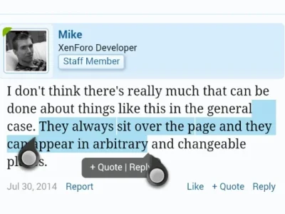
I don't think there's really much that can be done about things like this in the general case. They always sit over the page and they can appear in arbitrary and changeable places.
 
I don't think there's really much that can be done about things like this in the general case. They always sit over the page and they can appear in arbitrary and changeable places.
Maybe somehow let the users to choose if they want to copy/define the text or select it?
The "QuoteMe" add-on overcomes this by a button that disabled Apple's tooltip and enables quote selection.
Not sure if this is the best method here, maybe there are other solutions to this. It looks like Apple's tooltip is only shown on the top or bottom, on the blue selecting dots. There are two more dots on the sides, so maybe the code can be manipulated to show Apple's tooltip on one of the sides instead on its current place (or vice versa, to do it with XF's selecting quote).
But then I'm not sure how it would affect Android devices.
 
Last edited:
Does the pop-up have to appear attached to the (end of the) text?

Screenshot_2014-08-18-11-55-42.webp

I struggle most of the time to use the Reply option unless I zoom in on the screen so that the selection marker doesn't overhand the pop-up as much.

Maybe the pop-up could appear somewhere outside of the selection? That way it wouldn't be obscured by the various shaped selection markers.
 
As far as I can tell, the closing icon for all touch screen devices is below the line of text.
One possible solution therefore would be to have the tooltip above the line of text.

upload_2014-8-18_13-33-24.webp


Unfortunately it does obscure the selected text.
 
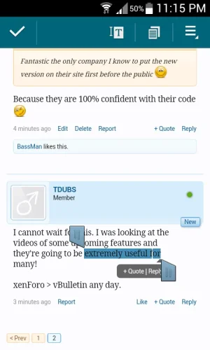
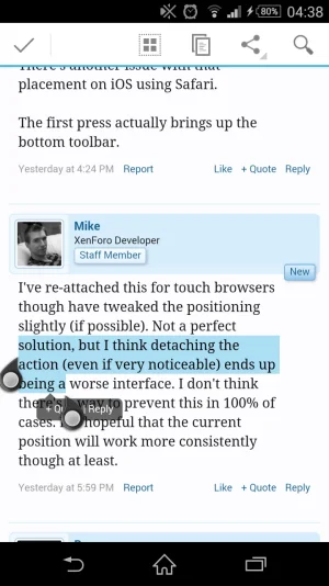
I can confirm this is also an issue on android. The end marker obscures most of the reply option in all cases I've tried so far.
 
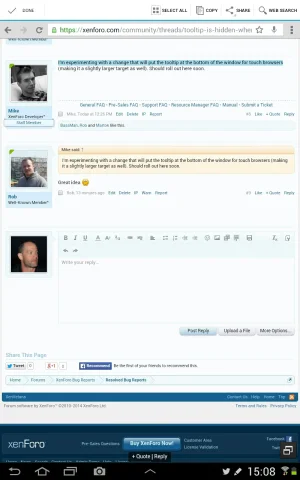
I'm experimenting with a change that will put the tooltip at the bottom of the window for touch browsers (making it a slightly larger target as well). Should roll out here soon.
 
I'm experimenting with a change that will put the tooltip at the bottom of the window for touch browsers
I hate to say this, but if you hadn't posted that I would have completely overlooked it and assumed it was no longer working.

Screenshots_2014-08-22-15-08-34.webp
 
@Mike, I see what brogan means. Could it maybe be bigger? When you explained it, I envisioned a block level layer that spans whole bottom of the screen?? That would get my attention because as brogan said it's easy to miss currently.
 
I personally don't think that would help.

It is too dissociated from the selected text and editor window.
 
Not big enough.
qm_touchevents-png.64067
 
Blimey, I didn't even notice it in Brogan's screenshot at first and it took me a few seconds once I realised there was a quote/reply tooltip (after subsequent replies) to spot it there at the bottom.

It is too dissociated from the selected text and editor window.
I totally agree.
 
Yeah, I think I'm going to roll it back. Even made more noticeable, I don't think it ends up being a good solution (hence "experimenting") since it just loses the association, particularly if the screen gets scrolled.
 
There's another issue with that placement on iOS using Safari.

The first press actually brings up the bottom toolbar.
 
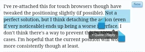
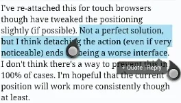
I've re-attached this for touch browsers though have tweaked the positioning slightly (if possible). Not a perfect solution, but I think detaching the action (even if very noticeable) ends up being a worse interface. I don't think there's a way to prevent this in 100% of cases. I'm hopeful that the current position will work more consistently though at least.
 
Top Bottom