Implemented The position of key buttons next to the breadcrumb

Grover

Well-known member
I am gonna to have a break from XenForo in the time to come. I just want to put the following in the limelight, because I feel it is or will become an issue when using XenForo. I think XenForo is (almost) perfect when it comes to the UI/UX, but I feel this could need some attention before XF becomes Gold.

I am talking about the position of key buttons like [Post New Thread] or [Search Threads and Posts] next to the breadcrumb. I believe this is a fundamentally wrong position and I will show why I think that.

[Search Threads and Posts]
First, there is this example about the [Search Threads and Posts]-button:
http://xenforo.com/community/thread...ics.2082/#post-30259

The [Search Threads and Posts] button there is more or less unrecognizable as a button that should be pressed to get more search options. It gets overlooked, very understandably, by endusers. To prevent it from being overlooked, it has to be put more into the viewpoint of the enduser. And that means... as close to the information-area as possible, there where the eye-focus of the enduser is. Meaning: in the center of the screen (right above the search input fields for example), not somewhere in a corner where it is not visible/clear/intuitive enough.

[Post New Thread]
The same problem occurs when users need to post a New Thread, as pointed out by Shanj in the following discussion where a visual example is posted in:
http://xenforo.com/community/thread...ead.2538/#post-41403

Needless to say that this can become obviously problematic. I don't know how XenForo displays multiple subforums underneath each other, but I could imagine it would be like this:
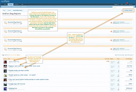
wrong position of key buttons in XF.webp

I believe a good UI should make it as easy/intuitive as possible to post a thread. Posting threads is THE BASIS of forums in the first place. That's why I find it a bit remarkable that XenForo puts the KEY button for this in a really counter-productive and non-intuitive position. A button with such an importance should be placed right there where the focus of the endusers-eye is, the moment he/she wants to post a new thread. And that is as near to the existing threadtitles as possible.

Those are my last constructive suggestions I will put out for a while (XF is near perfect in it's UI/UX for me). Hopefully M&K can share a part of this vision and re-think a bit the positions of those key buttons. I believe it will make XF better.

Keep up the good work (developers + community) and see you again after XF Gold's release!

Grover.

Please do [like] this first posting if you think it is a good feature suggestion for XenForo
 
Upvote 15
This suggestion has been implemented. Votes are no longer accepted.
Putting links/buttons at the end of text which can vary in length isn't a good idea.
This idea is a good one. I would argue it's also important not to "junk up" the UI. That is a good idea as well.
A good UI/UX should dictate that buttons, links, etc. should always be in the same place on every page view.
This idea is a good one. However, when you take into account another of your ideas ....
Optimise for the common case would be my suggestion ;)
I argue that the dropdown menu works because neither Mark Forums read, nor subscribe to this forum are *COMMON* use items.
Brogan: do you only use it on a forum where you are a moderator ? What percentage of your clicks on xenforo.com is mark this forum read ? Would 2 clicks work because only 1% of your clicking is Mark This Forum Read ? I never use it here, should everyone be subjected to seeing "Mark Forums Read" when a small percentage of people use it ? Does it help or confuse the "New to forums users" ? (The most important UI philosophy is less is more).
I use "Mark this forum read" a lot. I don't want to have to go looking for it.
Can you explain how you use it ?
A solution has been implemented here. Let's see what people think.

Hmmm ... I'll have to look for it I guess !
 
I don't use "Mark this Forum read" here as I am a moderator and therefore reading threads is obviously required, but on other forums I use it a lot, even my own.

You could argue the same point about other links and buttons; everyone uses forums differently.

I recall a similar discussion about the placement of the links on the lower navigation bar with some people wanting the most used ones on the left and others wanting them on the right.

I have made the point several times before but I'll say it again; it will be impossible to please everyone, no matter what implementation is finally decided upon.

If I don't like the final layout, I'll just edit the templates to suit which is why I posted previously that I'm not too worried about it.
 
Explaining why you put things where you did is important.

Okay, its probably just me but I think the 'order by' link on the pink bar are not really important so I took them off and placed the 'Post New Thread' button in their place and increased the size of the pink bar. That way it looks simpler. On one look, you go hey so that's a list of threads and oh yea.. and that's the button if I need to post my own thread. Instead of looking at it and going, wow too many items, how do I post my thread? Page number links (i think) are better when they are at the extreme right. Isn't that where the logout or exit or close buttons are all kept?

I think this way, its easier to navigate and find stuff. I don't know. We are brainstorming. Someone might feel my ideas aren't that good. :)
 
I don't use "Mark this Forum read" here as I am a moderator and therefore reading threads is obviously required, but on other forums I use it a lot, even my own.
Under what circumstances would you use "Mark this Forum read" ?
Do you check out the What's new and then go to key forums, look for important stuff, and when done click "Mark Forums Read" when you are done ?
You could argue the same point about other links and buttons; everyone uses forums differently.
One at a time baby.

I have made the point several times before but I'll say it again; it will be impossible to please everyone, no matter what implementation is finally decided upon.
Indeed. We are discussing specific situations. I think "Mark Forum Read" occupies a Premium position in Xenforo. "Expensive Real Estate" you might call it. I don't think it's used that much. I doubt that 1% of your xenforo clicking is using "Mark Forums Read" and I also think only Power users use it at all. For these two reasons I think the Premium Real estate that it occupies is out of proportion to it's usefulness. Location Location Location ! I don't put our wedding china in the daily dishes area, because we don't use it every day.

If I don't like the final layout, I'll just edit the templates to suit which is why I posted previously that I'm not too worried about it.
Indeed.

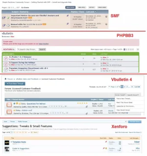
Here's how 4 major forums do it !
 

Attachments

  • comparison.of.4.major.forums.webp
    comparison.of.4.major.forums.webp
    116.4 KB · Views: 49
Under what circumstances would you use "Mark this Forum read" ?
On XenForo powered forums I use it to filter out content from the news feed (What' New?) I am not interested in.

Before I became a moderator here I used to use it pretty much every day to filter out everything from Test Messages, Off Topic, a lot of the Resources forums, ditto for add-ons and modifications.

For large forums I can imagine this practice becoming more common so the news feed content is more relevant to the individual.
 
phpbb has the new thread button well placed. i think.
i think i am too used to vbulletin. :D Kier's original design with sub-forums at the bottom was the best imo.
 
On XenForo powered forums I use it to filter out content from the news feed (What' New?) I am not interested in.

Before I became a moderator here I used to use it pretty much every day to filter out everything from Test Messages, Off Topic, a lot of the Resources forums, ditto for add-ons and modifications.

For large forums I can imagine this practice becoming more common so the news feed content is more relevant to the individual.

Aha !
As I expected, what you really want is a "Filtered" What's New !! So Do I :)

I think moderators and admins should have much much more power over the "What's New" - especially granular filtering.

Some days, I dont want to read "Off Topic" some days I really do.

What you are doing is manually filtering the what's new.

In reality, you don't want "Mark Forums Read", you want a "Filtered What's New?" or a What's new ONLY in the forums you want to read right then and there.
 
I would still need to mark the forums read that I don't filter though, as I wouldn't necessarily want to read every post.
 
Default design is not consistent: preference for the new alternative

To add some more fuel to this exciting :cool: discussion:

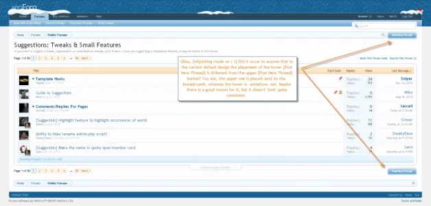
Okay, [nitpicking mode on ;-)] Did it occur to anyone that in the current default design the placement of the lower [Post New Thread] is different from the upper [Post New Thread] button? You see, the upper one is placed next to the breadcrumb, whereas the lower is -somehow- not. Maybe there is a good reason for it, but it doesn't 'look' quite consistent:

post new thread buttons not consistent.webp


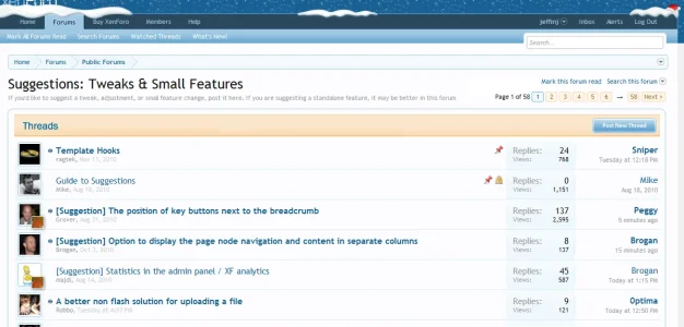
This in itself is another reason (albeit small, because it's a bit of nitpicking) why I like this mockup based upon Kier's new alternative:

How Location 2 looks without subforums.webp

... because this solution places the upper [Post New Thread] more in the same position (in relation to the breadcrumb) as the lower [Post New Thread]. So it all really fits.

Not only that but this solution seems also a bit less cluttered then the first version/proposal of Brogan to put the [Post New Thread] next to the 'Mark this forum', 'Search this forum', 'Selected Threads' - links as shown in Example 4 here and here:

button-png.7930


So what I said here still stands for me. From all our suggestions Kier came up with a placement/solution that we didn't think of ourselves (where have I experienced this before? ;)) and in my opinion this placement (without the 'jumping' of the button that is) is the best. Granted, not so ideal (too much white space) when you have subforums, but for the layout without subs it looks the best as the above second screenshot/mockup proves.

Now I need to eat for once and finally clean my house ... XF is too addictive! :)
 
Kier's current implementation was suggested previously but it introduces an extra row of whitespace which is why I personally didn't like it.

It's also still inconsistent with the lower button as that is on the same row as the page navigation.
 
Kier's current implementation was suggested previously but it introduces an extra row of whitespace which is why I personally didn't like it.

Yes, I mentioned this indeed in my posting above. But only when you have subforums. The mockup I created was/is not visible in real life, because of the 'jumping' of the button (without subforums Kier places the button still next/attached to the breadcrumb). If we get rid of that breadcrumb placement it looks really good without subforums (and the whitespace it creates then).

It's also still inconsistent with the lower button as that is on the same row as the page navigation.

Yes, you have a point there :).
 
It's also still inconsistent with the lower button as that is on the same row as the page navigation.

Yes, you have a point there :).

But... you have to agree with me then that placing the upper [Post New Thread] next/attached to the breadcrumb like it still is the case, is the most inconsistent placement of all? Because the page navigation is nowhere to be found there as well :). So I assume this was not a big argument in the first place for Mike and Kier in their original design?

The bottom-line is this: we can talk about consistency as much as we want (like I do myself ;)), but at the end of the day the ease-of-use/usability has a higher priority then consistency in my book. My point being: so what if a button is not quite on the same line with other elements or ditto buttons somewhere else on the screen? If it makes the product more easier/intuitive to use when positioning a button in maybe a tiny less consistent place compared to other elements... just do it! Priority = usability.

(the usability issues presented here is the reason why I started this discussion 4 months ago)
 
A solution could be to integrate the links (mark this forum read etc.) somewhere else and have the button instead. Since the button is actually more important than the links, this makes sense.

For example you could replace "mark all forums read" with "mark this forum read" on thread list pages. This also makes sense, since you are viewing a single forum, not a list of forums.
 
comparison-of-4-major-forums-jpg.7994

Of the major forums survey, xenforo has the "rightmost" Post Button.
The two largest forums (phpBB3, vB) have the the [New POST] button all the way to the left.
 
IPB has its new discussion button to the right too. Neither way is correct, it's a case of fitting in with established design principles within the style of the system.
 
IPB has its new discussion button to the right too. Neither way is correct, it's a case of fitting in with established design principles within the style of the system.

Sounds good.
Really, all the forums look very similar.

I just don't see how the style of invision and xenforo dictate they are suited to a [Post] button on the right side.

I think IPB does have the best search bar. The easy Toggle from Forum to Site looks handy.

IPB (Invision Power Board).

invision.post.button.webp

I think the changing the [Post] button to [You Cannot start a new topic] is smart.
 
Not sure what your point is Digital Doctor? What Kier said is simply that XF has most of its layout finalized, and at this time the 'post new thread' button fits on the right side in this layout. There is no reason to place it at the left side.
 
Top Bottom