Please make the order of plus/minus buttons in "Go to page" more intuitive

Steffen

Well-known member
Upvote 8
Not only here. I think the increade + button should in LTR languages always be on the right side. Your links are good examples.
 
Page numbers decrease to the left, and increase to the right. I think it would make sense to reflect this in the order of the plus and minus buttons:

Status quo:
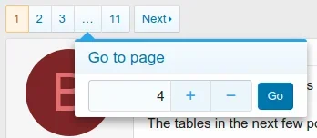
View attachment 199600

What I think would be more intuitive:
View attachment 199601

What do you think? :)

See also (1): https://ux.stackexchange.com/questi...-the-right-plus-or-minus-in-a-counter-feature

See also (2): https://ux.stackexchange.com/questi...-position-for-selecting-number-of-passengers/

I think they are correct the way they are.

If I am "jumping" to a page, I am more apt to be going forward then backwards.
 
If I am "jumping" to a page, I am more apt to be going forward then backwards.
The unmentioned assumption in this argument seems to be that the mouse is initially positioned on the input field (or relatively close to it). But to submit the form, you have to move the mouse over to the "Go" button. So the one distance that definitely matters is the one between the "+" button and the "Go" button. And this distance is smaller if you move the "+" button to the right. ;)

Edit: Maybe this proposal would be even better: https://xenforo.com/community/attachments/2-go-to-page-mockup-png.178147/
 
I would also suggest putting the + button to the far right after the [Go] button: - [Input Box] [Go] +

This is analagous to << Page >>

The problem with putting + just after the input box is it creates usability issues on touch screens. When I am using my finger to hold down the + button I can't see the page number being scrolled in the input box. Putting the + after the [Go] button would make things more usable on touch screens. The - button to the left of the input box wold still be usable since the number is changing to the right side of the input box. That's why the + button doesn't work just to the right of the input box.

Edit: after poking around in the code it seems this may be problematic to implement due to the [Go] button residing outside the numberbox. Perhaps a better compromise is to style the input box with text-align: center per the mockup posted above but with a little more padding to ensure fingers don't block things.
 
Last edited:
Back
Top Bottom