Indeed.. but since I'm an action gal, I just went ahead and changed the hex values in the redactor.js in beta 4 with the hex values from beta 3 No need for me to criticise something that I'm capable of changing for myself
Simplify !
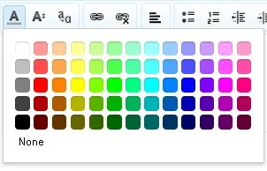
Hardly do people need 65 colours to choose from.
I like the new colours better.
Most importantly, it should be easy for a webmaster to tweak if they want.
Does the mobile style give 65 options ?
That can't be good.
The mobile colour selection is awkward.
The 65 tiles look too small.
I would have 5 main colour options ... with the option to show more, for the rare time someone wants more.
I tested the small color tiles and they seemed to be relatively easily selectable.
I guess it works well. I myself see zero point to that many options.
")
") XenForo will never please every one.
XenForo will never please every one. No need for me to criticise something that I'm capable of changing for myself