You are using an out of date browser. It may not display this or other websites correctly.
You should upgrade or use an alternative browser.
You should upgrade or use an alternative browser.
Lack of interest [Suggestion] Alternative style chooser
- Thread starter CyberAP
- Start date
This suggestion has been closed automatically because it did not receive enough votes over an extended period of time. If you wish to see this, please search for an open suggestion and, if you don't find any, post a new one.
This suggestion has been closed. Votes are no longer accepted.
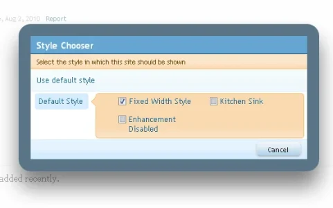
I appreciate that. But for the end user it doesn't matter how much markup is behind it. I just don't see the sense in having the style chooser be such a big deal (visually) and it not offering any functionality for the end user that they don't get through the dropdown menu.The drawbacks of a basic dropdown menu is that it's big/ugly and it creates a lot of extra markup especially if you got multiple styles. The popup system works better imo but it would indeed be much nicer if there was a preview visible for each style. Automated if possible would be great.
Do vB and IPB have thumbnails with the dropdown menu system then?
As I have posted on another thread, how would the thumbnail be created?
If you're relying on the administrator/forum owner to take a screenshot, crop and resize it, rename it and upload it to a specific directory then that's obviously not an option as not all admins/owners will know how to do that.
http://xenforo.com/community/threads/suggestion-thumbnails-for-styles.3772/
Guys, you make it all difficult to users. They just want to choose a style. They don't want to watch page with all these styles and previews. Title says it all. It's good when you click and pop-up shows all the styles structured (like in AdminCP) so they can understand which sub-style has main style.
Just because IPB and VB uses a way of doing something does not make it the best way.To be honest I prefer the way vBulletin and IP.Board (I think) have it. Just a simple dropdown menu. Always worked best for me.
To be honest, if you're gonna have an elaborate style chooser interface like you have here, I would expect a thumbnail of each style or something. The style chooser right now is certainly not being used to its full potential.
Carlos
Well-known member
I agree.Just because IPB and VB uses a way of doing something does not make it the best way.
He said that he liked the way they did it, not that because they did it he liked it.Just because IPB and VB uses a way of doing something does not make it the best way.
To be honest I like CyberAP's mockup. I understand completely what he's saying. Use the style chooser at vbstyles.com, maybe you'll understand.
*sigh* Why so defensive?Just because IPB and VB uses a way of doing something does not make it the best way.
I haven't said anywhere that something is one way or another because someone else does it that way.
What I said was... Oh well never mind. What's the point in repeating it if you didn't seem to be able to understand it the first time.
Oh, I understood it, just saying that I happen to like this way and everyone keeps comparing xf to vb and IPB.*sigh* Why so defensive?
I haven't said anywhere that something is one way or another because someone else does it that way.
What I said was... Oh well never mind. What's the point in repeating it if you didn't seem to be able to understand it the first time.
I've used that one before so I do understand. I still don't see a need for the extra coding.He said that he liked the way they did it, not that because they did it he liked it.
To be honest I like CyberAP's mockup. I understand completely what he's saying. Use the style chooser at vbstyles.com, maybe you'll understand.
No, you said that just because vB or IPB do it that way, doesn't mean it's the best way. Which is a pointless thing to say because nobody even hinted in that direction.Oh, I understood it, just saying that I happen to like this way and everyone keeps comparing xf to vb and IPB.
What I did say is that for the end user a little dropdown box is more obvious than this pop-out we have in xF. Whether vB, IPB or anyone else do it that way is of no consequence. Other than it plays a little role in what the people are used to. But that is not that important, because people will get used to it if it's good.
In my opinion, if you're gonna have a pop-out and whatnot, at least offer some extra functionality that a dropdown menu doesn't offer. An important part of the xF philosophy is making things easy and simple for the end user. That is why I think this is a good point to make.
Quite apart from the fact that (sensible) suggestions make xF a better software. Which is the reason we're all here.
So did I... And the sooner we get back to that, the better.
As I wrote previously - I think that the way the style chooser is now is not very good. Compared to the rest of XF that is.
It doesn't do anything that a dropdown menu doesn't. I think it should add a little something to justify it being a pop-out.
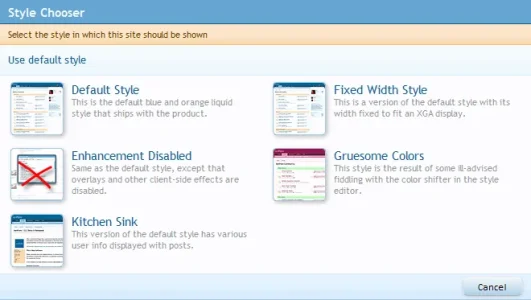
Like little preview images of the style.
As I wrote previously - I think that the way the style chooser is now is not very good. Compared to the rest of XF that is.
It doesn't do anything that a dropdown menu doesn't. I think it should add a little something to justify it being a pop-out.
Like little preview images of the style.
Dutchbb,The popup system works better imo but it would indeed be much nicer if there was a preview visible for each style. Automated if possible would be great.
It seems your wishes (and this one from Enigma) have been fulfilled by XenForo:
I think it's just beautiful. For those people who found there was nothing 'wrong' with the former offering... well nothing was 'wrong', but it must be obvious this is such a great improvement? It's the best style chooser I have ever seen on any forum product.
Although it's not essential functionality, things like these make the UI/UX of XenForo an even more pleasurable experience than it already was. Even the not-so-much-used functionality get this excellent 'XF UI/UX'-paint over it and this eye/care for 'detail' in the UI/UX throughout is just so welcoming refreshing. Outstanding.
Dutchbb,
It seems your wishes (and this one from Enigma) have been fulfilled by XenForo:
I think it's just beautiful. For those people who found there was nothing 'wrong' with the former offering... well nothing was 'wrong', but it must be obvious this is such a great improvement? It's the best style chooser I have ever seen on any forum product.
Although it's not essential functionality, things like these make the UI/UX of XenForo an even more pleasurable experience than it already was. Even the no-so-much-used functionality get this excellent 'XF UI/UX'-paint over it and this eye/care for 'detail' in the UI/UX throughout is just so welcoming refreshing. Outstanding.
It really helps that kier has a designers eye as well as excellent coding development skills but the background design knowledge in his case has certainly helped in the way the UI/UX looks and feels. And, of course I agree that it's nothing short of outstanding. RC1 in my mind is a brilliant release and they just seem to be getting better and better.
Similar threads
- Replies
- 2
- Views
- 149
- Question
- Replies
- 9
- Views
- 904
- Replies
- 1
- Views
- 783

