I want to start off by stating that I have a full understanding of the alert users system that is in place. There isn’t anything wrong with it, I just think it could use a small quality of life change:


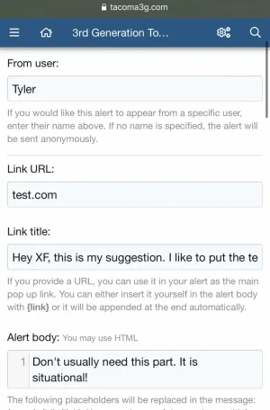
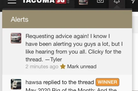
The screenshots above are my preferred input and output. (The input text doesn’t match the output text, but just pretend it does for this.)
Putting all of the text in the link title box makes the alert function as it normally does on XF. The whole alert box is a link; not just certain words.
If put your text in the alert body instead, which I would call situational because of the useful HTML and and placeholders, the alert box will use the link text or automatic link at the end of the text as the spot where you should click to go to the link. So, you’re clicking on a normal URL instead of the entire alert box to go to the link.
Even more inconsistent is that you actually CAN still click the whole alert box anyway. It just looks funny because the link text still appears like a URL would, suggesting it should be click, when you can less obviously just click anywhere.
But here is the part I dislike the most: Putting your text in the body box is useful because of the HTML and also because it’s a larger text box to be typing a message in. However, if you use this box, you have to either add some link text in your alert body (resulting in the funny URL thing mentioned above), OR you have to leave the link text box blank and then it will automatically display the entire link at the end of the alert, which is almost always unnecessary. (Members don’t really need the full link URL; it’s unlikely the forum owner would send them to a malicious website.)
This is my proposal:
Option 1: If the link text box is left blank and the alert body box has the message, allow us to opt out of having the full URL tacked onto the end of the alert message.
Option 2: Literally just make the link text box as big as the alert body box so we can do what I did in the screenshot, but longer text messages will show on your screen as it should.
If this is very confusing, I can explain further.
Upvote
0