Ingenious
Well-known member
I've noticed that my fluid forum looks a bit too wide and sparse on an HD monitor so I would like to set a max width, say 1200px. So ideally to have a min width too (as it has fixed width banners) of say 800px.
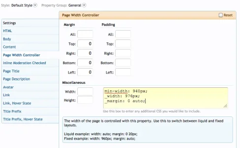
My styling at the moment for a completely fluid forum that fills the screen is:

I have tried simply adding max-width: 1200px; but this constrains only the forum body and not the header background, which still covers the whole width of the page (it's a 2000px wide image). And it doesn't centre the page either, it is left aligned.
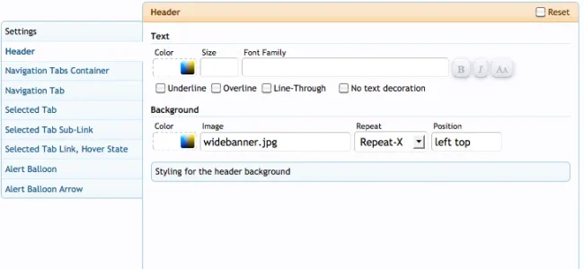
My header style is:

How can I have a fluid width that affects the whole page including the header, keeps things centred if it's narrower than the browser window, and keeps the header background aligned with the top left of the header/logo area even if it's narrower than the browser window? But has min and max sizes also set?

My styling at the moment for a completely fluid forum that fills the screen is:

I have tried simply adding max-width: 1200px; but this constrains only the forum body and not the header background, which still covers the whole width of the page (it's a 2000px wide image). And it doesn't centre the page either, it is left aligned.
My header style is:

How can I have a fluid width that affects the whole page including the header, keeps things centred if it's narrower than the browser window, and keeps the header background aligned with the top left of the header/logo area even if it's narrower than the browser window? But has min and max sizes also set?