XF 2.2 Making Sub Nav Row same max width as the max page width

vintage

Member
I want to make the Sub Navigation Row background color the same width as the Maximum Page Width: 1400px.
By default the Sub Nav Row seems to extend the full width of the window, wider than the Max Page Width.

I put this in the extra box for the Sub Nav Row:
max-width:1400px;
and it did make it the proper width, but it was aligned to the far left of the window.
so I added this:
margin: auto;
But that makes the box and text centered in the page and small, no longer 1400px wide.

I still want the text left justified in the Sub Nav Row, I just don't want the Sub Nav Row background color to extend any wider than the Max Page Width at 1400px.
As seen here:
 
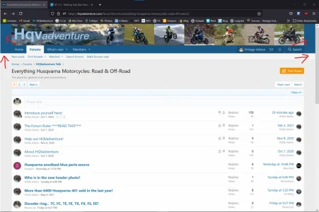
I just set up a light colored style, and that has revealed to me that it isn't just the Sub Navigation row that extends too far to the sides. The area above that, maybe the header background color?, also extends past the Max Page Width.
See the red arrows in the picture below.
Any help please?

1623170769606.webp
 
Last edited:
Try this:

CSS:
.p-nav, .p-sectionLinks {
    width: 100%;
    max-width: 1400px;
    margin: auto;
}

If 1400px is not the number you're using, change it to the same number you have in the 'maximum page width' field in the page setup style property.
 
Ok, so I did some googling and I added p-header to the call, like this:
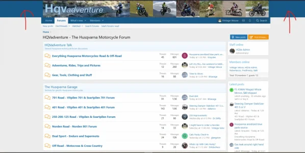
/* edit: Make header color backgrounds only 1380px */ .p-header, .p-nav, .p-sectionLinks { width: 100%; max-width: 1380px; margin: auto; }

And that seemed to work! But, I was just plugging around: was that a good method to fix this or will there be side effects that I just don't understand?

1623196206895.webp
 
If it displays as expected at all screen widths, then it's good.

Resize the browser or access via different devices to confirm.
Got it.
I ended up changing my method.
I put this in each "extra" "code box" for all the relevant rows in the Header and Navigation section.

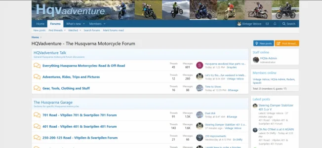
width: 100%; max-width: 1400px; margin: auto;

It is repetitive having to do it for each row, but I think that way is better for a novice like me, as it is a child style and won't get lost if I update the parent style that way. I hope.
 
Yes. Is there a particular setting for that?

put this code in your extra.less template. Adjust the width to your liking in this code and match it with your page width in your property ACP. You will then have to have a very small css (which I will provide in a minute) to adjust your background since it's now a boxed style and your page background will be a bit changed. (which is what I always use).

I would also strongly suggest you consider purchasing a pixelexit theme as their themes are quite easy to work with and will do what you need without having to add this code plus excellent support. I hope the below code is what you are looking for.

Create a test style in default and use this code to get used to it. I'll brb with the code for the boxed background.

.p-pageWrapper {
max-width: 1230px;
margin: 0 auto;
padding: 15px;
}
 
Last edited:
add the below css after you've created your box style with the above code. Add this css to your extra css template as well and adjust color to your liking or link to a pic :)

html{background: red;}
 
put this code in your extra.less template. Adjust the width to your liking in this code and match it with your page width in your property ...
That does work nicely. A slightly different effect, as it constrains the size of the background to the page wrapper. The method on post #9 allows the background to full the entire window.
Very interesting, Thank you.
And thank you sixlxvi and brogan as well!
 
Back
Top Bottom