Responsive Design for XenForo 1.1 [Paid] [Deleted]

The new youtube embedded is amazing. It scales down the video thumbnails really really well in both landscape and portrait.

I have an Android phone(havent tested on iphone yet) but ideally the only downside I can see is that it doesn't load in the Android YouTube player. It loads in the embed and is quite sluggish and just doesnt feel right.

Heres the twist, I dont know how, but Jaxels add-on does this, although it doesnt have the great format that the new updated responsive design shows.

So my question is, can we get support for auto-sizing of XenMedio videos? Embeds and from the media pages.
Also, can we get the XF embedded YT videos to load in the YT player in Android?
As always, im more then happy to help and be a tester.

Thanks Arty
 
Arty,
Just found out why my youtube doesn't work with your latest version. I use the HTML5 embed code instead of the default XF iframe code. Here is the one I have. Would be great if you get it to work with html5 object embed as well.
Code:
<object width="500" height="300" data="//www.youtube.com/v/{$id}&amp;fs=1" type="application/x-shockwave-flash">
<param name="movie" value="//www.youtube.com/v/{$id}&amp;fs=1" />
<param name="allowFullScreen" value="true" />
<param name="wmode" value="opaque" />
<embed src="//www.youtube.com/v/{$id}&amp;fs=1" type="application/x-shockwave-flash" allowfullscreen="true" wmode="opaque" width="500" height="300" />
</object>

Arty,
The experimental support doesn't seem to work. I wrap my youtube media code inside a <div class="video-container"> and add the following to responsive_extra.css and it works. After I upgraded to the latest version, I remove them and the youtube does not seem to scale down. Would love to use your addon to take care of this as I have other media bbcode and I don't want to touch them.
Code:
.video-container {
position: relative;
padding-bottom: 56.25%;
padding-top: 30px;
height: 0;
overflow: hidden;
}
 
.video-container iframe, 
.video-container object, 
.video-container embed {
position: absolute;
top: 0;
left: 0;
width: 100%;
height: 100%;
}
 
The new youtube embedded is amazing. It scales down the video thumbnails really really well in both landscape and portrait.

I have an Android phone(havent tested on iphone yet) but ideally the only downside I can see is that it doesn't load in the Android YouTube player. It loads in the embed and is quite sluggish and just doesnt feel right.
I tested with an Android phone.
If your youtube embed is using the default iframe, it will play inside your browser.
If you change your youtube embed into html5 object, it will play in your phone youtube player. The html5 code is above.
 
That code deals only with iframes. To resize other tags add something like this to responsive_extra.css (replace iframe with other tag):
Code:
    iframe
    {
        display: none;
    }
    
        .baseHtml iframe
        {
            display: block;
            max-width: 100%;
        }
Arty,

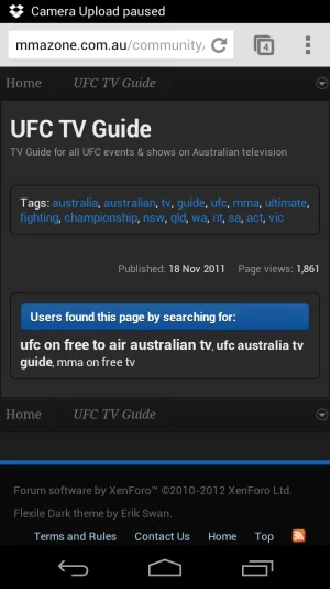
May have found a bug. My embedded Google Calendar has disappeared from mobile view(landscape or portrait)

URL: http://mmazone.com.au/community/pages/tv-guide/
Add class="baseHtml" to <article> tag before your calendar code or add this to responsive_extra.css
Code:
article iframe { display: block !important; }
 
That code deals only with iframes. To resize other tags add something like this to responsive_extra.css (replace iframe with other tag):
Code:
    iframe
    {
        display: none;
    }
   
        .baseHtml iframe
        {
            display: block;
            max-width: 100%;
        }

Add class="baseHtml" to <article> tag before your calendar code or add this to responsive_extra.css
Code:
article iframe { display: block !important; }
Sorry maybe I dont quote follow your instructions, I tried adding your code to responsive_extra.css with no luck and the article tag which I think i did wrong - <article class="baseHtml"></article> into my calendar page html. sAny ideas?
 
Hi guys - just noticed an IE-wide bug on this add-on (happens in IE9, as well as on IE Mobile for Windows Phone). The forum displays, but clicking on a thread gives a 404 not found.


I saw you had a similar issue with the theme Soft Responsive, which was around the javascript style.js. Did you make the same change to the add-on?

looks like the update hasn't addressed the issue above fully. When I click on a thread, the first time it will give me a 404 page not found, the second time it will load. This is on IE9 mobile running Windows Phone 7.5.

I don't have a PC with IE9 to hand at the moment, but in the previous version of Responsive Design I noticed the same issue. Is it working smoothly on a desktop now?
 
@ddmmh: I don't see ether code on your forum.

@Silvan: make sure you uploaded new responsive.js and refreshed it in mobile browser. You can check it by clicking near link instead of link, if it works then you have old js file.
 
@Silvan: make sure you uploaded new responsive.js and refreshed it in mobile browser. You can check it by clicking near link instead of link, if it works then you have old js file.

Sorry, think my Windows Phone was caching the JS file. All working now :)
 
Arty....

Have been changing a few things on my site, and I noticed that the XenPorta "Recent Slider" seems to be "responsive", but not the "Recent Accordian".

I have both blocks up and running at my site currently, if you'd like to take a look.

http://www.awalkerbit.me

I would like to go with the Recent Accordian, only because I can easily control the height of that block.
 
It should work, but will require minor adjustments.

Few lines of code to add to responsive_extra.css
Code:
.porta-link-box { height: auto !important; }
.porta-link-box a { margin: 10px auto !important; width: auto; float: none; }
and you'll need to do something with recent activity and 2 other blocks in footer of portal page, they use inline style and don't even have class names
 
Top Bottom