Yes.Still works on xf 1.2.0 ?
Yes.Still works on xf 1.2.0 ?
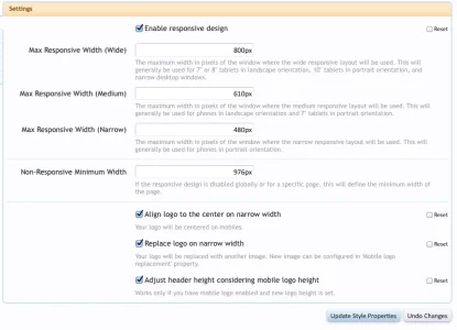
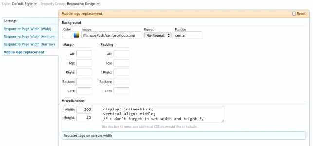
Doesn't seem to be working :\Use Mobile Logo Replacement property. Set height and image source there and then enable 'Adjust header height considering mobile logo height' property.

I'm currently developing the style on local host, once I go live with it on my site I'll get back to you and hopefully we can sort this outStrange. Can you give me a link where you are testing this?

Looks fine for me@CyberAP
http://orojackson.com/forums/
I'm using mobile logo replacement property and have checked adjust header height, but it seems to still have that space, the theme is now live there so you can check it out. Sorry for teh trouble!

Oh it does replaces the header fine, but while you are resizing the browser/at different sizes in responsive there is a lot of extra space above/below the header. at http://bbsmiley.com/ while resizing there isn't space above/below the header. As far as I am aware @Shelley is using your add-on.
Use Mobile Logo Replacement property. Set height and image source there and then enable 'Adjust header height considering mobile logo height' property.

") Is it possible to upload a mobile logo at twice the size I want it displayed at, but have the Respollo add-on display it at 50% size. If so, what do add to the Respollo.css template to make this happen?
Is it possible to upload a mobile logo at twice the size I want it displayed at, but have the Respollo add-on display it at 50% size. If so, what do add to the Respollo.css template to make this happen? 
We use essential cookies to make this site work, and optional cookies to enhance your experience.
