XF 1.4 Question about responsive design

Amin Sabet

Well-known member
My question relates to how my sites (using mildly customized default XF 1.4 style) render on my phone (iPhone 6 Plus) vs my small tablets (Nexus 7, iPad Mini).

I have read this resource and the accompanying discussion: https://xenforo.com/community/resources/responsive-design.2193/

iPhone 6 Plus renders at 1242 × 2208 pixels
Nexus 7 (later model) renders at 1200 x 1900 pixels

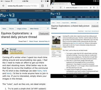
Here is how my site looks on iPhone 6 Plus (left) compared with Nexus 7 (right)
IMG_0397.webp

You can see how the avatar and member info are shown above the message text on the phone, and to the left of the message text on the tablet. On the tablet, the message text looks quite small at normal reading distances.

What I'd like is for the small tablets (7" Android tabs, iPad Mini), when used in portrait orientation, to render like a phone. How can I accomplish this?
 
The screensize in pixels that a device has is not the same as the viewport size.

You can see the viewport sizes for different devices here:

http://viewportsizes.com

You can find the viewport size of the device you are using here:

http://viewportsizes.com/mine/

I changed all the trigger points to 1540 and still can't get the Nexus 7 to switch. Could one of you tell me the trigger point settings to use so that all of the 7-8" tabs will render like a phone?
 
Nexus 7 (2012 version) has a viewport size of 601 x 962. You can use the link in my last post to test on your devices (Nexus 7 2013 in your case) to find the trigger points.
 
Nexus 7 (2012 version) has a viewport size of 601 x 962. You can use the link in my last post to test on your devices (Nexus 7 2013 in your case) to find the trigger points.
A very useful link @Martok, thanks.

I'm not lazy, I'm clueless. But I can't seem to use this knowledge:

"Nexus 7 (2012 version) has a viewport size of 601 x 962"

to find a trigger point setting that works for what I am trying to do.

My current trigger point settings are the default 800px/610px/480px/976px. I've tried setting them much higher (1540px/1540px/1540px/1540px), and I've tried setting them lower. No matter what I enter, the Nexus 7 doesn't render like a phone. Can you suggest numbers for me to replace those four numbers with?
 
No, you need to do that after using the site I linked to. I don't have your devices so don't know the viewport sizes.

Thanks, I understand now. Using that site, I found the following viewport widths for my devices:

iPad (all types): 768
Nexus 7 (newest): 600
iPhone 6 Plus: 414

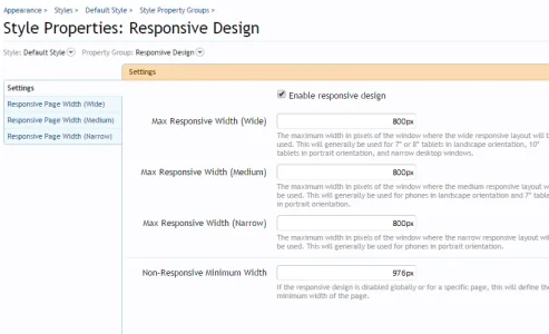
In order to get all of these devices to render as desired (with the narrow responsive layout), I had to set Max Responsive Width (Narrow) to "800"

Can anyone explain how the medium responsive layout differs from the wide responsive layout when using the default XenForo 1.4 style? These settings seem to give me the results I wanted:

2015-03-21_2031.webp
 
Last edited:
Medium responsive width is the first one that puts the sidebar below the forums.

The easiest thing to do is look at this forum and slowly decrease your browser width on your PC to see the 3 different responsive looks.

Regarding your settings, you probably won't want all of the responsive settings set to 800. I'd expect to see differing views on tablets, PC and phones due to their differing viewport sizes.
 
Last edited:
Medium responsive width is the first one that puts the sidebar below the forums.

The easiest thing to do is look at this forum and slowly decrease your browser width on your PC to see the 3 different responsive looks.

Regarding your settings, you probably won't want all of the responsive settings set to 800. I'd expect to see differing views on tablets, Post and phones due to their differing viewport sizes.

Got it. Thanks, again!
 
Top Bottom