Lack of interest Provide a name for the User Control Panel

This suggestion has been closed automatically because it did not receive enough votes over an extended period of time. If you wish to see this, please search for an open suggestion and, if you don't find any, post a new one.
This suggestion has been closed. Votes are no longer accepted.
I would rather people's usernames be up there, then they know that area is for them.

If you would like that, I think you should change the template.
 
I like your suggestion, James. I think that would be a huge improvement if that was the default in Xenforo.

I think, personally, it doesn't need to be. Sure, maybe the old arrow can be put back to identify it as a dropdown but it isn't necessary IMO.

You can change the phrase though if need be!
 
I just don't buy this argument which is constantly trotted out about members being too stupid to work things out for themselves or follow simple directions.

Yes it's an interesting issue. Ive come up against you and a few others several times on this one. Then a few people chime in with me about it. So there seem to be different kinds of communities. Some are pretty savvy and some are definitely not.
It does no good for me to say I don't have experience of these whizzy users who only need to be told once, and who work a lot out for themselves. Because you do, and so do others. So there are strikingly different admin experiences.

Possibly because I work with
a) very young users
b) disabled users - some very disabled
c) anxious stressed out parents who can just about email (I teach them to do attachments!) struggling for the sake of their kids
d) an elder population to whom net things are challenging - research shows that over 60s find the concepts alien.

I wouldn't call my communities stupid though nor all the others like them. Just there are a substantial number of net user who have very limited net skills, and lack confidence around learning.
If you're working around being an admin, any area of tech, vehicles (in fact stereotypically masculine zones) online business, a lot of contemporary arts, games, music, then it will be very different.

Just different needs.
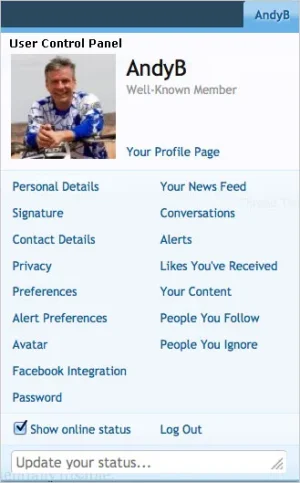
 
I think, personally, it doesn't need to be. Sure, maybe the old arrow can be put back to identify it as a dropdown but it isn't necessary IMO.

You can change the phrase though if need be!

Looking at other websites (ie: facebook, youtube and Stack Overflow) having your username on the right part of the navigation is the norm. I still think that once you click your username in xF and open up "Username Dropdown" it would be a nice touch to describe it with a name.

Regarding changing it on my forum, I prefer to leave things as stock as possible. Leaving things like this stock is better as members might visit several other xF forums and having controls be the same between the different xF forums is preferable. That's why I'm making suggestions in this forum in the hopes that in the future this could be improved.
 
Last edited:
Yes it's an interesting issue. Ive come up against you and a few others several times on this one. Then a few people chime in with me about it. So there seem to be different kinds of communities. Some are pretty savvy and some are definitely not.
It does no good for me to say I don't have experience of these whizzy users who only need to be told once, and who work a lot out for themselves. Because you do, and so do others. So there are strikingly different admin experiences.

Possibly because I work with
a) very young users
b) disabled users - some very disabled
c) anxious stressed out parents who can just about email (I teach them to do attachments!) struggling for the sake of their kids
d) an elder population to whom net things are challenging - research shows that over 60s find the concepts alien.

I wouldn't call my communities stupid though nor all the others like them. Just there are a substantial number of net user who have very limited net skills, and lack confidence around learning.
If you're working around being an admin, any area of tech, vehicles (in fact stereotypically masculine zones) online business, a lot of contemporary arts, games, music, then it will be very different.

Just different needs.

While it may seem you deal with users who aren't very capable of navigating XenForo, I think in terms of software suggestions there's a limit on how dumbed down the software can be.

We have so much control so we can adapt the software to our needs. As such, XF needs to provide an experience for the majority (who are all capable of navigating and understanding how to use the software). For the minority, the tools are there to modify.

Sometimes the suggestions are too specific to your site to be implemented globally.
 
Sometimes the suggestions are too specific to your site to be implemented globally.
Nicely put James but you missed the point that whenever this has come up I'm by no means the only one who cares aboit considerate design. It's not just me.

Good design which makes things clear and accessible is not the same thing as dumbing down.
Dumbng down is making things too big with big big icons (rather like the admincp icons in centre content area actually!)
Or hiding controls so you cant do things like Windows has ever since XP.
Clear and accessible = all the key things are there, I don't need to click around to find what I need. If I do have to click it's on a triad traffic light design - immediate need-very few items large in prime territory / secondary print or second level/ tertiary small print or 3rd level.
 
Top Bottom