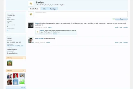
Instead of explaining it I provided a mockup via the attachment which explains it better than I could. As you can see the follow/followers block are moved towards the bottom and the avatar's been shifted to the right next the the profile members data/credentials with the gradients extended across the left (where the avatar was) instead of the white space. Thoughts?
Attachments
Upvote
2

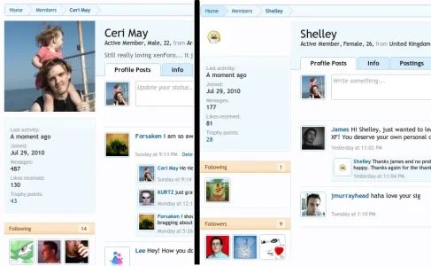
 .. it was a design issue that was not thought of that has created a very ugly issue
 ")