You are using an out of date browser. It may not display this or other websites correctly.
You should upgrade or use an alternative browser.
You should upgrade or use an alternative browser.
Lack of interest Preview in quick reply
- Thread starter ankurs
- Start date
This suggestion has been closed automatically because it did not receive enough votes over an extended period of time. If you wish to see this, please search for an open suggestion and, if you don't find any, post a new one.
This suggestion has been closed. Votes are no longer accepted.
change post reply button to preview button & once its previewed, it changes back to Post Reply buttonTo go back on-topic: if you would add a preview button, another button needs to go, because 4 buttons is fugly.
i dont think 4 button is going to make it fugly
Not everyone wants to preview their post.change post reply button to preview button & once its previewed, it changes back to Post Reply button
i dont think 4 button is going to make it fugly
That's no solution, you don't want a preview for every message. Especially not for the very short ones.change post reply button to preview button & once its previewed, it changes back to Post Reply button
Well that may be personal preference, but it will make it more complex and confusing with 4 different buttons to choose from, even with clear descriptions on them. QR should be simple and direct.i dont think 4 button is going to make it fugly
seems like majority doesn't want a preview for quick reply
Rather then adding a button, making More Options... start with a preview would be better, and accomplish what you wish.
Personally it doesn't make sense to me to do so. The QR editor is a WYSIWYG one, and the same width as what your post would be. Everything you type is exactly how it will appear in your post, so having an additional preview on that seems redundant.seems like majority doesn't want a preview for quick reply
Not quite.The QR editor is a WYSIWYG one, and the same width as what your post would be. Everything you type is exactly how it will appear in your post, so having an additional preview on that seems redundant.
The post body is 796px wide, the editor body is 778px wide (there is an 8px margin plus 1px border)
")
I'll go with this. I Liked a few posts in that regard, but really wanted to give more explicit input.If you've got a crowd of people hanging on your every post, I think you should burden yourself with using the "more options" option <snip>...
Nitpicker.Not quite.
The post body is 796px wide, the editor body is 778px wide (there is an 8px margin plus 1px border)
 Fine, suggest the editor size adjusted for it and you're there.
F
Floris
Guest
If you use the wysiwyg editor, in quick reply, it should be the "preview".
Adding bloat to quick reply doesn't make it a quick reply.
Users who want more, click on more options > preview.
Adding bloat to quick reply doesn't make it a quick reply.
Users who want more, click on more options > preview.
Let's rename "quick" reply, "convenient" reply then. Now is there any reason why a convenient reply wouldn't have a convenient preview button?have to agree with this, thats why its a quick reply, assuming you need to take the time to preview your post you would not not really making a quick reply.
4 buttons is fine. Although TBH I'd personally ditch the "Upload a File" button and put preview there. "Uploading a File" isn't really a "quick reply" (but then it sure is convenient... hmmm..).To go back on-topic: if you would add a preview button, another button needs to go, because 4 buttons is fugly.
Personally it doesn't make sense to me to do so. The QR editor is a WYSIWYG one, and the same width as what your post would be. Everything you type is exactly how it will appear in your post, so having an additional preview on that seems redundant.
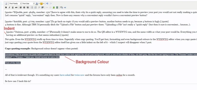
Not quite. Even the WYSIWYG stuffs up from time to time. Especially when copy-pasting. You'll get font, formatting and even background colours in the WYSIWYG editor when you copy-paste in, that won't show up in the actual reply. Even me just copy-pasting your quote from the WYSIWYG editor itself has given me a little indent on the left of it - which I suspect will disappear when I post.
Copy-pasting example: Background colour doesn't appear when posted (If only I could conveniently preview that in one simple click just to be sure):
Sometimes I like to preview my posts before I post them to check how colors look against the actual post background, which is one of two shades of blue, not dark grey, like the box I am typing in now. The "Preview" button would simply take you to the same place clicking on "More Options" -> "Preview..." takes you. Would remove an extra click.
Think of the clicks.
Well fine to be on topic.... if you need a preview and you have typed in the QR all you need to do is click more options and your future post will be in the full editor where you can click preview ... SOLVED
This seems to go against the point of having all that JavaScript overhead in XF in the first place. Why have quick reply at all? Why have alerts that pop-up in the bottom-left of screen to tell you that you have new alerts? Why even have alerts? I mean, you can just re-fresh the page! And is it really so hard to find your posts where people quoted you? It's the same as how you don't have to do a page load after you hit "post reply", it Ajax's your post into the thread right before your eyes. All of it just works together to make a nice, easy interactive experience for the end-user.
...
But... all of that is irrelevant. It's something my users have asked for twice now and the forums have only been online for a month.
So how can I hack this in?
Attachments
Let's rename "quick" reply, "convenient" reply then. Now is there any reason why a convenient reply wouldn't have a convenient preview button?
4 buttons is fine. Although TBH I'd personally ditch the "Upload a File" button and put preview there. "Uploading a File" isn't really a "quick reply" (but then it sure is convenient... hmmm..).
 I dunno....that seems pretty quick to me...
but at any rate...the only way I would want the preview button there is if there was a preview of the post in an overlay container...I would not want the preview below the post myself...click the button...check how it looks then close it. If the button redirects to another page then put the preview button there which is already the way it is. That's my two cents.
It would look crowded and overwhelming. Most forms have one or two buttons, three is already more than conventional. I really think this is bad for usability.4 buttons is fine. Although TBH I'd personally ditch the "Upload a File" button and put preview there. "Uploading a File" isn't really a "quick reply" (but then it sure is convenient... hmmm..).
I'm sure in a world with Ajax / JavaScript, CSS and fun design - in a forum with pop-ups, pop-down "quick link" menus, popping out "thread display options", hover-over thread text, pop-out sub-forum menus, popping up alerts (in two places) and all sorts of other jazz - someone can add a lousy button to a form and make it look fine.
This is about making the forum software fun, quick, convenient and easy to use (therefore encouraging people to keep coming back and using it) and reducing the steps from: Reply -> More Options (Page Load) -> Preview (Page Load) -> Post.
... to: Reply -> Preview (Page Load) -> Post.
How can having LESS STEPS involved in a process be a bad thing?
In fact hell, make "More Options" preview the text by default (if text has been entered). It loads the same area.
This is about making the forum software fun, quick, convenient and easy to use (therefore encouraging people to keep coming back and using it) and reducing the steps from: Reply -> More Options (Page Load) -> Preview (Page Load) -> Post.
... to: Reply -> Preview (Page Load) -> Post.
How can having LESS STEPS involved in a process be a bad thing?
Exactly. Now imagine if it took two clicks and two full page loads to do that. Would that be fun?View attachment 25472I dunno....that seems pretty quick to me...
Said the man who doesn't want preview at all and has argued that clicking "more options" and getting another page load is problem "SOLVED".but at any rate...the only way I would want the preview button there is if there was a preview of the post in an overlay container...I would not want the preview below the post myself...click the button...check how it looks then close it. If the button redirects to another page then put the preview button there which is already the way it is. That's my two cents.
In fact hell, make "More Options" preview the text by default (if text has been entered). It loads the same area.
you need to re read-what I said...I never said I don't want a preview...I bet I use previews more than you...in fact I am sure of it.
If you are adding a preview button...I DO NOT WANT THE PREVIEW BELOW WHERE I AM TYPING RIGHT NOW when I click preview.! I would want it in an overlay like how a membercard popup is shown and not messing with the forum page I am viewing.
If you are adding a preview button...I DO NOT WANT THE PREVIEW BELOW WHERE I AM TYPING RIGHT NOW when I click preview.! I would want it in an overlay like how a membercard popup is shown and not messing with the forum page I am viewing.
Indeed good sir, your previewing abilities are truly legendary. Why I first heard of EQnoble - Master of the Preview - when I was venturing in yonder forums and did note tales of EQnoble's pressing of the preview button on a most regular basis.you need to re read-what I said...I never said I don't want a preview...I bet I use previews more than you...in fact I am sure of it.
I do indeed concede to you the title of EQnoble, Master of Using the Preview. I also hear a certificate is in the mail from the International Society of Preview. Truly an honour well deserved for a man of your stature.
I was referring to your earlier comment though:If you are adding a preview button...I DO NOT WANT THE PREVIEW BELOW WHERE I AM TYPING RIGHT NOW when I click preview.! I would want it in an overlay like how a membercard popup is shown and not messing with the forum page I am viewing.
I am heartened by your change of heart and desire to have a preview button in the quick reply form though - including a most useful suggestion. Truly, all I was after was to load the standard preview but your suggestion will provide brave and bold new functionality that will be convenient. Together, we shall join forces and vanquish these foes who doth stand in our way and prevent us from having useful and handy features!Well fine to be on topic.... if you need a preview and you have typed in the QR all you need to do is click more options and your future post will be in the full editor where you can click preview ... SOLVED
Similar threads
- Question
- Replies
- 3
- Views
- 51
- Question
- Replies
- 2
- Views
- 711
- Question
- Replies
- 1
- Views
- 580
- Replies
- 3
- Views
- 721