Photoshop drives me CRAZY!!

Pope Viper

Well-known member
Let me start by saying I've got zero graphics ability. Zero. Period.I'm working on a logo for a new site, and I'm getting an exercise in frustration, and a test of my patience.

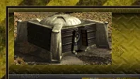
If you look at the attached image, you'll see that the "bunker" image I've got, for the life of me I cannot fit in nicely between the top and bottom "border". It overlaps at bit at the top, and there's too much space below.

I've fiddled with image size, canvas size. When I get the correct image size, when I copy the layer over, it centers it perfectly top to bottom, but when I drop it over to the left where I want it, the image automatically snaps to the top or bottom of the canvas.

What the heck am I doing wrong?!?
 
Additionally, I want to "pretty up" the bunker image, to make it less blocklike, but again, no clue on how to start that.
 
If the image is snapping to certain areas then chances are you have the "snap" setting enabled although it seems to have a mind of it's own always enabling itself in photohop CS2. To disable it, along the top menu, find View then click and in the dropdown menu uncheck Snap.
 
Argh, here's the screeny.


I'll give that a shot, thanks Shelley!!
 

Attachments

  • Capture.webp
    Capture.webp
    5.8 KB · Views: 25
You are truly a blessing, that worked perfectly!!

Great stuff glad you got it sorted. For some odd reason (on my version of photoshop) it sometimes enables itself so you may want to be aware of that if you experience the same problem again.
 
The snap can be useful - if you want to position things very accurately without snap getting in the way, move your layer into roughly the correct position, then with the move tool still selected, you can move the layer around using the arrow keys on the keyboard to shift one pixel at a time.
 
I usually use the method kier pointed out if I want absolutely accurate positioning. Arrow keys are a blessing in photoshop to align things and it can get very frustrating when some other graphics softwares don't support them.
 
When you work at small scales the snap feature is a nightmare. Large scale projects it can be helpful. For the smaller scaled projects I enable Smart Guides but rely more on my keen eye than anything.

It all really depends on the scale of your work with a little user preference thrown in.
 
OK, another stupid question.

I've got a header (obviously), with an image on the left hand side, with the text name, and a humorous quote below it. When I design it at my normal resolution, it is perfect centered, however, when I review it on a monitor with a smaller resolution, it is not. I want to keep the left side where it is, and have the center items automatically centered. Is this something I can fix via Photoshop, or do I need to take it up with the skin developer (Blue Pearl)?

You'll have to slice the image and place the appropriate code in your header. It's the little scalpel icon (screenshot below)

slice-tool.webp
 
OK, got that in place (finally!).

Another question for you (last one, I promise!)

In my header, I've got a set site name, using one layer, with a second layer containing various "slogans" my user base has come up with. The question I have is how can I have the second layer perfectly aligned with the first? Do I need to make just one?

Example below.
 

Attachments

  • Capture.webp
    Capture.webp
    14.8 KB · Views: 12
In my header, I've got a set site name, using one layer, with a second layer containing various "slogans" my user base has come up with. The question I have is how can I have the second layer perfectly aligned with the first? Do I need to make just one?
Turn on Grid and Rulers. After that it's all visual. You can align layers to your liking with Move tool.

View -> Show -> Grid
View -> Rulers

You might wanna turn off Snap, Snap to Grid, Guides:

View -> Snap
View -> Snap to -> Grid or Guides

Check out tutorials at http://www.photoshopcafe.com/
 
OK, got that in place (finally!).

Another question for you (last one, I promise!)

In my header, I've got a set site name, using one layer, with a second layer containing various "slogans" my user base has come up with. The question I have is how can I have the second layer perfectly aligned with the first? Do I need to make just one?

Example below.


You can do a few things here to align your bottom slogan text to your top text.

"Tracking" or the amount of space between letters might be the solution for you.

Open up your .psd and click on the Slogan layer.

Click on the Text tool, and toggle the Character and Paragraph Palette.

textools.webp


This opens a pop up palette with a number of options.. including the tracking option.


textools2.webp


Use the drop down to adjust the width of the space between the letters, and thus the width of your slogan until it nicely fits.

You can also adjust the font size, or use the bounding box or The "Edit"/"Free Transform" to adjust the whole thing without this.

If you do not have a good "eye" use the guide rules and drag a guide to the start of your larger text, and another to the end of your larger text so you can perfectly align.
 
What the heck am I doing wrong?!?

Using software !!

No, all of it has a major learning curve even though the makers claim you can learn it fast and become an expert in no time, I guess that is why they teach classes in community colleges on technical skills because none of it is 'easy' !!
 
Photoshop is particularly annoying. It used to drive me NUTS on a windows machine because all the help files would say "use xyz menu option", without ever TELLING YOU WHERE THAT OPTION WAS.
I was shocked when we moved to OSX and when you put the keyword in the search and hovered on the result that looked like it might apply: It opened the menu for you and put a big floating arrow next to the option you need to use!

Argh! All those frustrating help file blindspots were suddenly explained.

I generally use Fireworks anyway as Photoshop is generally overkill for most of the things I try to do. But then I'm graphically challenged, I leave design/styling to Susan ;).
 
I've grown up with Photoshop, used it since version 2 (as far as I know, that's when I started counting, I may have used version 1, I'm not sure) and while I'd love to try doing some graphics in Fireworks, I always find myself back in Photoshop. Even Illustrator has me tearing my hair out within a few minutes, I tend to get annoyed at anything that doesn't work like Photoshop.
 
I started using Lightroom 3 and the user interface is lightyears (pun intended) ahead of PS. I would say that about 98% of what I usually need to do to a Photo can be done with LR. PS is overkill for most things, but you can't deny it's power. It's just too bad it has such a high learning curve.
 
Top Bottom