This sounds like it could get messy?These categories will then be displayed as tabs on the account page.
-
This forum has been archived. New threads and replies may not be made. All add-ons/resources that are active should be migrated to the Resource Manager. See this thread for more information.
You are using an out of date browser. It may not display this or other websites correctly.
You should upgrade or use an alternative browser.
You should upgrade or use an alternative browser.
- Status
- Not open for further replies.
I agree. It's the cleanness of the mod that appealed to me - a nice list of bookmarked threads. I think category tabs are unnecessary bloat.This sounds like it could get messy?
S
Syndol
Guest
It's an option, you don't have to use it. Some want it some don't.
If the majority of you do not want it then I can stop writing it right now and save myself the headache!
A show of hands should solve this issue I guess. Those in favour raise your right hand while those against raise your left (no your other left)
If the majority of you do not want it then I can stop writing it right now and save myself the headache!
A show of hands should solve this issue I guess. Those in favour raise your right hand while those against raise your left (no your other left)
S
Syndol
Guest
S
Syndol
Guest
Not sure why you would want to?!Can we see all the bookmarks in Admin ACP?
The way I see it working is you will have the ability to add up to 4 categories / tabs (as more would not fit with fixed width pages).
Bookmarks that are not assigned to one of those 4 categories will get placed in the default Thread Posts and Profile Posts tabs.
In other words, all of your bookmarks will get displayed in either the default tabs (as is now) and/or in any of up to 4 additional ones.
I just thought it would be useful to be able to 'file' some bookmarks.
It is just an idea. I am quite happy forgetting about the whole thing if no one is interested. I could use the time off
I think it might be good to have categories for better navigation. Also, Never hurt to have it as an option. So here is my right hand.It's an option, you don't have to use it. Some want it some don't.
If the majority of you do not want it then I can stop writing it right now and save myself the headache!
A show of hands should solve this issue I guess. Those in favour raise your right hand while those against raise your left (no your other left)
Whilst I don't have an issue with "categories", the issue is by using profile tabs to implement them.
My point is... tabs are limited for overall space on a per design basis:

You could fit maybe 5 - 6 tabs in that space... then what?
Categories valid... method of implementation, I see only problems. You know someone is going to want more than the space provides... where do they go then?
Why not a simple, nice, list that displays floated in the top of the bookmarks tabs? I don't know what the answer is... but you know the tabbed space is limited and people are going to want additional categories that surpass the tabbed room... and come looking at the developer for answers.
Is there a solution to this already within your design? Does it simply place an end tab with "additional" or such in a dropdown menu? If that is the case, then why not just put one tab, "categories" as a dropdown for selection!
My point is... tabs are limited for overall space on a per design basis:

You could fit maybe 5 - 6 tabs in that space... then what?
Categories valid... method of implementation, I see only problems. You know someone is going to want more than the space provides... where do they go then?
Why not a simple, nice, list that displays floated in the top of the bookmarks tabs? I don't know what the answer is... but you know the tabbed space is limited and people are going to want additional categories that surpass the tabbed room... and come looking at the developer for answers.
Is there a solution to this already within your design? Does it simply place an end tab with "additional" or such in a dropdown menu? If that is the case, then why not just put one tab, "categories" as a dropdown for selection!
S
Syndol
Guest
It's a fair point, but life is full of limitations. Who said categories/tags need to be limitless - surely that defeats their purpose.You could fit maybe 5 - 6 tabs in that space... then what?
Whilst I don't have an issue with "categories", the issue is by using profile tabs to implement them.
The only other method I can see working here is the ability to 'tag' each bookmark with one (1) tag word (a category in essence).
You will then have a select drop-down box somewhere on the page (not a tab) to filter the bookmarks to your selected tag.
Once again, this is just an idea, I'm not saying this add-on must have such a feature.
Whilst I don't have an issue with "categories", the issue is by using profile tabs to implement them.
My point is... tabs are limited for overall space on a per design basis:
View attachment 22739
You could fit maybe 5 - 6 tabs in that space... then what?
Categories valid... method of implementation, I see only problems. You know someone is going to want more than the space provides... where do they go then?
Why not a simple, nice, list that displays floated in the top of the bookmarks tabs? I don't know what the answer is... but you know the tabbed space is limited and people are going to want additional categories that surpass the tabbed room... and come looking at the developer for answers.
Is there a solution to this already within your design? Does it simply place an end tab with "additional" or such in a dropdown menu? If that is the case, then why not just put one tab, "categories" as a dropdown for selection!
Not saying this is a permanent solution but xenforo has always been overly generous with the padding in tabs and this alone (By lowering the padding) will free up quite a bit of space. easily shave off 12px on each side effectively doubling or thereabouts the tab count. 22px is far far too much. 10px would be a nice amount.
Code:
.bookmarksPage .tabs.mainTabs li a {
    padding-left: 22px;
    padding-right: 22px;
}
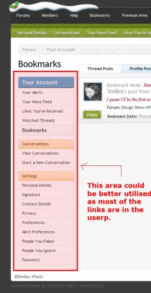
Suggestion (Below) Screenshot is self explanatory and possibly this could be used (the area) for something (catergories perhaps).

You Could add another tab next to "Profile Posts" titled "Categories" or what ever where the Bookmarks are sorted like the forum view. Each Category is a "Forum" and the Bookmarks are shown like Posts. I hope you understand what I talking about or should I attach an image?
S
Syndol
Guest
The tagging idea sounds extremely sensible... hadn't thought about that. Basically a prefix system, which can be quickly sorted, as you say, by selecting it from a list.
Your mod, you obviously do what you want with it... I can just see the issues with the tabbed method immediately. I don't see shaving padding as a solution... especially if a user has 20 categories to bookmark their content, another six, another 30, etc...
A tagging system sounds like a really solid solution actually.... of which doesn't detract and clutter things... nice idea that one.
I think that would work great for tags.How about a drop-down list right above the sticky icon just like the 'tread tools' one:
View attachment 22749
It resolves all the issues related to tabs as you could dynamically reload the page with the selected tag.
Then again, you could also call them categories, as the end result would be the same.
The tagging idea sounds extremely sensible... hadn't thought about that. Basically a prefix system, which can be quickly sorted, as you say, by selecting it from a list.
Your mod, you obviously do what you want with it... I can just see the issues with the tabbed method immediately. I don't see shaving padding as a solution... especially if a user has 20 categories to bookmark their content, another six, another 30, etc...
A tagging system sounds like a really solid solution actually.... of which doesn't detract and clutter things... nice idea that one.
I did say it wasn't a permanent solution Anthony. I'm quite aware of the issues which did arise in the profile tabs when the tabs broke onto another line.
S
Syndol
Guest
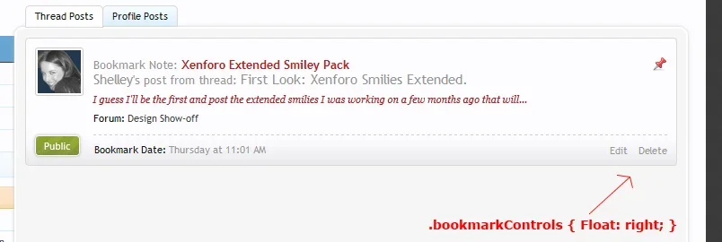
Looks good. They are currently placed where they are in order to match the look of the posts themselves.Another suggestion a cosmetic one really that I'm more than happily to do myself by adding the css to EXTRA but perhaps float the .bookmarkControls to the right offering a cleaner uncluttered look.
One issue with that might be that if my browser is opened large and the forum is liquid layout then those links are waaay to the right.
As for tags, another possibility is to have a 'Categories' tab as some have suggested and when clicked the page loads a list of categories/tags - instead of a drop-down list.
Looks good. They are currently placed where they are in order to match the look of the posts themselves.
One issue with that might be that if my browser is opened large and the forum is liquid layout then those links are waaay to the right.
As for tags, another possibility is to have a 'Categories' tab as some have suggested and when clicked the page loads a list of categories/tags - instead of a drop-down list.
No worries Syndol. It's a alteration I'm more than willing to make I just thought even though it's kept inline with how xenforo has placed the privatecontrols it just didn't look right and felt it was cluttering the date and timestamp.
- Status
- Not open for further replies.
Similar threads
- Question
- Replies
- 7
- Views
- 110
- Replies
- 0
- Views
- 50
- Replies
- 1
- Views
- 12


