You are using an out of date browser. It may not display this or other websites correctly.
You should upgrade or use an alternative browser.
You should upgrade or use an alternative browser.
Implemented Online Status Indicator / move outside of Avatar-image
- Thread starter erich37
- Start date
- Status
- Not open for further replies.
This suggestion has been implemented. Votes are no longer accepted.
Just substitute the word green here for any color you have there.
CSS / Template Edit
Then it doesn't really matter. No matter what, this is something that simply will not be agreeable upon by everyone. Some people want a dot, some the banner, some a flashing UFO above their name (I am in that camp). Some don't want anything by their username (I am in that camp).
At least it's now in, and is able to be styled.
I agree. I'm not sure why this feature is so subtle by default. Just something for members to miss or have to have explained to them rather than being obvious.
Me neither. I love XenForo because of it's outstanding UI/UX, but this (position of the) new online indicator seems a bit off. Both from a design and usability point of view I am a bit suprised this implementation is choosen.
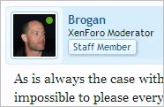
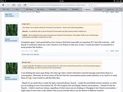
The best example might be my own posts:
---
I mean... a graphic over a graphic? Maybe I am missing the point, but what good does it serve to place an online indicator inside another graphic? Look at my Avatar...the online indicator is so burried, not many people will notice I am even online! An indicator is called an indicator for a reason. If the indicator can hardly be noticed, it does not serve it's purpose/function anymore.
An indicator should be place there were it can be easily noticed by the enduser. In this case the most obvious place would be next to the Username.
I am quite puzzled why this approach is chosen and I would like to suggest for it to be reconsidered. Thanks.
As is always the case with suggestions such as this, it is impossible to please everyone.
The developers have chosen to position it over the avatar by default.
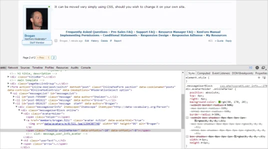
Anyone who doesn't like that can change it with a few lines in EXTRA.css.
I already have the CSS added to EXTRA.css to move it as shown in the screenshot above.
The developers have chosen to position it over the avatar by default.
Anyone who doesn't like that can change it with a few lines in EXTRA.css.
I already have the CSS added to EXTRA.css to move it as shown in the screenshot above.
Me neither. I love XenForo because of it's outstanding UI/UX, but this (position of the) new online indicator seems a bit off. Both from a design and usability point of view I am a bit suprised this implementation is choosen.
The best example might be my own posts:
View attachment 79314
---
I mean... a graphic over a graphic? Maybe I am missing the point, but what good does it serve to place an online indicator inside another graphic? Look at my Avatar...the online indicator is so burried, not many people will notice I am even online! An indicator is called an indicator for a reason. If the indicator can hardly be noticed, it does not serve it's purpose/function anymore.
An indicator should be place there were it can be easily noticed by the enduser. In this case the most obvious place would be next to the Username.
I am quite puzzled why this approach is chosen and I would like to suggest for it to be reconsidered. Thanks.
I have to agree regarding the placement, it's not my preferred choice. That being said...
1. Technically it's not a graphic not that there's anything wrong having a graphic over a graphic (helper spans are very popular in that regard) majority of people like graphics over graphics.
2. It'll literally take you 10 seconds to make the adjustments and place it to your preferred location
3. Have to agree, this is one of those feature placements where you'll never make everyone happy.
One issue I think will happen is that members will add their own status indicators onto their avatar. They'll be cute and add different color status indicators just to be a PITA.
On my forum I will disable the status indicator altogether as I prefer not to have one.
Is there a switch in the Admin Control Panel to disable the status indicator?
On my forum I will disable the status indicator altogether as I prefer not to have one.
Is there a switch in the Admin Control Panel to disable the status indicator?
I assume a style property, is this correct?
Thank you.
*edit* didn't see image at time of reply.
Last edited:
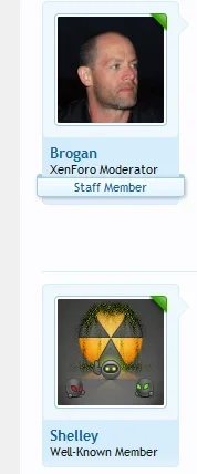
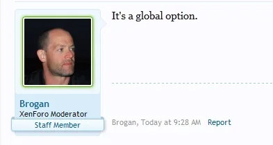
I don't mind the dot. But when it does get released I am sure there will be many ways to change it. For those that don't like the dot and think it messes with the avatar you could make the avatar itself be the online indicator.
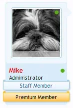
View attachment 79325

Good ideaI don't mind the dot. But when it does get released I am sure there will be many ways to change it. For those that don't like the dot and think it messes with the avatar you could make the avatar itself be the online indicator.
View attachment 79325
I think so too.
But it shows users who don't like the current circular icon that it's easy to change and modify to their needs. Essentially it will take anyone who prefers another design minutes to change (this literally took 2mins) 1min 43 seconds (I timed it) and that was designing the image from scratch and fiddling with firebug, it would have been quicker had I went directly into EXTRA.CSS. Point being making changes is incredibly easy and quick to accomplish. Obviously, more advance designs will take longer but generally online markers are as basic as images will ever get. Win/win
But it shows users who don't like the current circular icon that it's easy to change and modify to their needs. Essentially it will take anyone who prefers another design minutes to change (this literally took 2mins) 1min 43 seconds (I timed it)
- Status
- Not open for further replies.
Similar threads
- Replies
- 1
- Views
- 82
- Question
- Replies
- 1
- Views
- 376
- Replies
- 11
- Views
- 1K
- Replies
- 1
- Views
- 279
