XF 2.3 Newbie queston re. forum sizing

ShenmueGuru

Member
Hi all,

trying to get our forums in order after we had to get rid of our previous web developer. We are doing ok, but I have a question I feel is probably easy to answer, but i am still learning fast.

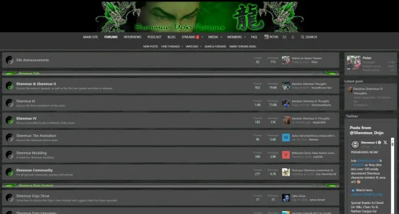
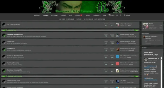
We have 3 themes, and 2 of them have a narrow style of nodes and posts below the header. But one stretches the full length of the desktop. Here are the examples:

Narrow
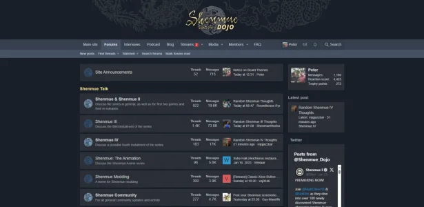
Narrow.webp

Wide

Wide.webp


The question I have is where abouts is it within the appearance section that this can me edited? Is this just in the styles section, or is it part of any custom code? I would say its the nodes section on the main page, but posts within topics are also the same width, so I assume they are all linked to a specific option?

Thanks in advance!
 
Last edited:
Yep, there's quite a bit in there. For the narrow template, there 1249 lines. I would be unsure as to what relates to changing the width for desktop though.

Code:
.p-body-header {
    margin: 24px 0px;
}
.p-header-logo {
    margin: 0 auto;
}
.p-header-logo.p-header-logo--image img {
    width: auto;
    height: 130px;
}

.node-title a {
    color: rgb(214, 214, 214);
}
.node-title a:hover {
    color: #FFC831;
}
.node-description {
    color: #A0A7B3;
}
.node+.node {
    border: none;
}
.p-body {
    margin: 24px 0;
}


/*
==========================================================================
    NEW CHANGES - Light Yellow
==========================================================================
*/

a:hover {
    color: #FDEB98;
}

/* Blocks */
.block {
    margin-bottom: 16px;
}
.block-header, .block-minorHeader {
    font-size: 18px;
    color: #A0A7B3;
    color: #FDEB98;
    background: #1A1F28;
    font-weight: bold;
    /* text-transform: uppercase; */
    letter-spacing: 0.5px;
    @media screen and (min-width: 900px) {
        padding: 8px 0px;
    }
}
.block-minorHeader {
    font-size: 16px;
}
.block-container {
    border: none;
    background: none;
}

.memberOverviewBlock-seeMore {
    background: none;
    border: 1px solid #FDEB98;
    padding: 12px;
}
.blockLink.is-selected {
    background: none;
    border-color: #FDEB98;
    color: #ffffff;
}
.blockLink:hover {
    background: none;
}
.block-row.block-row--alt {
    background: none;
}
.block-row {
    border: 1px solid #373f4e;
    background: #2B2F36;
    padding: 16px 12px;
}

/* Nodes */

 svg {
        display: none;
    }

.node+.node, .node {
    border-top: 1px solid #373f4e;
    border: 1px solid #373f4e;
    background: #2B2F36;
    margin-bottom: 8px;
}
.node-title a:hover {
    text-decoration: none;
    color: #FDEB98;
}
.node-icon  {
    padding: 16px;
    @media screen and (min-width: 900px) {
        padding-right: 40px;
    }
}
.node-extra, .node-main {
    margin-left: 16px;
}

.node .node-icon i:before {
    display: none;
}
.node .node-icon i{
    width: 40px;
    height: 40px;
    display: block;
    background-repeat: no-repeat;
    background-size: contain;
}

.node--read .node-icon i{
    background-image: url("https://www.shenmuedojo.com/wp-content/uploads/2019/11/forum_read.png") !important;
}
.node--unread .node-icon i{
    background-image: url("https://www.shenmuedojo.com/wp-content/uploads/2019/11/forum_unread.png") !important;
}


/*
==========================================================================
    LAYOUT
==========================================================================
*/
.p-body-main--withSidebar .p-body-content {
    @media screen and (min-width: 900px) {
        padding-right: 24px;
    }
}
.p-title-pageAction .button, .p-title-pageAction a.button {
    margin-right: 8px;
}
.p-title {
    justify-content: space-between;
}
.p-title-value {
    font-weight: bold;
    text-transform: uppercase;
    font-size: 18px;
    color: #FDEB98;
    @media screen and (min-width: 900px) {
        font-size: 24px;
    }
}
.p-body-sidebar {
    @media screen and (min-width: 900px) {
        width: 290px;
    }
}
body[data-template="forum_list"] .p-body-header {
    display: none;
}
.structItem-cell {
    padding: 18px 20px;
}
#background {
    background: #2B2F36;
}

Thats just the first 170 lines.
 
Not at all, thank you for helping!

Hmmm no actually, the only p-body code in there is this:

Code:
==========================================================================
    LAYOUT
==========================================================================
*/
.p-body-main--withSidebar .p-body-content {
    @media screen and (min-width: 900px) {
        padding-right: 24px;
    }
}
.p-title-pageAction .button, .p-title-pageAction a.button {
    margin-right: 8px;
}
.p-title {
    justify-content: space-between;
}
.p-title-value {
    font-weight: bold;
    text-transform: uppercase;
    font-size: 18px;
    color: #FDEB98;
    @media screen and (min-width: 900px) {
        font-size: 24px;
    }
}
.p-body-sidebar {
    @media screen and (min-width: 900px) {
        width: 290px;
    }
}
body[data-template="forum_list"] .p-body-header {
    display: none;
}
.structItem-cell {
    padding: 18px 20px;
}
#background {
    background: #2B2F36;
}

/*
 
I know, I am sorry. So much code and it could lie anywhere. I have been trying to compare the codes between the two, but as is the way, needle in a haystack for a semi amateur such as myself. I really do appreciate the help though!
 
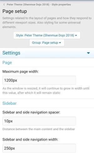
Hi Cedric, page width is at 1200px

1000039345.webp

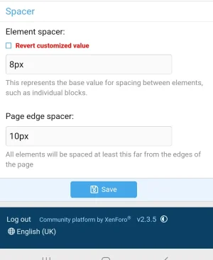
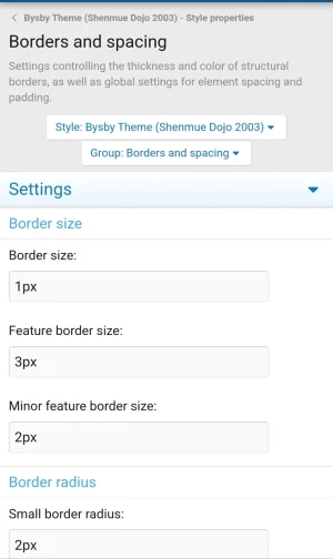
I am trying to see anything that may help, and going back to the borders and spacing style properties... Both the "narrow" themes all have customised values (the red notification under each), whereas the "wide" theme seems to have no customisation at all:

1000039347.webp
 
Back
Top Bottom