Need Your Opinion

Xarcell

Well-known member
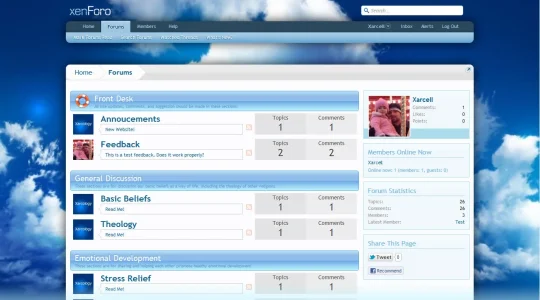
I started on a theme for another xenForo project of mine. I wanted to know you opinions on the node layout. Do you think it's lame having avatars of the last poster instead of the node icons and having such big areas for discussion & message count?

The theme is far from finished though...
 

Attachments

  • screenshot-xarchology-1.webp
    screenshot-xarchology-1.webp
    74 KB · Views: 39
I quite like the large discussion and message count.

The avatars, not so much. I wouldn't look at a forum list and go check out a post just because I recognise (or not) an avatar.
 
I like it - it's a good idea - but I can only see it working if you have a very small number of forums. Once you get past 5 or 6 your homepage starts ot get quite long and I expect that would hinder navigation and frustrate your regulars. (y)
 
I don't like the topics / comments ... so little somewhat irrelevant information taking up so much space = waste.
Last poster Avatar on forumhome = not a fan. distracting.

How many forums do you have ? I think a good idea is to try to get all your forums on ONE screen.

Idea: Make every forum like a card. The forum home listing is 2 columns, and each card is twice as tall as a current forum listing height. When you hover over the card it highlights, clicking it takes you to the forum.
 
I like the category styling.

That's about it. The breadcrumbs especially looks odd without the navigation and margin keeping it in check. Also, I've never been a fan of breadcrumbs that extend the full page, the xenforo default design doesn't cater for it.

The navigation being separate is an interesting idea, something I have done but never really created a design to compliment the separation and again the default styling just doesn't work.

The threads & comments is wasteful space. Not to mention index space (vertically) should never be wasted and this is what your implementation does very well. I can see what you were trying to do and done correctly this can be visually pleasing and nice on the eye and without the wasted space. I did something similar with vbulletin and it turned out nicely without the wasted space.

The thread title and lastposter looks odd and I'm not a fan of the lastposter avatar on the left.

Overall thoughts, it looks cluttered yet it uses up more space which in some critiques would be deemed hypocritcal for me to say but you've amanaged to accomplish this. Not liking it at all I'm afraid.
 
I thought this was a cool design.
forum-categories-jpg.28781


I think the entire ForumHome needs to be re-thought.
It is such an important page .. and it's ultra-boring. I think for returning members it provides almost nothing.
 
I thought it was a wonderful idea, but after I implemented it, I hated it. I came really close to scrapping it. However, now that I've been using it a bit, it's starting to grow on me... a lot.

The only major drawback is that there is too much vertical scrolling. However, if you really look at it, it doesn't add much more scrolling than the default. I did a side-by-side comparison. It's only about 5px more per row. What's bad is the categories, as having images with descriptions is taking up massive room. The categories add about 12px more compared to default. This totals about 17px more scrolling per category, and I have 9 categories.

I think I will continues to tinker with it more. Most likely move the RSS icon somewhere else.

As far as the breadcrumbs, I personally like. I separated the header and footer and encapsulated the forum within the top and bottom breadcrumb. I even put my moderation bar and login bar below the top breadcrumb. It turned quite nicely in my opinion.

All in all I'm about 60-40 on keeping it.

Thanks to everyone for their opinion.
 
Top Bottom